Generate a new design based on this screen using your own content.
Thank you! Your submission has been received!
Oops! Something went wrong while submitting the form.
# Design from Reference: Hugo 404 Page
Create an original, high-fidelity visual design inspired by the reference. Prioritize composition, typography, colors, spacing, and component styling over technical implementation.
## Reference
- **Product:** Hugo
- **Category:** 404 Page
- **Screenshot:** https://cdn.prod.website-files.com/5e9dc792e1210c5325f7ebbc/6acbd248d69dbc5db101895e_6acbd003594cf60a031e331b_cms-405aed136b4260eb4151cd4d.webp
Analyze the screenshot first. If inaccessible, request it rather than guessing.
## Content
{{content.instructions}}
{{content.data}}
Preserve essential messaging and factual accuracy. Adapt structure and copy length for visual balance; never invent product claims.
## Visual Design
Use this context to reproduce the reference's visual language: layout, typography, colors, spacing, borders, radii, and distinctive elements. The screenshot takes priority if descriptions conflict.
## Direction
{{preferences.fidelityInstructions}}
## Output
{{output.instructions}}
Deliver a polished, cohesive design with precise alignment, hierarchy, and spacing. Produce the requested visual artifact, not just a description. If unsupported, explain the limitation.
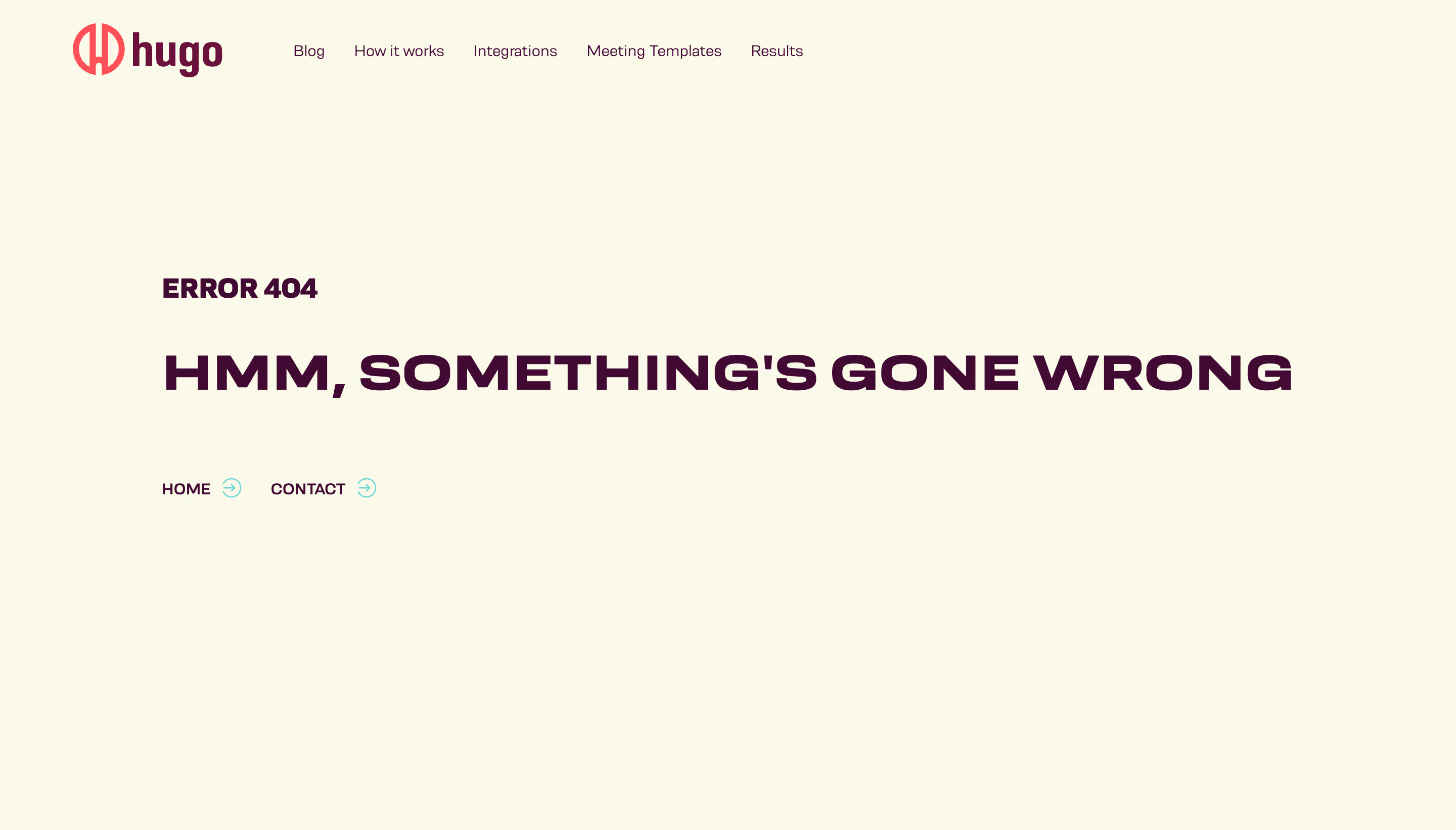
Hugo’s 404 page embodies playfulness within a professional SaaS framework. The design balances minimalist structure with delightful whimsy, relying on ample white space and crisp edges to keep the interface uncluttered, while a vibrant illustration captures attention and softens the friction of a lost page.
Layout and Structure
A single-page experience, the layout centers all content for easy scanning. The hero-style section features a bold, quirky illustration paired with a concise headline and reassuring subcopy. Immediately beneath, a strong Call-to-Action button guides users back to the homepage—minimizing dead-end frustration. The absence of extra navigation or footer items streamlines recovery and keeps the focus on a simple next step.
Visual Elements
The custom illustration stands out—a whimsical megaphone with anthropomorphic features makes the typical apology message memorable and on-brand. There are no complex animations or distractions, just a minimal motion hint within the illustration that adds a subtle spark of life without overwhelming users.
Color Palette and Typography
A bold, saturated blue forms the primary color, contrasted sharply by white backgrounds and complemented by energetic accent hues (like rich yellow and soft lavender) within the artwork. Modern, sans-serif typography creates a clear hierarchy: headline (large and weighty), subheadline (smaller, lighter), and a visually prominent button.
User Experience Patterns
Key UX principles are evident: a high-contrast CTA, clear error context, and ultra-simple navigation back to safety. The tone is empathetic and slightly humorous, reducing stress for lost users. Every element invites action rather than confusion—demonstrating user-centric design even in error moments.
Unique and Notable Design Choices
Hugo transforms a potential frustration into a brand opportunity, using custom illustration, personality-driven messaging, and restraint in layout. The 404 page reinforces the brand character while gently nudging users forward, exemplifying how a thoughtful error page can elevate SaaS user experience.