Design with AI
Generate a new design based on this screen using your own content.
# Design from Reference: Hotjar Onboarding Email Flow
Create an original, high-fidelity visual design inspired by the reference. Prioritize composition, typography, colors, spacing, and component styling over technical implementation.
## Reference
- **Product:** Hotjar
- **Category:** Onboarding Email
- **Screenshot:** https://cdn.prod.website-files.com/5e9dc792e1210c5325f7ebbc/6acbcb758313d4c6c0cc789b_6acbc90dad8ac5752786fcf2_cms-535cb82c6d183b99e0bf36ae.webp
Analyze the screenshot first. If inaccessible, request it rather than guessing.
## Content
{{content.instructions}}
{{content.data}}
Preserve essential messaging and factual accuracy. Adapt structure and copy length for visual balance; never invent product claims.
## Visual Design
### Overall aesthetic
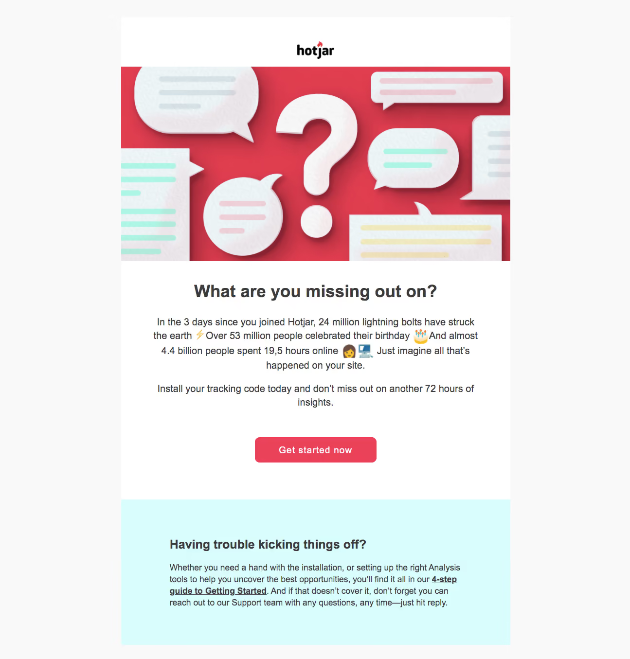
- **Style:** Branded onboarding email with a large red illustration, centered persuasive copy, and a pale-cyan support section.
- **Character:** Bold dark headings, conversational body text with emoji, white content canvas, and a red-pink primary action.
- **Decoration:** Textured paper speech bubbles and a large question mark appear as a dimensional illustration over the red hero image.
### Page composition
- **Capture:** 1295 × 1355 image px. Dimensions below describe screenshot pixels; email-client CSS scale and zoom are unverified.
- **Email body:** Approximately 800 image px wide, centered on a very light-gray surround.
- **Brand header:** White strip with a small centered Hotjar logo.
- **Hero image:** Full-column illustration approximately 800 × 400 image px.
- **Message:** Centered headline, two prose groups, and a centered action within a spacious white region.
- **Support panel:** Full-column cyan block below, with left-aligned heading and paragraph inset about 100 image px.
### Information hierarchy
- **Illustration:** Red hero image establishes the strongest visual emphasis.
- **Main headline:** Bold question follows the image and leads into an installation reminder.
- **Primary action:** Red-pink Get started now button is isolated with broad whitespace.
- **Support:** Cyan panel separates help content from the main persuasive message.
- **Inline resource:** Bold underlined guide link appears inside the support paragraph.
### Typography
- **Family:** Arial-like sans serif; exact family is unverified.
- **Main heading:** Approximately 36 image px bold with 44px line-height.
- **Body:** Approximately 20 image px regular with 29–30px line-height, centered.
- **Action:** Approximately 20 image px bold white label.
- **Support heading:** Approximately 26 image px bold.
- **Support body:** Approximately 18 image px with 24px line-height.
- **Precision:** These are observed image-scale estimates, not verified email CSS values.
### Colors & surfaces
- **Surround:** Sampled #F9F9F9.
- **Main email:** Sampled #FFFFFF.
- **Text:** Sampled #3C3C3C.
- **Support surface:** Sampled #D9FDFD.
- **Red illustration:** Sampled #DF3E4F and #E94259 in the hero artwork.
- **Paper tones:** Sampled #EAE5E9, #ECF4F6, and nearby pale textured shades.
- **Surface treatment:** Flat content blocks; dimensional shadows belong to the illustration rather than a raised email card.
### Components
- **Brand strip:** Approximately 102 image px high with centered small logo.
- **Hero artwork:** Cropped speech bubbles around a large question mark, with soft paper textures and shadows.
- **Primary button:** Approximately 250 × 52 image px, red-pink fill, white bold label, and 10px radius.
- **Message area:** Broad white block with centered text measure around 670 image px.
- **Support section:** Approximately 300 image px high with generous vertical padding and an unboxed text group.
- **Guide link:** Dark bold underline within paragraph text, without separate button styling.
- **State limits:** Static email only; installation, guide navigation, and reply behavior are not demonstrated.
### Visual rhythm
- **Block sequence:** White logo, red image, white message, cyan help create four distinct bands.
- **Text rhythm:** Large headline followed by spaced paragraph groups, then a broad pause around the button.
- **Alignment contrast:** Centered persuasion gives way to left-aligned support copy.
- **Margins:** Wide outer and inner whitespace prevents the bright illustration from overwhelming the text.
### Responsive
- **Observed state:** One email capture; mobile/email-client variants are unverified.
- **Width recommendation:** Use a fluid email-safe container with appropriate maximum width and 20–24px mobile gutters.
- **Artwork recommendation:** Scale the hero proportionally and provide descriptive alternative text.
- **Text recommendation:** Reduce the headline while preserving comfortable body size and natural wrapping.
- **Action recommendation:** Keep the primary link comfortably tappable across email clients.
### Adaptation guidance
- **Preserve:** Bold red illustration, concise installation reminder, single red action, and distinct cyan assistance block.
- **Content fidelity:** Use actual approved onboarding timing and claims; numerical comparisons in the screenshot are historical copy.
- **Email implementation:** Use supported email markup and real destination links, with a meaningful image alternative.
- **Scale guidance:** Establish intended CSS dimensions independently from the screenshot’s image size.
- **Support adaptation:** Keep the guide and reply route clear without adding unsupported assistance promises.
Use this context to reproduce the reference's visual language: layout, typography, colors, spacing, borders, radii, and distinctive elements. The screenshot takes priority if descriptions conflict.
## Direction
{{preferences.fidelityInstructions}}
## Output
{{output.instructions}}
Deliver a polished, cohesive design with precise alignment, hierarchy, and spacing. Produce the requested visual artifact, not just a description. If unsupported, explain the limitation.