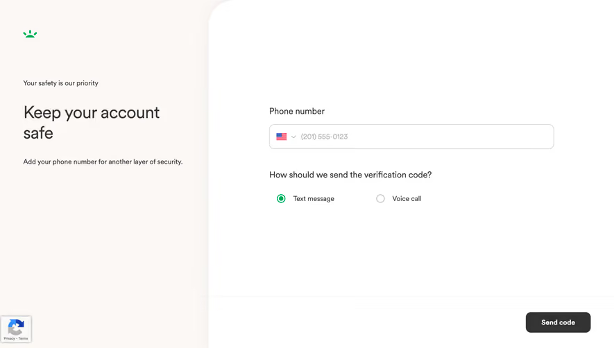
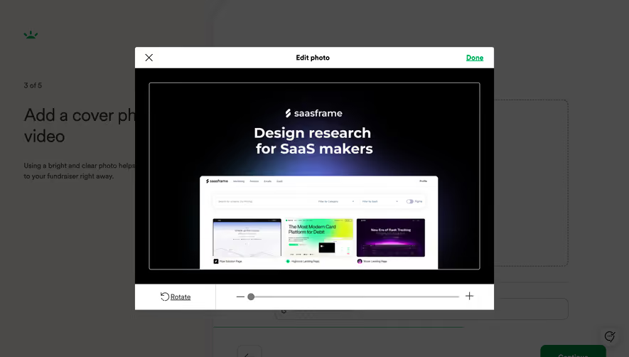
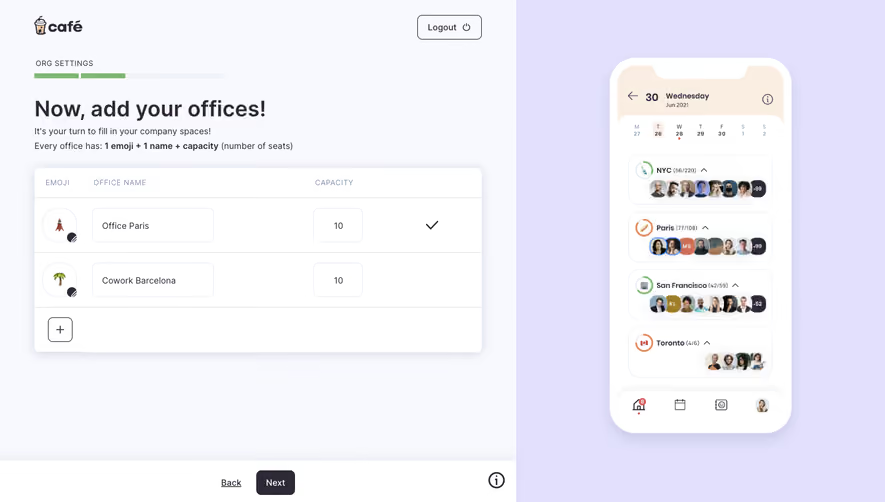
Generate a new design based on this screen using your own content.
Thank you! Your submission has been received!
Oops! Something went wrong while submitting the form.
# Design from Reference: GoFundMe Foundraiser Review
Create an original, high-fidelity visual design inspired by the reference. Prioritize composition, typography, colors, spacing, and component styling over technical implementation.
## Reference
- **Product:** GoFundMe
- **Category:** Account Setup
- **Screenshot:** https://cdn.prod.website-files.com/5e9dc792e1210c5325f7ebbc/6acad5245a5fdf4c30310f0e_6acad44bb2165b6c7f00b35c_cms-382f3e1c6df3fe42df6a36ac.webp
Analyze the screenshot first. If inaccessible, request it rather than guessing.
## Content
{{content.instructions}}
{{content.data}}
Preserve essential messaging and factual accuracy. Adapt structure and copy length for visual balance; never invent product claims.
## Visual Design
Use this context to reproduce the reference's visual language: layout, typography, colors, spacing, borders, radii, and distinctive elements. The screenshot takes priority if descriptions conflict.
## Direction
{{preferences.fidelityInstructions}}
## Output
{{output.instructions}}
Deliver a polished, cohesive design with precise alignment, hierarchy, and spacing. Produce the requested visual artifact, not just a description. If unsupported, explain the limitation.
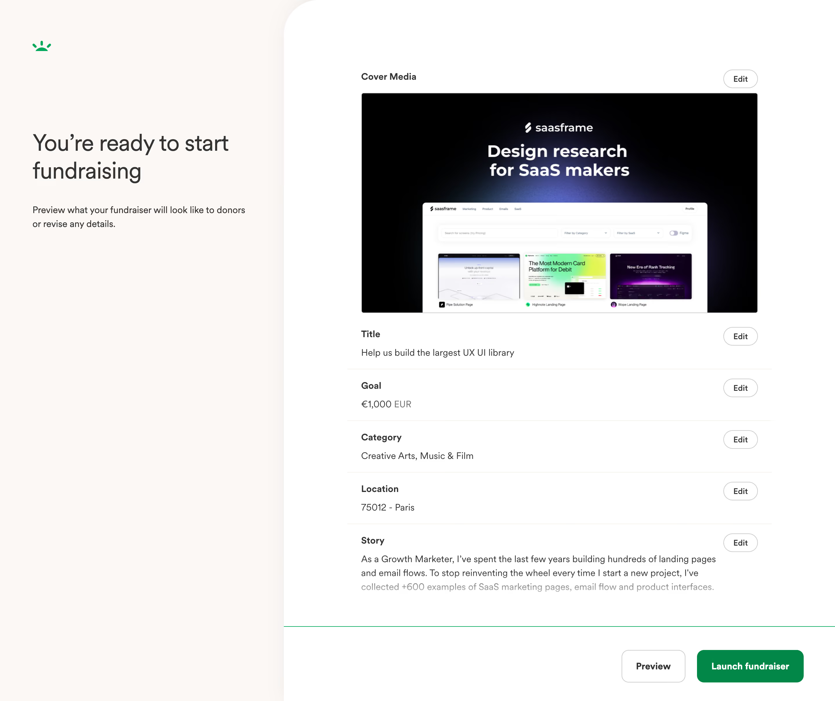
This is GoFundMe's final review screen before launching a campaign, and it's a masterclass in structured simplicity. The left panel is mostly whitespace with a bold heading and a short reassuring line. That's it. No clutter, no anxiety. The right side stacks every editable detail in clean, labeled rows with consistent "Edit" buttons tucked to the right. You scan everything in seconds.
Smart use of restraint
The color palette is almost entirely black, white, and gray, with green reserved for exactly two things: the logo and the "Launch fundraiser" CTA. That green button pops hard against everything else. Typography is simple and well-spaced. The cover media preview is generous in size, giving creators a real sense of how their image reads.
What makes it stick
The two-column split feels balanced without being symmetrical. Each section has just enough breathing room. The "Preview" button in outline style next to the filled "Launch fundraiser" button creates a clear visual hierarchy for the final decision. Functional and confident.