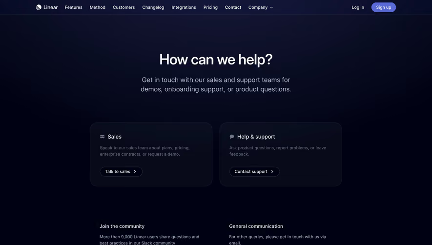
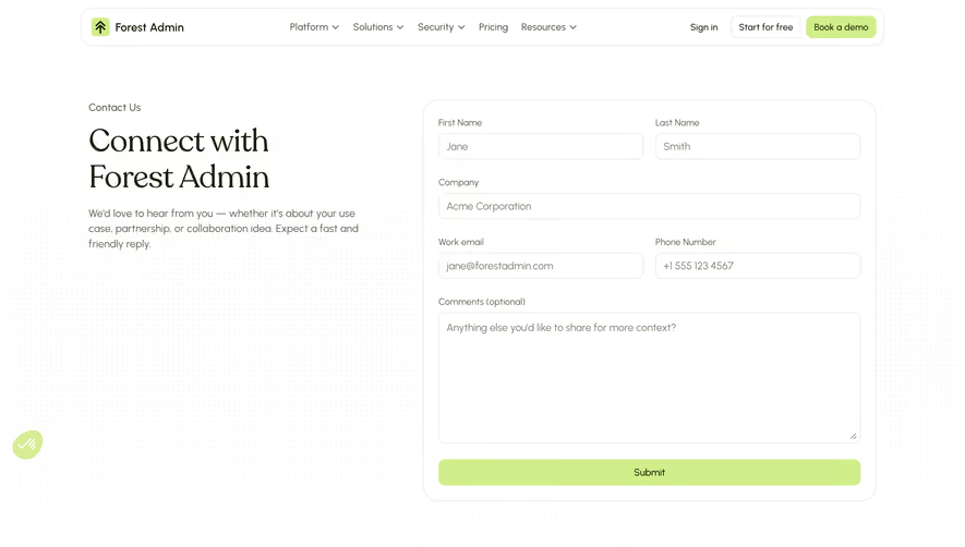
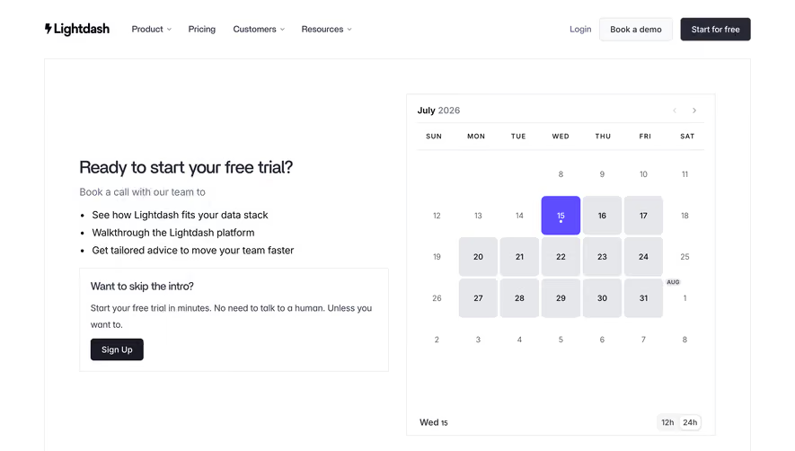
Generate a new design based on this screen using your own content.
Thank you! Your submission has been received!
Oops! Something went wrong while submitting the form.
# Design from Reference: FlowMapp Contact Page
Create an original, high-fidelity visual design inspired by the reference. Prioritize composition, typography, colors, spacing, and component styling over technical implementation.
## Reference
- **Product:** FlowMapp
- **Category:** Contact Page
- **Screenshot:** https://cdn.prod.website-files.com/5e9dc792e1210c5325f7ebbc/6acad7e71025e911ae520ea9_6acad76efef6904ce0091a74_cms-34b6a3d259e1ea638d0bfe21.webp
Analyze the screenshot first. If inaccessible, request it rather than guessing.
## Content
{{content.instructions}}
{{content.data}}
Preserve essential messaging and factual accuracy. Adapt structure and copy length for visual balance; never invent product claims.
## Visual Design
Use this context to reproduce the reference's visual language: layout, typography, colors, spacing, borders, radii, and distinctive elements. The screenshot takes priority if descriptions conflict.
## Direction
{{preferences.fidelityInstructions}}
## Output
{{output.instructions}}
Deliver a polished, cohesive design with precise alignment, hierarchy, and spacing. Produce the requested visual artifact, not just a description. If unsupported, explain the limitation.
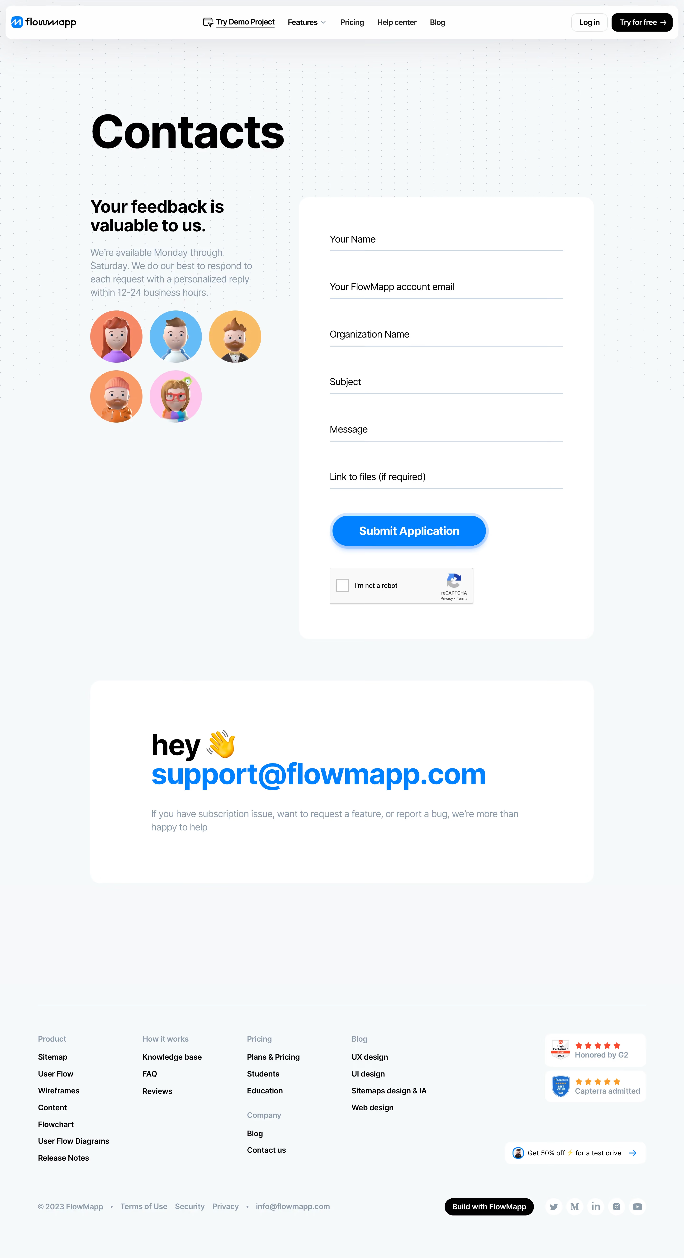
FlowMapp’s Contact Us page radiates a modern, approachable aesthetic with unmistakable playfulness. Whitespace abounds, fostering a clutter-free and welcoming environment that invites user interaction. The visual narrative feels dynamic yet professional—balancing friendliness with credibility, perfect for tech-forward SaaS audiences.
Layout and Structure
The structure is clear and intuitive: a concise hero section delivers an inviting message and context. Directly below, the main content centers a thoughtfully designed contact form, accompanied by supportive micro-copy and quick access support links. The streamlined footer anchors the page with brand consistency and essential links.
Visual Elements
Hand-drawn, whimsical illustrations animate the page, infusing character while reinforcing the brand’s creative ethos. These vector-style graphics soften the typical rigidity of SaaS forms, making the experience feel far more human. Subtle shadowing and soft shapes guide attention without overwhelming users.
Color Palette and Typography
A refreshing blue-and-white palette dominates, punctuated by gentle pastel accents and expressive iconography. Typography is equal parts readable and spirited: bold headlines pull focus, paired with clean sans-serif body text for effortless legibility and a clear content hierarchy.
User Experience Patterns
Navigation is minimal—focused, with a sticky header for quick access to main sections. CTAs are prominently colored and inviting. The form uses large input fields, clear labels, and friendly micro-copy to reduce friction. Responsive animations offer delightful feedback, enhancing engagement and signaling actions.
Unique or Notable Design Choices
Noteworthy is the blend of illustration with utility—the design encourages interaction not just through visuals, but by projecting warmth and approachability, seamlessly enhancing user trust and lowering communication barriers for visitors.