
Thank you! Your submission has been received!
Oops! Something went wrong while submitting the form.
Get SaaSFrame Pro
Monthly
$18
Quarterly
$48
Yearly
$180
Upgrade to access this feature
Browse all screens & flows
Filter and search screens & flows
Access Figma files
Access mobile versions
Bookmark screens & flows
Join now

Dub Use Cases

Dub
Open-source link management tool
Designed by
No items found.

Bookmark
Bookmark

Design with AI
Thank you! Your submission has been received!
Oops! Something went wrong while submitting the form.
# Design from Reference: Dub Use Cases
Create an original, high-fidelity visual design inspired by the reference. Prioritize composition, typography, colors, spacing, and component styling over technical implementation.
## Reference
- **Product:** Dub
- **Category:** Use Cases
- **Screenshot:** https://cdn.prod.website-files.com/5e9dc792e1210c5325f7ebbc/6acd732735351b63773b1237_7jexwkygrhtc0x9jyfvvxfhjyf3b7fgy.png
Analyze the screenshot first. If inaccessible, request it rather than guessing.
## Content
{{content.instructions}}
{{content.data}}
Preserve essential messaging and factual accuracy. Adapt structure and copy length for visual balance; never invent product claims.
## Visual Design
### Overall aesthetic
- **Style:** Minimal creator-focused SaaS solution page with a white architectural grid, restrained black typography and polished analytics illustrations.
- **Character:** Large centered headings, subtle pastel light, fine neutral borders and compact black/white actions. Product previews fade into white rather than appearing as heavy screenshots.
- **Contrast:** Most of the page stays light; a near-black pricing/conversion band near the bottom provides the strongest tonal shift.
### Page composition
- **Capture scale:** 2880 × 17054 image px. CSS estimates assume an unverified 2× capture, corresponding to approximately 1440 × 8527 CSS px.
- **Container:** Main grid is approximately 1080 CSS px wide, centered with around 180 px outer margins. Faint vertical guide lines continue across multiple sections.
- **Header:** Dub logo left, product/solutions/resources/customer/pricing navigation center, login and black signup controls right. Solutions has a pale selected background.
- **Hero:** A small Content Creators pill precedes a centered two-line headline. A tall central creator portrait is surrounded by small analytics panels; a branded-link card overlays the portrait's lower edge. Supporting copy and paired actions sit beneath.
- **Hero background:** A faint square grid and soft blue/green light occupy the lower hero area. The surrounding analytics windows fade toward their edges.
- **Trust strip:** A small centered introduction and four customer logos occupy a separate horizontal band; several logos have tiny case-study captions.
- **First feature grid:** A centered short-links heading and explanation lead to four cells in two columns. Each has a product illustration above its title, paragraph and small Learn more button.
- **First testimonial:** A centered logo, large quote, small portrait and attribution form a spacious standalone proof section.
- **Analytics section:** A centered heading and description sit above a large dashboard with tabs, metrics, line chart and two smaller data lists. Four equal-width explanatory cells form the section's lower edge.
- **Customer story:** A large creator photograph with pink lower gradient carries a white outcome headline and story link. Four logo tabs sit beneath; the first is selected as a black pill.
- **Second feature grid:** Another two-by-two grid illustrates filters, dashboard, aggregate data and customer insights. A second centered testimonial follows.
- **Pricing band:** A sculpted white-to-dark transition introduces a black grid background. Large conversion copy and rating marks sit left; a white Pro pricing card sits right.
- **Footer:** Returns to white, with logo/social links at left and multiple text columns for product, solutions, resources, company and comparisons. Status, compliance mark and copyright occupy the lower row.
### Information hierarchy
- **Hero focus:** The large headline introduces the creator use case, while the central portrait and overlaid short-link card show the connection between audience and product.
- **Feature hierarchy:** Section headings establish broad outcomes; grid-cell titles describe capabilities; paragraphs and Learn more actions remain secondary.
- **Proof hierarchy:** Logos, attributed quotes and a photographic case study interrupt feature explanations with distinct evidence formats.
- **Analytics emphasis:** The large line chart is the central product demonstration, supported by compact metrics and categorized lists.
- **Conversion hierarchy:** Start for free uses black fill; Get a demo is white and outlined. The final pricing card repeats a clear primary action before a quieter full-plans route.
- **Captured interactions:** One story tab and a yearly pricing switch are visibly selected. Other tab, hover and billing states are not shown.
### Typography
- **Family:** Neutral modern sans serif with restrained rounded forms. Exact identity is unverified.
- **Hero and section headings:** Approximately 48–50 CSS px, regular to medium weight, with 50–56 px leading and slightly tight tracking.
- **Feature titles:** Approximately 16 px semibold with 22 px leading.
- **Body text:** Approximately 18 px with 26–28 px leading for section introductions and feature descriptions; muted gray reduces emphasis.
- **Testimonials:** Approximately 24–26 px with 32 px leading, centered; selected phrases use a heavier weight rather than a different color.
- **Interface imagery:** Small labels, metrics and tabs vary by product preview. Treat them as illustrative content rather than the marketing page's primary type scale.
- **Buttons and footer:** Approximately 14 px; attribution lines and tiny case-study captions are smaller, around 12–14 px.
- **Measurement limit:** All sizes and weights are visual CSS estimates under the assumed 2× capture.
### Colors & surfaces
- **Canvas:** Sampled sRGB #FFFFFF dominates the page and pricing card.
- **Secondary surfaces:** Sampled #FAFAFA and #F5F5F5 provide subtle pale-gray reference tones for component surfaces.
- **Dark band:** Sampled #171717 forms the near-black closing pricing region.
- **Primary actions/text:** Sampled #000000 provides the strongest black reference.
- **Secondary copy:** Sampled #737373 supplies a recurring medium-gray body-text tone.
- **Borders:** Sampled #E5E5E5 is a principal light-neutral border tone.
- **Localized accents:** Charts use blue, the hero has a soft blue/green glow, the featured story has pink shading and product icons add small purple/orange/green details. These are illustration accents; exact values are not established by the dominant-color sample.
### Components
- **Hero portrait:** Approximately 320 × 400 CSS px, rounded about 12 px, with a monochrome image and blue shading near the bottom.
- **Floating product panels:** Small bordered analytics cards surround the portrait. Their low contrast and fading edges prevent them from competing with the headline.
- **Hero actions:** Compact buttons around 38–40 CSS px high, modest 7–8 px radii, black primary and white bordered secondary.
- **Feature cells:** Half-container-width rectangles separated by fine horizontal/vertical rules, with roughly 40 px padding and generous illustration space.
- **Learn more actions:** Small white outlined rectangles with subtle rounded corners and dark text.
- **Dashboard:** Large rounded bordered panel with shallow shadow, tab strip, metric cells, blue line/area chart, tooltip and two lower data-list cards.
- **Case-study card:** Broad rounded image with gradient overlay, large lower-left white text, small category pill at upper right and a quieter story link below the headline.
- **Customer tabs:** Four evenly distributed logos under the story image; the selected first logo is reversed on a black capsule.
- **Pricing card:** White rounded rectangle with compact plan name, billing toggle, large amount, description, full-width black action, feature list and outlined plans link.
- **Footer details:** Small colored product/comparison icons, social symbols, outlined operational-status badge and a subdued compliance mark.
### Visual rhythm
- **Section alternation:** Hero, logos, feature grid, quote, dashboard, case study, second grid, quote and pricing create a deliberate sequence of product explanation and proof.
- **Grid continuity:** Shared vertical guides and full-width horizontal rules unify sections despite their varied content.
- **Whitespace:** Centered headings and quotes receive broad vertical breathing room; feature cells use tighter text/action spacing.
- **Image fading:** Product illustrations often dissolve into white at their lower edges, keeping the page visually light.
- **Closing contrast:** The dark pricing band creates a clear final decision region before the quieter white footer.
### Responsive
- **Evidence limit:** Only desktop is visible; the following are recommendations.
- **Hero recommendation:** Reduce surrounding analytics panels or place them below the portrait, preserving headline and CTA readability.
- **Grid recommendation:** Stack two-column feature cells into one column with consistent padding and illustration aspect ratios.
- **Dashboard recommendation:** Use an intentionally cropped preview or readable simplified chart instead of shrinking all embedded labels.
- **Story recommendation:** Keep outcome text on a stable gradient area and allow customer tabs to wrap or scroll accessibly.
- **Pricing recommendation:** Stack conversion copy above the plan card; preserve billing context and avoid horizontal overflow.
- **Footer recommendation:** Reduce navigation columns progressively while maintaining clear link grouping.
### Adaptation guidance
- **Preserve outcome-led structure:** Introduce the audience, demonstrate real capabilities, provide genuine proof and end with a clear commercial path.
- **Use truthful content:** Replace logos, quotes, growth claims, rating marks, prices and allowances with verified target-product information.
- **Adapt product imagery:** Show relevant analytics and workflow examples instead of copying unrelated short-link controls.
- **Retain visual discipline:** Use white space, thin grid rules, neutral typography, compact actions and localized product accents.
- **Match content volume:** Omit feature cells or proof sections that lack real source material; do not stretch the page to match the reference height.
- **Accessibility recommendation:** Provide readable chart alternatives, accessible tabs and clear billing controls. Interactive behavior is not verified by the static image.
Use this context to reproduce the reference's visual language: layout, typography, colors, spacing, borders, radii, and distinctive elements. The screenshot takes priority if descriptions conflict.
## Direction
{{preferences.fidelityInstructions}}
## Output
{{output.instructions}}
Deliver a polished, cohesive design with precise alignment, hierarchy, and spacing. Produce the requested visual artifact, not just a description. If unsupported, explain the limitation.


Category
Patterns
No items found.


Added on
October 13, 2026
Similar screens



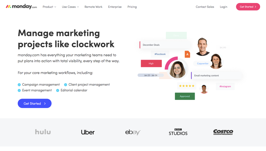



Upgrade to SaaSFrame Pro now to see similar examples.
Monthly
$18 /month
Billed $18 monthly
Browse all screens & flows
Filter and search screens & flows
Search text in screenshots
Access Figma files
Access mobile versions
Join now
Quarterly
$16 /month
Billed $48 quarterly
Browse all screens & flows
Filter and search screens & flows
Search text in screenshots
Access Figma files
Access mobile versions
Join now
Yearly
$15 /month
Billed $180 yearly
Browse all screens & flows
Filter and search screens & flows
Search text in screenshots
Access Figma files
Access mobile versions
Join now