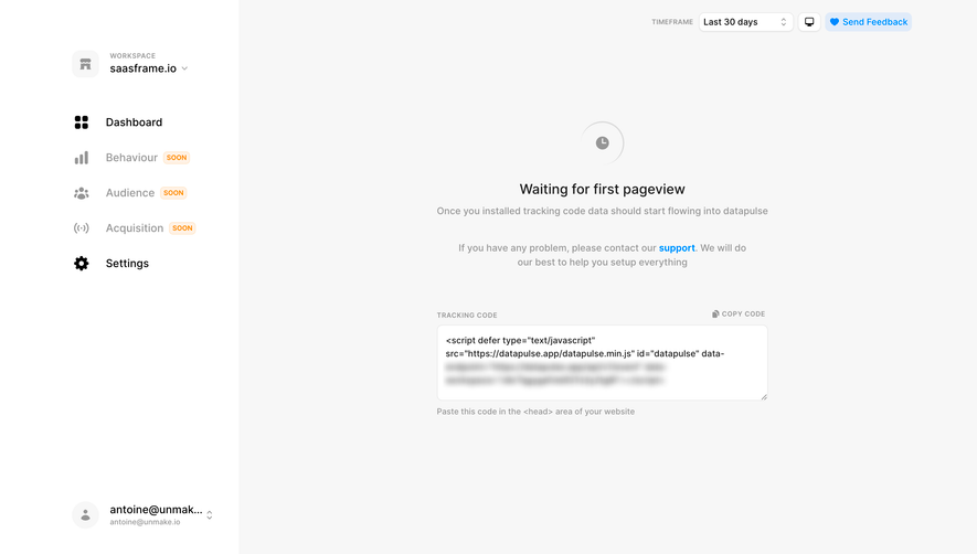
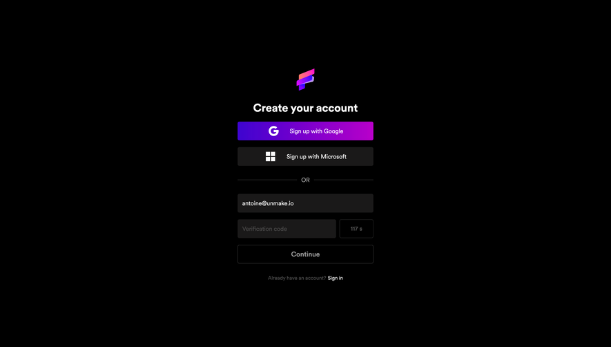
Design with AI
Generate a new design based on this screen using your own content.
# Design from Reference: DataPulse Signup
Create an original, high-fidelity visual design inspired by the reference. Prioritize composition, typography, colors, spacing, and component styling over technical implementation.
## Reference
- **Product:** DataPulse
- **Category:** Signup
- **Screenshot:** https://cdn.prod.website-files.com/5e9dc792e1210c5325f7ebbc/6acb61b7c08cd859ff851b69_6acadc7d5f2661b166587787_cms-2fa99084b1f850a8d3562bc7.webp
Analyze the screenshot first. If inaccessible, request it rather than guessing.
## Content
{{content.instructions}}
{{content.data}}
Preserve essential messaging and factual accuracy. Adapt structure and copy length for visual balance; never invent product claims.
## Visual Design
### Overall aesthetic
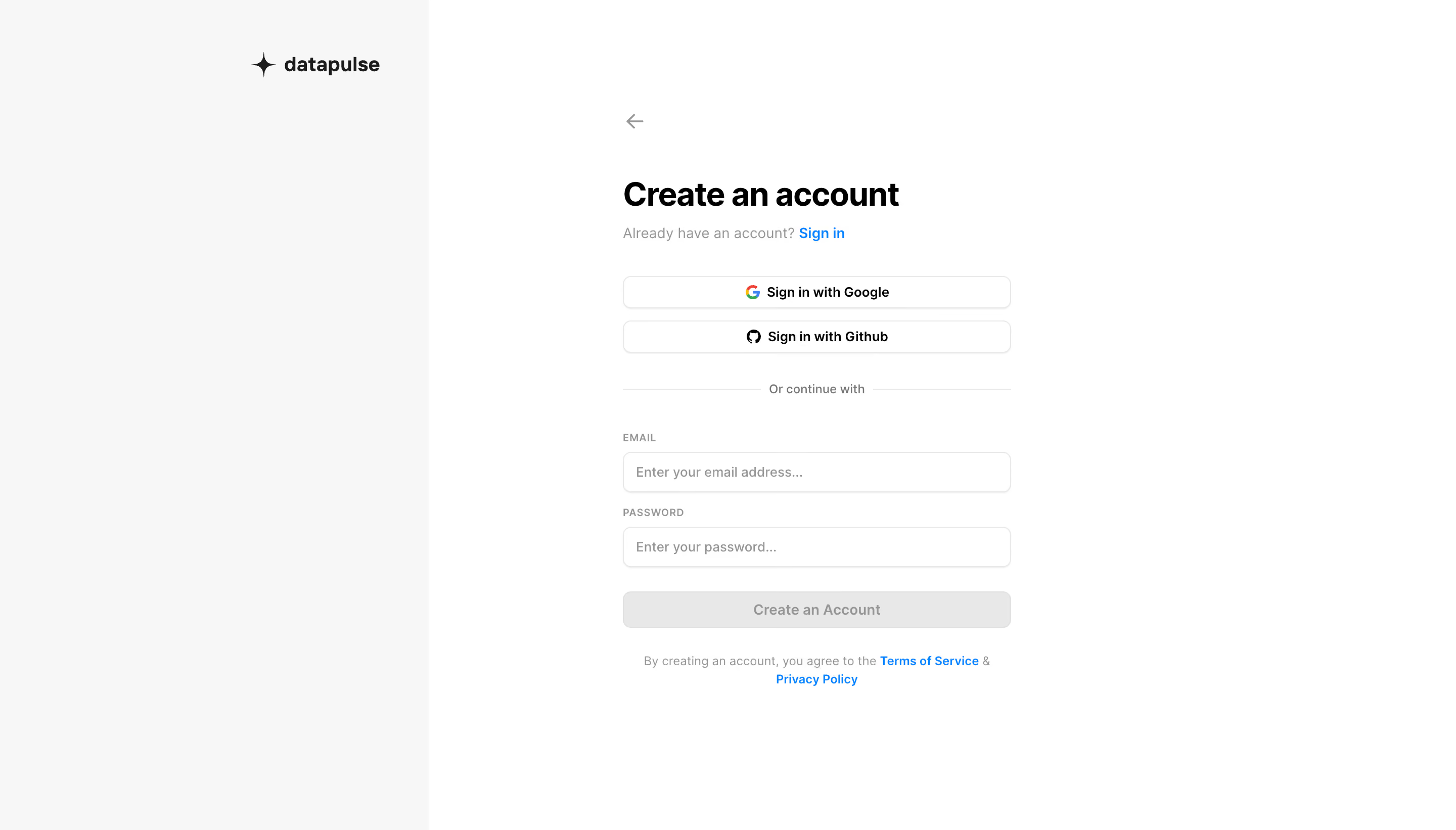
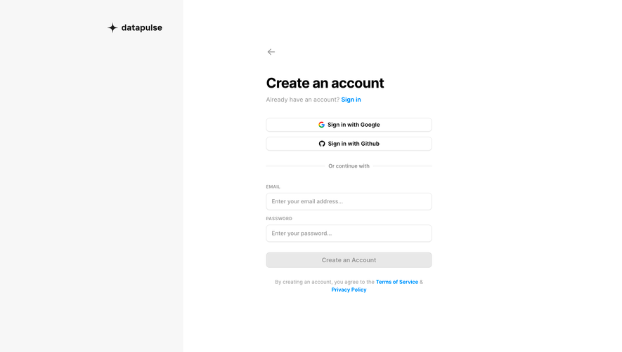
- **Character:** A minimal account-creation screen with a pale brand rail and a narrow monochrome form.
- **Evidence scale:** Original 2880 × 1642 pixels; CSS estimates assume an unverified 2× capture scale.
### Page composition
- **Rail:** Approximately 424 px pale-gray left region with small Datapulse wordmark near the upper right of that region.
- **Form:** Roughly 384 px column in the white remaining area, beginning with a back arrow and account heading.
- **Order:** Sign-in prompt, Google/GitHub buttons, divider, email/password inputs, creation action and legal text.
### Information hierarchy
- **Heading:** Bold Create an account leads.
- **Authentication paths:** Provider actions precede email/password fields.
- **State:** Creation button is gray and visually low-emphasis with empty inputs; functional disabled state is unverified.
- **Secondary:** Blue sign-in and policy links are quieter than the form heading.
### Typography
- **Heading:** Unverified sans-serif around 32 px bold, 40 px line height.
- **Body/buttons:** Approximately 14 px regular/medium.
- **Labels:** Small approximately 10–11 px uppercase with modest tracking.
- **Legal:** Around 12 px centered, 18 px line height.
### Colors & surfaces
- **Canvas:** White #FFFFFF and pale rail #F7F7F7.
- **Structure:** Light #E8E8E8 borders and gray action fill.
- **Text:** Black #000000 and muted #969696.
- **Accent:** Bright blue links; provider marks retain brand colors.
### Components
- **Provider buttons:** Approximately 384 × 32 px white outlined rounded rectangles.
- **Fields:** Approximately 384 × 40 px, thin gray border, 8 px radius and subtle lower shadow.
- **Divider:** Thin horizontal rules around a small centered label.
- **Creation action:** Full-width roughly 36 px rounded gray button.
- **Back:** Small gray unboxed arrow.
### Visual rhythm
- **Spacing:** Roughly 32 px between authentication groups; 16 px between provider buttons.
- **Alignment:** All form controls share edges; legal text is centered below.
- **Whitespace:** Broad margins keep the screen calm.
### Responsive
- **Observed limit:** Desktop only.
- **Recommendation:** Remove or reduce the brand rail and keep a fluid form with mobile gutters.
- **Readability:** Preserve control height and natural legal-text wrapping.
### Adaptation guidance
- **Retain:** Clear choice between provider and email signup.
- **Implement:** Neutral fields with restrained blue links and explicit labels.
- **Verify:** Confirm fonts, scale and validation behavior separately; no account was created.
Use this context to reproduce the reference's visual language: layout, typography, colors, spacing, borders, radii, and distinctive elements. The screenshot takes priority if descriptions conflict.
## Direction
{{preferences.fidelityInstructions}}
## Output
{{output.instructions}}
Deliver a polished, cohesive design with precise alignment, hierarchy, and spacing. Produce the requested visual artifact, not just a description. If unsupported, explain the limitation.