Generate a new design based on this screen using your own content.
Thank you! Your submission has been received!
Oops! Something went wrong while submitting the form.
# Design from Reference: Copperx Integrations Page
Create an original, high-fidelity visual design inspired by the reference. Prioritize composition, typography, colors, spacing, and component styling over technical implementation.
## Reference
- **Product:** Copperx
- **Category:** Integrations Page
- **Screenshot:** https://cdn.prod.website-files.com/5e9dc792e1210c5325f7ebbc/6acad84eb3daa04f542763af_6acad7d111963fdadfb72657_cms-d6ab5663232d994fe537923e.webp
Analyze the screenshot first. If inaccessible, request it rather than guessing.
## Content
{{content.instructions}}
{{content.data}}
Preserve essential messaging and factual accuracy. Adapt structure and copy length for visual balance; never invent product claims.
## Visual Design
Use this context to reproduce the reference's visual language: layout, typography, colors, spacing, borders, radii, and distinctive elements. The screenshot takes priority if descriptions conflict.
## Direction
{{preferences.fidelityInstructions}}
## Output
{{output.instructions}}
Deliver a polished, cohesive design with precise alignment, hierarchy, and spacing. Produce the requested visual artifact, not just a description. If unsupported, explain the limitation.
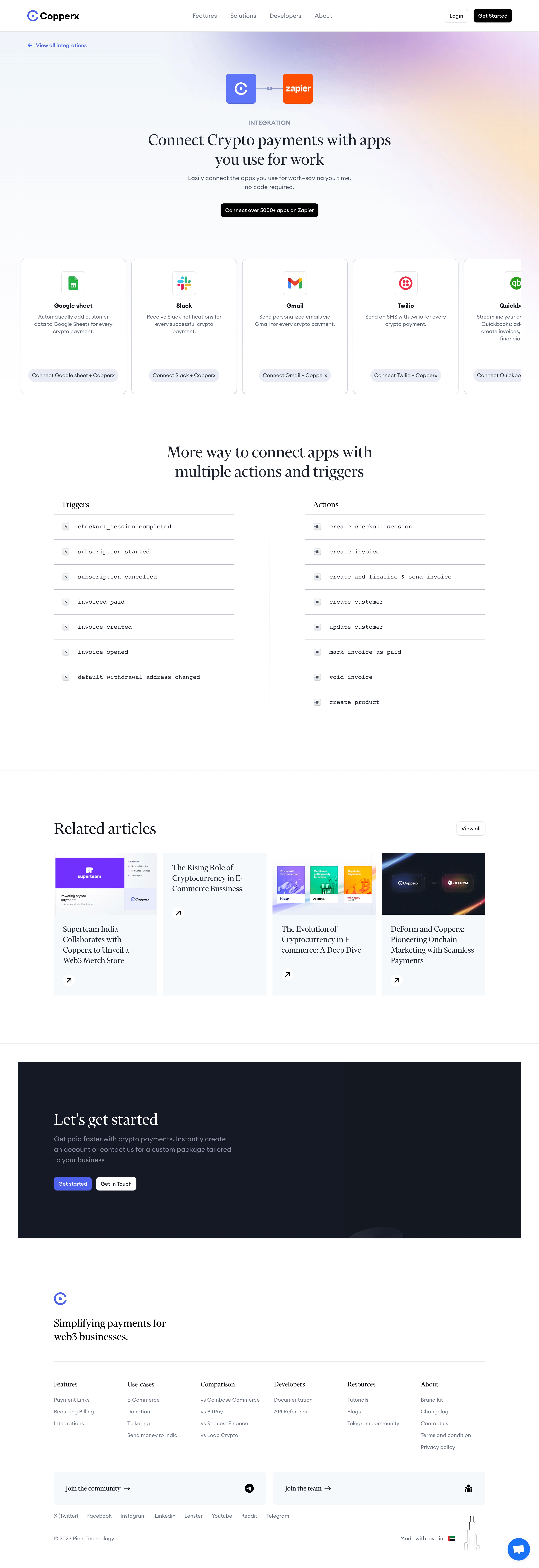
Copperx’s Zapier integration page exudes a distinctly modern and minimalist vibe, blending professionalism with just a pinch of playful energy. The interface is uncluttered, using generous white space to let key elements breathe, and the polished look is accentuated by rounded UI elements and crisp, clean lines throughout.
Layout and Structure
The page follows a classic single-column SaaS layout. A prominent hero section upfront immediately spotlights the Copperx-Zapier connection, complete with a concise headline and a bold CTA. Below, a features overview elegantly walks users through use cases and automation possibilities, using card-based content blocks for clarity. The layout prioritizes scannability, making it effortless to digest information at a glance.
Visual Elements
Subtle yet effective illustrations serve as visual anchors without overwhelming the content. Custom icons illustrate integration workflows, while hover effects add a dynamic touch. The supporting visuals—especially the Zapier and Copperx logos—strengthen trust and brand association.
Color Palette and Typography
A fresh, trustworthy palette mixes vibrant blues with flashes of copper-orange and cool grays. The font selection balances modern sans-serif for headings and body text, creating sharp hierarchy with bold weights for headlines and regular weights for copy. Strategic color accents draw the eye to CTAs and important links.
User Experience Patterns
Navigation is frictionless, with a sticky header and clearly marked calls to action guiding users towards signup or further exploration. Micro-interactions, such as smooth hover states and button animations, enhance engagement without distraction.
Unique or Notable Design Choices
The integration hero section pairs a short explainer video with contextual CTAs, allowing users to choose between learning more and getting started. The overall tone radiates innovation and reliability, making it as inviting as it is authoritative for SaaS enthusiasts seeking design inspiration.