Overall Style and Aesthetic
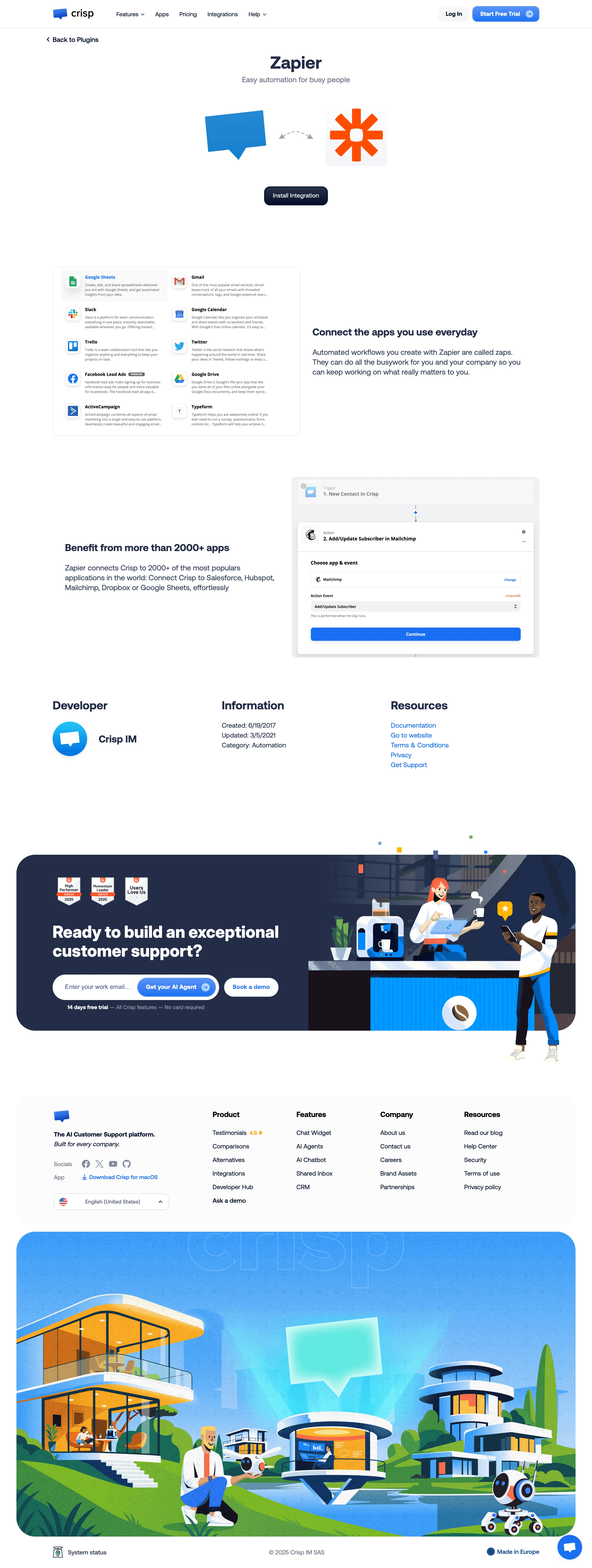
The Crisp + Zapier integration page adopts a fresh, approachable, and distinctly modern SaaS style. Its aesthetic is clean and minimalist, using ample white space to frame essential content and create a sense of clarity. The tone balances professionalism with a hint of playfulness, making the page inviting without undermining credibility—ideal for B2B users. Layout and Structure
The layout unfolds logically, beginning with a prominent hero section that instantly communicates the product’s value proposition through bold text and visual cues. Feature highlights are presented in digestible sections, using iconography and short descriptions to guide scanning eyes. The page maintains a concise focus—eschewing lengthy testimonials or pricing in favor of targeted, benefit-driven information. The sticky navigation bar keeps key actions within reach as users scroll. Visual Elements
Illustrations dominate the visual language, adding character and vibrancy. The integration with Zapier is spotlighted through playful, branded icons and animated graphics that convey workflow automation. Subtle movement draws attention to CTAs without overwhelming the user. There’s no heavy reliance on photography, instead leveraging bespoke vector art for an on-brand experience. Color Palette and Typography
A crisp palette of blue and white, accented with vivid brights (such as Zapier’s signature orange), provides both harmony and strategic contrast. Typography embraces a geometric, easy-to-read sans-serif, establishing clear hierarchy: bold headlines, friendly sub-headlines, and readable body copy ensure immediate comprehension. User Experience Patterns
Navigation is streamlined with a persistent call-to-action and helpful in-context links. Interactive elements—like buttons and hover states—are prominent, intuitive, and visually distinguished. Conversion is a top priority, emphasized through repeated, well-placed “Connect” CTAs. Unique or Notable Design Choices
Notably, the use of custom illustrations contextualizes integration scenarios, setting this page apart from generic template-based designs. The page’s economy of words, coupled with delightful micro-animations, creates both clarity and engagement—perfect inspiration for SaaS teams seeking a seamless, conversion-focused showcase.