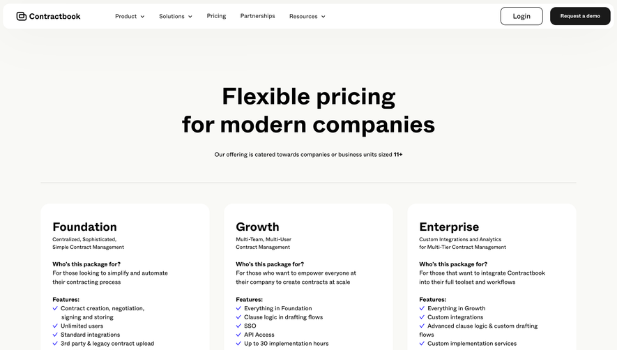
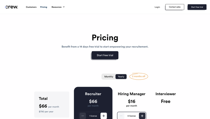
1. The page begins with a header section, which includes the logo of Confetti and the navigation menu. 2. The first section on the page is the Hero section, which has a catchy headline, subheading, and a CTA button that encourages the user to sign up for a free trial. 3. Next, there is a section that highlights the benefits of using Confetti – this includes a paragraph of introductory text and three separate columns that detail the main features of the platform. 4. Following this, there is a section specific to pricing information. There are three main pricing plans available, and each plan is presented with an accompanying image and a brief overview of what is included. 5. Below the pricing table is a customer feedback section, which displays quotes from several satisfied customers. This section includes images of these customers as well. 6. The next section is a FAQ section, which answers several frequently asked questions about Confetti. 7. Finally, there is a CTA banner at the bottom of the page that encourages the user to sign up for a free trial. This banner floats at the bottom of the page as the user scrolls, ensuring that it is always visible.


Confetti Pricing Page

Confetti
Celebrate positive daily habits
Designed by
No items found.
Category
Patterns
No items found.
Tech Stack
Added on
May 9, 2020