Generate a new design based on this screen using your own content.
Thank you! Your submission has been received!
Oops! Something went wrong while submitting the form.
# Design from Reference: Crew Pricing Page
Create an original, high-fidelity visual design inspired by the reference. Prioritize composition, typography, colors, spacing, and component styling over technical implementation.
## Reference
- **Product:** Crew
- **Category:** Pricing Page
- **Screenshot:** https://cdn.prod.website-files.com/5e9dc792e1210c5325f7ebbc/6acbbda2d6be908889c4e625_6acbbcd007a85b98c47c9b2d_cms-550341ac4527e080dd33badd.webp
Analyze the screenshot first. If inaccessible, request it rather than guessing.
## Content
{{content.instructions}}
{{content.data}}
Preserve essential messaging and factual accuracy. Adapt structure and copy length for visual balance; never invent product claims.
## Visual Design
Use this context to reproduce the reference's visual language: layout, typography, colors, spacing, borders, radii, and distinctive elements. The screenshot takes priority if descriptions conflict.
## Direction
{{preferences.fidelityInstructions}}
## Output
{{output.instructions}}
Deliver a polished, cohesive design with precise alignment, hierarchy, and spacing. Produce the requested visual artifact, not just a description. If unsupported, explain the limitation.
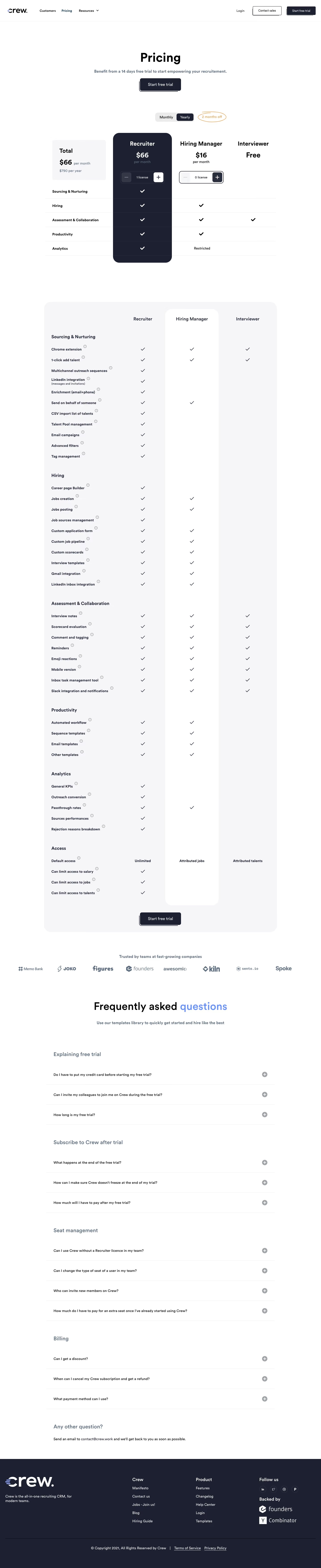
Crew’s pricing page is a masterclass in contemporary minimalism, exuding a sleek, tech-forward energy. The layout is crisp and uncluttered, balancing ample white space with smart splashes of bright color—most notably a vibrant teal that signals interactivity and draws the eye.
Layout & Structure
A focused hero section headlines the page, keeping navigation at the top simple and always visible. The pricing tier cards dominate the center, arranged for easy scanning and comparison, while concise benefit callouts and microcopy support decision-making. Minimal distractions ensure attention remains on conversion. The footer is understated but informative, offering quick navigational links and support access.
Visual Elements
Custom illustrations and expressive icons convey Crew’s modern personality while keeping the experience welcoming. Iconography is bold and playful, reinforcing feature highlights. Engaging hover effects and interactive toggles (like the monthly/annual switcher) add tactile delight without overwhelming users. Animations are restrained, focusing on smooth transitions that maintain a premium feel.
Color Palette & Typography
A clean white background pairs with prominent teal accents and supportive grays, ensuring content clarity and accentuating calls to action. Typography is sharp and tech-inspired, using a hierarchy of bold headlines, friendly body texts, and differentiated pricing figures for effortless scannability.
User Experience Patterns
Transparent CTAs (“Get started for free”) sit above the fold and atop each plan, maintaining user momentum. Responsive layouts and sticky navigation cater to both desktop and mobile experiences, while plan comparison elements use clear checkmarks and subtle divisions for clarity.
Unique Design Choices & Tone
Crew balances approachability and professionalism through its energetic palette, expressive icons, and frictionless sign-up cues. The transparent, distraction-free pricing focus projects trustworthiness, while the site’s consistent visual theme creates a sense of innovation and reliability—an ideal SaaS design to inspire clarity and confidence.