Design with AI
Generate a new design based on this screen using your own content.
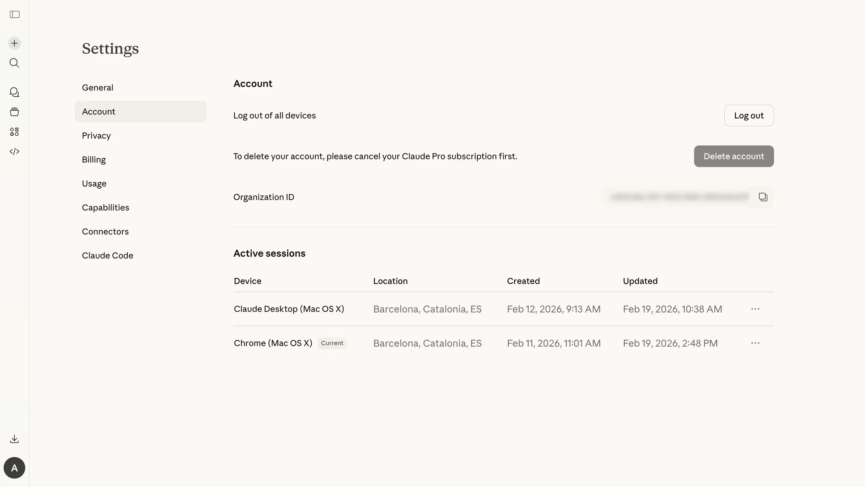
# Design from Reference: Claude Account Settings
Create an original, high-fidelity visual design inspired by the reference. Prioritize composition, typography, colors, spacing, and component styling over technical implementation.
## Reference
- **Product:** Claude
- **Category:** Settings
- **Screenshot:** https://cdn.prod.website-files.com/5e9dc792e1210c5325f7ebbc/69971c1ef325d56cf155bfd6_JOcZbV_PtEZDsv9AF0tCU-3soaCDV_BKpLJbe92V8JQ.avif
Analyze the screenshot first. If inaccessible, request it rather than guessing.
## Content
{{content.instructions}}
{{content.data}}
Preserve essential messaging and factual accuracy. Adapt structure and copy length for visual balance; never invent product claims.
## Visual Design
### Overall aesthetic
- **Character:** A quiet account-settings page uses a warm off-white canvas, sparse controls, a serif settings title, and a flat session table.
- **Evidence:** Source dimensions are 2880 × 1624 px, inspected at 1400 px width. Dimensions below estimate a 1440 px CSS layout at 2× capture; ratio is unverified.
### Page composition
- **Global rail:** A narrow icon-only strip occupies the far left with utilities above and avatar below.
- **Settings navigation:** A secondary column lists settings categories beneath the page title, with Account selected.
- **Main area:** Account actions occupy the upper region, followed by an organization identifier row and a divider.
- **Sessions:** A four-column active-session table contains two rows and trailing overflow menus.
- **Whitespace:** Most of the lower screen remains empty, with no enclosing card surfaces.
### Information hierarchy
- **Location:** A serif Settings title and pale selected Account row establish context.
- **Actions:** Logout, an explanatory deletion restriction, and a gray deletion button form distinct horizontal rows.
- **Identifier:** A labeled organization ID is blurred in the capture, with a copy icon at right.
- **Sessions:** Bold section heading precedes Device, Location, Created, and Updated columns. One device has a small Current badge.
### Typography
- **Families:** Serif title contrasts with neutral sans-serif interface copy. Exact identities are unverified.
- **Title:** Approximately 27–28 CSS px, regular serif.
- **Section labels:** Around 16 px semibold.
- **Body/navigation:** Approximately 14–15 px with 22 px leading.
- **Table metadata:** Muted text around 16 px; the Current badge is approximately 10–11 px.
### Colors & surfaces
- **Measured palette:** Source samples include warm #FAF9F5, #F9F8F3, selected neutral #F0EEE6, #F9F8F4, #FAF9F4, and gray #878684.
- **Semantic use:** Warm off-white grounds the page; a slightly darker neutral marks selected navigation.
- **Text:** Dark charcoal identifies main labels; gray supports table metadata and the deletion control.
- **Rules:** Fine warm-gray lines separate identifier and session rows.
### Components
- **Selected navigation:** A broad pale rounded rectangle with compact text.
- **Logout:** Small outlined button around 82 × 36 CSS px with 9 px radii.
- **Delete:** Gray filled rectangle around 132 × 36 px with white label; it appears disabled or restricted by adjacent explanatory copy.
- **Identifier row:** Blurred value area and small copy icon; the actual identifier is not readable.
- **Session table:** Flat rows about 57 px high with horizontal rules, no vertical grid lines, and trailing ellipsis controls.
- **Current badge:** Tiny pale rounded label beside the active device name.
### Visual rhythm
- **Columns:** Secondary navigation is roughly 220 px wide; main content begins around x390 CSS px.
- **Action spacing:** Broad vertical gaps separate account operations and identifier.
- **Table alignment:** Column headings and values share stable vertical axes.
- **Restraint:** Large empty margins and minimal borders maintain a calm settings experience.
### Responsive
- **Observed limit:** Only desktop is shown; mobile/table behavior is unverified.
- **Recommended navigation:** Collapse or stack settings navigation on narrow screens.
- **Recommended sessions:** Convert rows to labeled blocks or accessible horizontal scrolling without losing dates/device context.
- **Recommended actions:** Allow explanatory text and controls to stack while retaining clear associations.
### Adaptation guidance
- **Preserve:** Keep the flat warm-neutral style, explicit account-action explanations, and structured session information.
- **Implement:** Use accessible button names, table headers, copy feedback, and overflow menus.
- **Privacy:** Use suitable example session data and identifiers rather than copying personal details.
- **Validate:** Confirm fonts, CSS scale, restricted-action behavior, keyboard access, and long date wrapping. No logout, deletion, or session-menu result is shown.
Use this context to reproduce the reference's visual language: layout, typography, colors, spacing, borders, radii, and distinctive elements. The screenshot takes priority if descriptions conflict.
## Direction
{{preferences.fidelityInstructions}}
## Output
{{output.instructions}}
Deliver a polished, cohesive design with precise alignment, hierarchy, and spacing. Produce the requested visual artifact, not just a description. If unsupported, explain the limitation.