Generate a new design based on this screen using your own content.
Thank you! Your submission has been received!
Oops! Something went wrong while submitting the form.
# Design from Reference: Checkout.com Strategy Builder
Create an original, high-fidelity visual design inspired by the reference. Prioritize composition, typography, colors, spacing, and component styling over technical implementation.
## Reference
- **Product:** Checkout.com
- **Category:** Flowchart
- **Screenshot:** https://cdn.prod.website-files.com/5e9dc792e1210c5325f7ebbc/6acad4c51025e911ae51849e_6acad3dc5a5fdf4c30309ccc_cms-b135040307faab5f2ad4e0e5.webp
Analyze the screenshot first. If inaccessible, request it rather than guessing.
## Content
{{content.instructions}}
{{content.data}}
Preserve essential messaging and factual accuracy. Adapt structure and copy length for visual balance; never invent product claims.
## Visual Design
Use this context to reproduce the reference's visual language: layout, typography, colors, spacing, borders, radii, and distinctive elements. The screenshot takes priority if descriptions conflict.
## Direction
{{preferences.fidelityInstructions}}
## Output
{{output.instructions}}
Deliver a polished, cohesive design with precise alignment, hierarchy, and spacing. Produce the requested visual artifact, not just a description. If unsupported, explain the limitation.
A fraud detection strategy builder that actually feels approachable
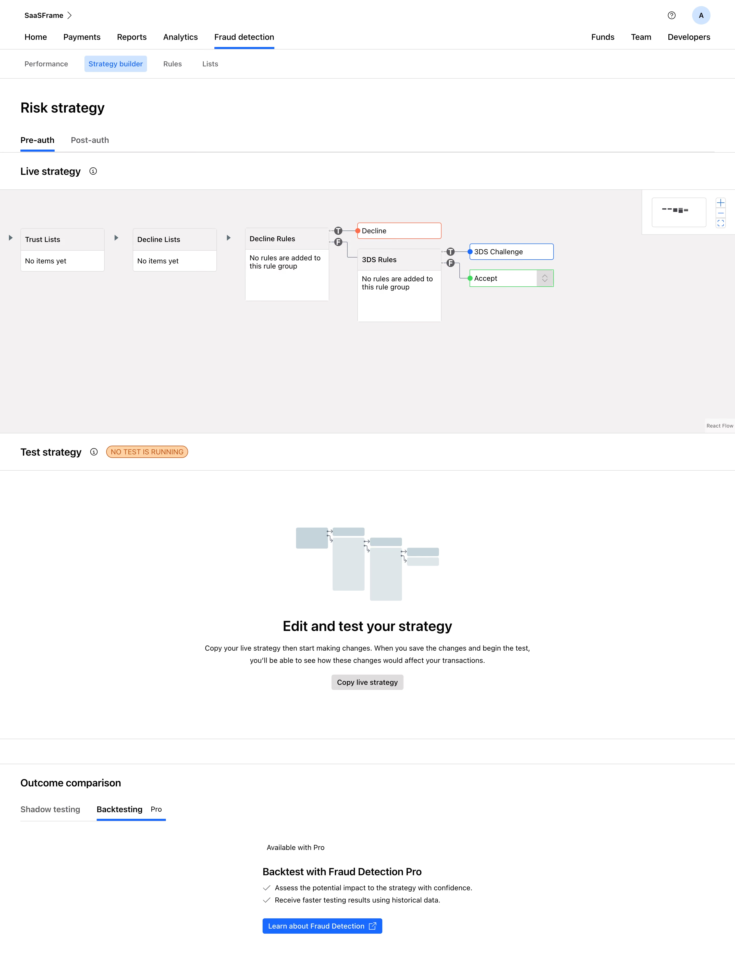
The flow diagram in the center is what grabs you first. It maps out the risk logic visually, from Trust Lists through Decline Rules to 3DS Rules, ending in clear outcomes like Decline, 3DS Challenge, and Accept. The node-based layout with true/false branching (those little orange T and F badges) makes complex decision trees digestible at a glance.
Smart use of progressive disclosure
The page stacks three distinct sections vertically: live strategy, test strategy, and outcome comparison. Each one has a clear purpose and doesn't crowd the others. The "No items yet" and "No rules are added" empty states are honest without being annoying. That "Copy live strategy" CTA sits in a calm illustration section that breaks up the density well.
Restrained color palette doing heavy lifting
Almost everything is neutral gray and white. Orange only appears on the strategy builder tab and flow connectors. Blue marks the 3DS Challenge node. Green signals Accept. Typography is clean and hierarchical. The Pro badge on the Backtesting tab is a subtle upsell nudge that doesn't feel pushy. Solid enterprise UI work.