Generate a new design based on this screen using your own content.
Thank you! Your submission has been received!
Oops! Something went wrong while submitting the form.
# Design from Reference: Channeled Landing Page
Create an original, high-fidelity visual design inspired by the reference. Prioritize composition, typography, colors, spacing, and component styling over technical implementation.
## Reference
- **Product:** Channeled
- **Category:** Landing Page
- **Screenshot:** https://cdn.prod.website-files.com/5e9dc792e1210c5325f7ebbc/6acb6c175391d62536b6723e_6acb6aa4bf2e69a0c03b5873_cms-3991973e914de2fa411a15b0.webp
Analyze the screenshot first. If inaccessible, request it rather than guessing.
## Content
{{content.instructions}}
{{content.data}}
Preserve essential messaging and factual accuracy. Adapt structure and copy length for visual balance; never invent product claims.
## Visual Design
Use this context to reproduce the reference's visual language: layout, typography, colors, spacing, borders, radii, and distinctive elements. The screenshot takes priority if descriptions conflict.
## Direction
{{preferences.fidelityInstructions}}
## Output
{{output.instructions}}
Deliver a polished, cohesive design with precise alignment, hierarchy, and spacing. Produce the requested visual artifact, not just a description. If unsupported, explain the limitation.
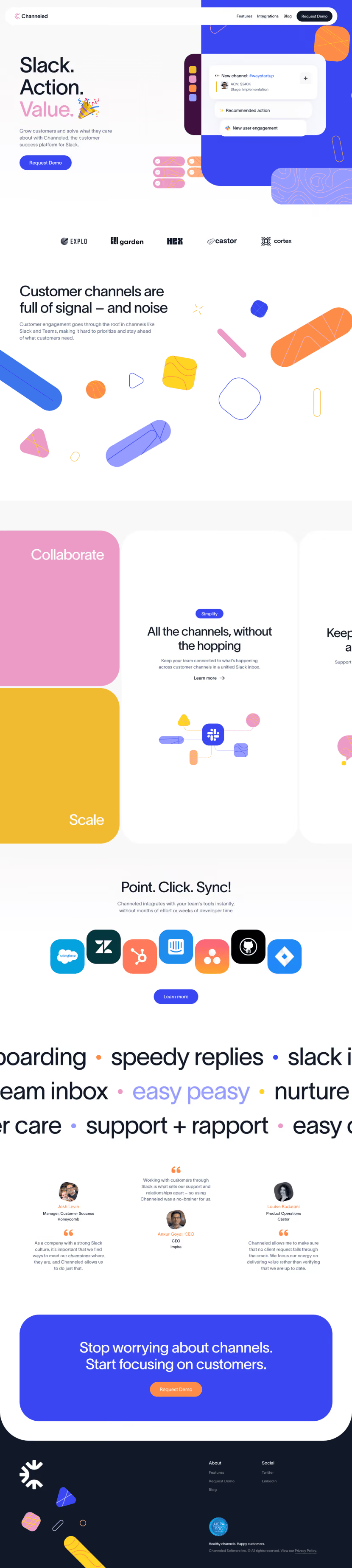
With Channeled embodies a crisp, modern aesthetic, masterfully balancing a minimalist sensibility with energetic accents. The interface emphasizes clarity and space, resulting in a polished, professional look that feels approachable yet sophisticated. Motion is subtle but effective, lending a sense of dynamism without overwhelming the user.
Layout and Structure
The layout is structured around a commanding hero section that immediately communicates value, followed by a clearly segmented features area with succinct copy and visual hierarchy. Social proof is anchored with authentic testimonials, and the straightforward pricing section guides prospects smoothly toward conversion. Logical flow and ample white space make the journey intuitive, capped by a comprehensive footer with essential links and contact options.
Visual Elements
Illustrations are playful yet clean, blending organic and geometric forms that echo the platform’s innovative spirit. Icons are distinct and cohesive, enhancing scannability. Thoughtful use of micro-animations and gentle transitions energize the browsing experience, adding polish and engagement. No excessive stock photography, focusing instead on bespoke visuals that reinforce the brand identity.
Color Palette and Typography
A balanced palette of deep blues and lively emeralds grounds the page, punctuated by gradients and deliberate pops of color that draw attention to interactive elements. Typography combines a bold sans-serif headline font with a refined, legible body typeface, establishing clear hierarchy while remaining inviting and easy to parse.
User Experience Patterns and Unique Choices
Navigation is frictionless via a sticky navbar and prominent, contrasting CTAs that guide users at each stage. Section transitions feel fluid, and call-to-action buttons are bold and actionable. Notably, the design leverages subtle layering and depth, with interactive elements that respond to hover and scroll, creating a tactile, memorable exploration. The overall tone is innovative and trustworthy—perfect for inspiring forward-thinking SaaS design.