###
Overall Style and Aesthetic
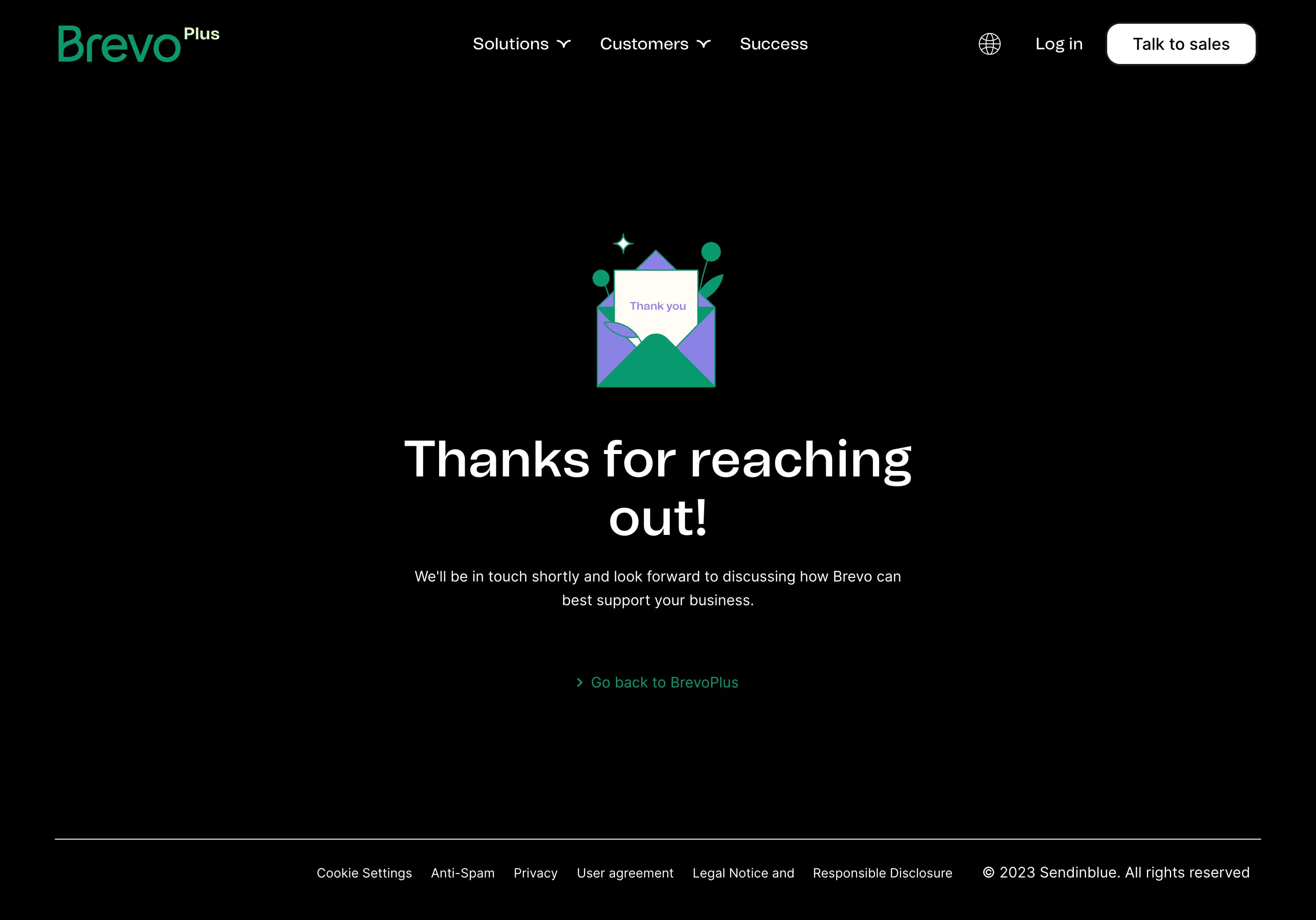
Brevo’s enterprise thank-you page embodies a crisp, modern minimalism paired with an inviting, professional tone. The aesthetic steers clear of visual clutter, using generous white space to foster focus and calm, while subtle accents add approachability. The look is clean yet warm, signaling reliability and a premium digital experience without feeling sterile or cold. ### Layout and Structure
The structure is straightforward and user-centric, centered around a single, content-rich hero section. The “Thank You” message is immediately visible, paired with concise next steps and supportive content, ensuring users aren’t left wondering. There’s a seamless continuation into a strong, monochrome footer offering essential navigation links, reinforcing the sense of closure and guidance without overwhelming the user. ### Visual Elements
Illustrations take center stage—playful yet grown-up graphics deliver personality while maintaining professionalism. Soft, rounded shapes and expressive characters evoke friendliness and approachability. Sparse icons reinforce clarity, and discrete animations (e.g., subtle movement or fade effects) may add a layer of interactivity, keeping the page visually engaging even though it’s a transactional moment. ### Color Palette and Typography
The palette leans on tranquil blues and friendly greens, occasionally warmed by orange or yellow accents. These colors project trust and positivity, with CTA buttons popping subtly from the largely neutral background. Typography features a modern sans-serif, hierarchically layered: bold headers for clarity, generous line spacing for legibility, and lighter body text for ease of scanning. ### User Experience Patterns
Navigation remains accessible via the sticky header and robust footer, while CTAs are clear and action-oriented (“Back to Homepage,” further resources, etc.). The page is distinctly single-focus but allows users to transition smoothly to explore more, ensuring the thank-you isn’t a dead-end. Interactions are intentionally minimal—streamlined for a decisive, reassuring finish. ### Unique or Notable Design Choices
Brevo’s thank-you page stands out for its positive momentum: it not only closes the loop on the contact process but also subtly guides users toward continued engagement. The combination of soft illustrations with premium aesthetic cues provides both friendliness and credibility—demonstrating how even a simple transactional page can reinforce brand personality while delivering an elevated, satisfying SaaS experience.