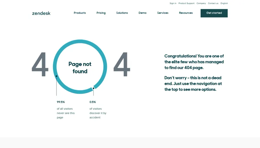
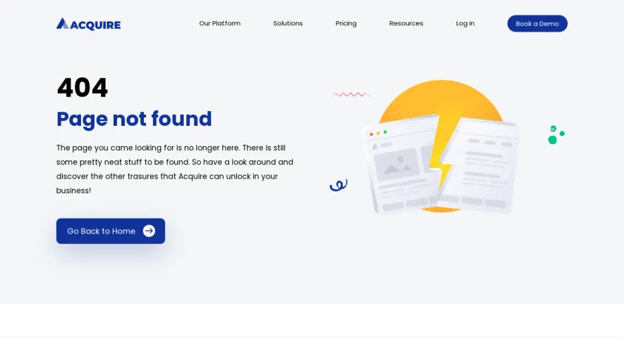
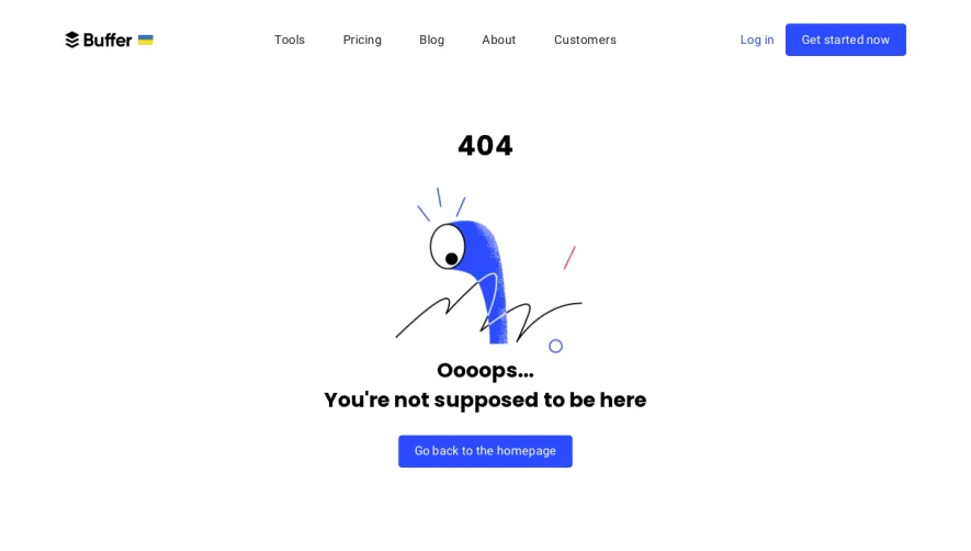
Generate a new design based on this screen using your own content.
Thank you! Your submission has been received!
Oops! Something went wrong while submitting the form.
# Design from Reference: Artboard Studio 404 Page
Create an original, high-fidelity visual design inspired by the reference. Prioritize composition, typography, colors, spacing, and component styling over technical implementation.
## Reference
- **Product:** Artboard Studio
- **Category:** 404 Page
- **Screenshot:** https://cdn.prod.website-files.com/5e9dc792e1210c5325f7ebbc/6acb67f9c08cd859ff869380_6acb66da5391d62536b5a6d9_cms-cc6c137a4178da2e6ed05a25.webp
Analyze the screenshot first. If inaccessible, request it rather than guessing.
## Content
{{content.instructions}}
{{content.data}}
Preserve essential messaging and factual accuracy. Adapt structure and copy length for visual balance; never invent product claims.
## Visual Design
Use this context to reproduce the reference's visual language: layout, typography, colors, spacing, borders, radii, and distinctive elements. The screenshot takes priority if descriptions conflict.
## Direction
{{preferences.fidelityInstructions}}
## Output
{{output.instructions}}
Deliver a polished, cohesive design with precise alignment, hierarchy, and spacing. Produce the requested visual artifact, not just a description. If unsupported, explain the limitation.
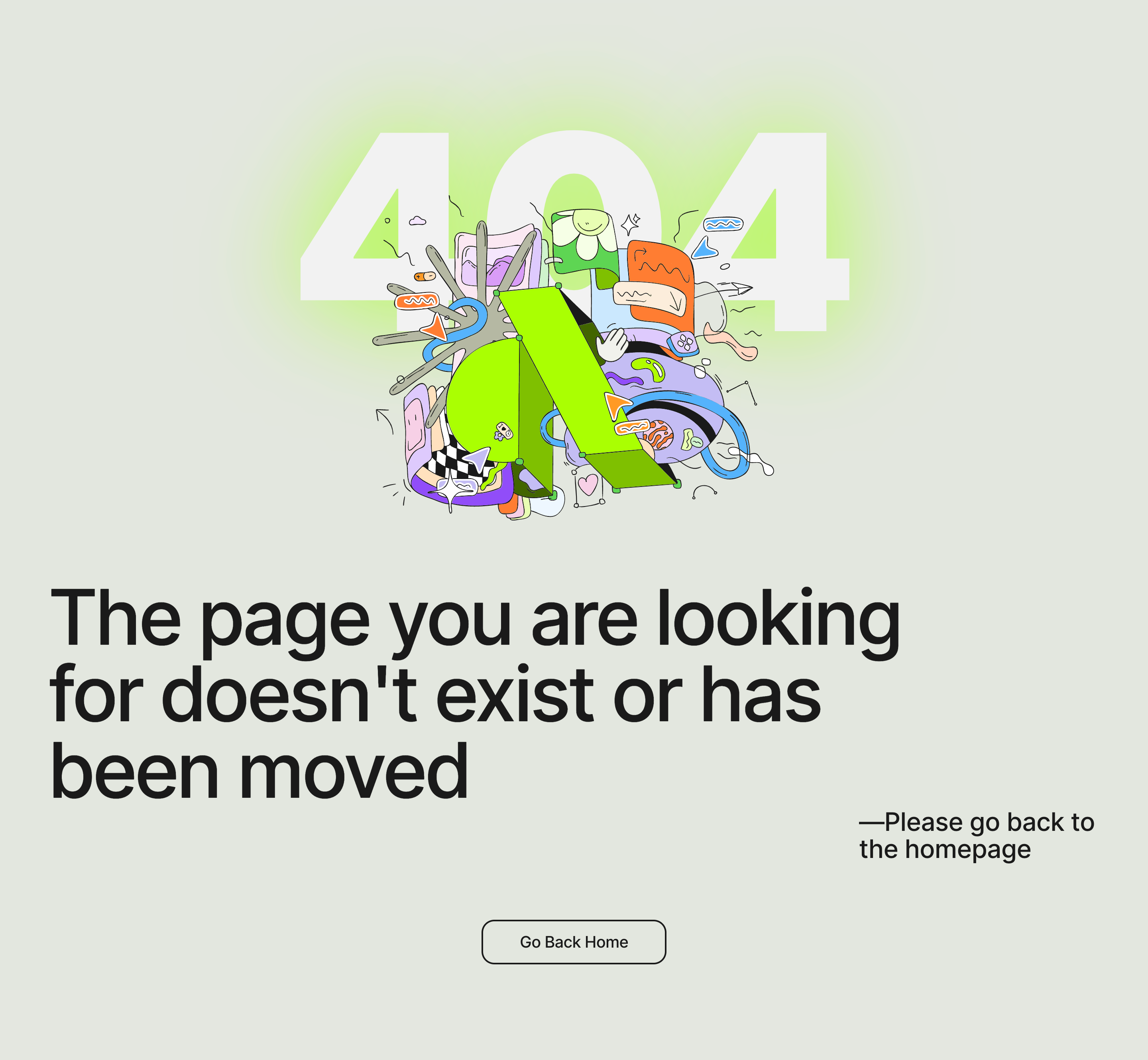
Artboard Studio’s 404 page takes a playful and modern approach, immediately capturing attention with its bold, imaginative error illustration. The minimalist yet expressive layout feels innovative and polished, using humor and visual storytelling to turn a frustrating error page into a delightful user experience.
Layout and Structure
The page centers all content on a soft, neutral canvas, leading with a large, animated hero illustration depicting a whimsical 3D scene that references the brand’s design focus. Above and below, concise messaging keeps users oriented, while a clear call-to-action button guides visitors back to the homepage. There’s no clutter—just a focused arrangement that prioritizes clarity and engagement.
Visual Elements
Striking 3D-style vector artwork with lively animation steals the show, showcasing brand personality and creativity. The character design and floating objects deliver both playfulness and professionalism, while small microinteractions (such as hovering the CTA) add a dynamic layer to the experience.
Color Palette and Typography
A clean, lightly off-white background sets the stage for bright primary accent colors—vivid blue, cheerful yellow, and coral red—making the illustration pop. Typography uses a modern, geometric sans-serif for both headline and supporting text, employing distinct size hierarchy and generous spacing for readability.
User Experience Patterns and Unique Choices
Navigation is focused but intuitive, with a single prominent return-home CTA. The delightful animation and the absence of unnecessary content keep friction low, encouraging users to re-engage rather than abandon the site. The decision to celebrate the error state with creative flair exemplifies innovative design thinking, transforming a potential dead end into a touchpoint for brand affinity.