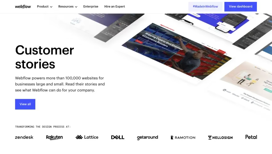
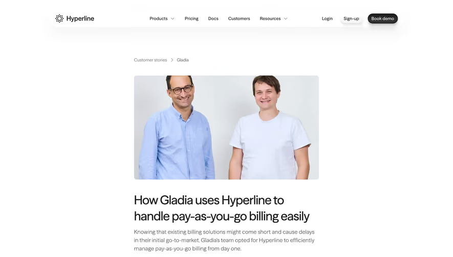
Generate a new design based on this screen using your own content.
Thank you! Your submission has been received!
Oops! Something went wrong while submitting the form.
# Design from Reference: Appcues Customers Page
Create an original, high-fidelity visual design inspired by the reference. Prioritize composition, typography, colors, spacing, and component styling over technical implementation.
## Reference
- **Product:** Appcues
- **Category:** Customers Page
- **Screenshot:** https://cdn.prod.website-files.com/5e9dc792e1210c5325f7ebbc/62ec9c881d8c6b22e62d8604_1659625193009-screenshot-device-0da255002747bd56a89125b70b536247-1659605225666.webp
Analyze the screenshot first. If inaccessible, request it rather than guessing.
## Content
{{content.instructions}}
{{content.data}}
Preserve essential messaging and factual accuracy. Adapt structure and copy length for visual balance; never invent product claims.
## Visual Design
Use this context to reproduce the reference's visual language: layout, typography, colors, spacing, borders, radii, and distinctive elements. The screenshot takes priority if descriptions conflict.
## Direction
{{preferences.fidelityInstructions}}
## Output
{{output.instructions}}
Deliver a polished, cohesive design with precise alignment, hierarchy, and spacing. Produce the requested visual artifact, not just a description. If unsupported, explain the limitation.
Appcues' customers page embraces a modern, approachable aesthetic that blends professionalism with subtle playfulness. The overall vibe is clean and confident, with ample whitespace, balanced layouts, and a lively yet restrained use of brand colors. This results in a feel that is trustworthy, user-centric, and energetic—ideal for SaaS inspiration.
Layout and Structure
The page begins with a concise hero section that establishes credibility through a straightforward headline and a discreet call to action. Below, curated customer stories appear as visually engaging 'cards' organized by well-spaced grids. Each story is clickable, inviting deeper exploration without overwhelming the visitor. The navigation remains persistent and intuitive at the top, ensuring seamless movement across the site.
Visual Elements
Photography is used thoughtfully—each customer logo or success story is accompanied by sharp brand images or screenshots, adding authenticity. Interactive hover states and micro-animations gently highlight CTAs and cards, signaling interactivity without distracting the user. Simple icons and badges subtly guide attention to standout stories or company segments.
Color Palette and Typography
Appcues leverages a balanced palette: navy blues and whites dominate, accented by vivid purples and sunny yellows for key highlights and buttons. Typography is bold and clean, with a clear hierarchy—large headings in a friendly sans-serif font, well-spaced subheadlines, and body copy that's easy to scan.
User Experience Patterns & Unique Touches
The customer grid offers search/filter functionality and sticky navigation, promoting efficient browsing. Instead of traditional testimonials, the focus on customer logos and case studies adds both social proof and visual interest. Subtle, animated transitions create a smooth scrolling experience. The overall tone is solutions-oriented and collaborative, making users feel part of a thriving, innovative community.