Design with AI
Generate a new design based on this screen using your own content.
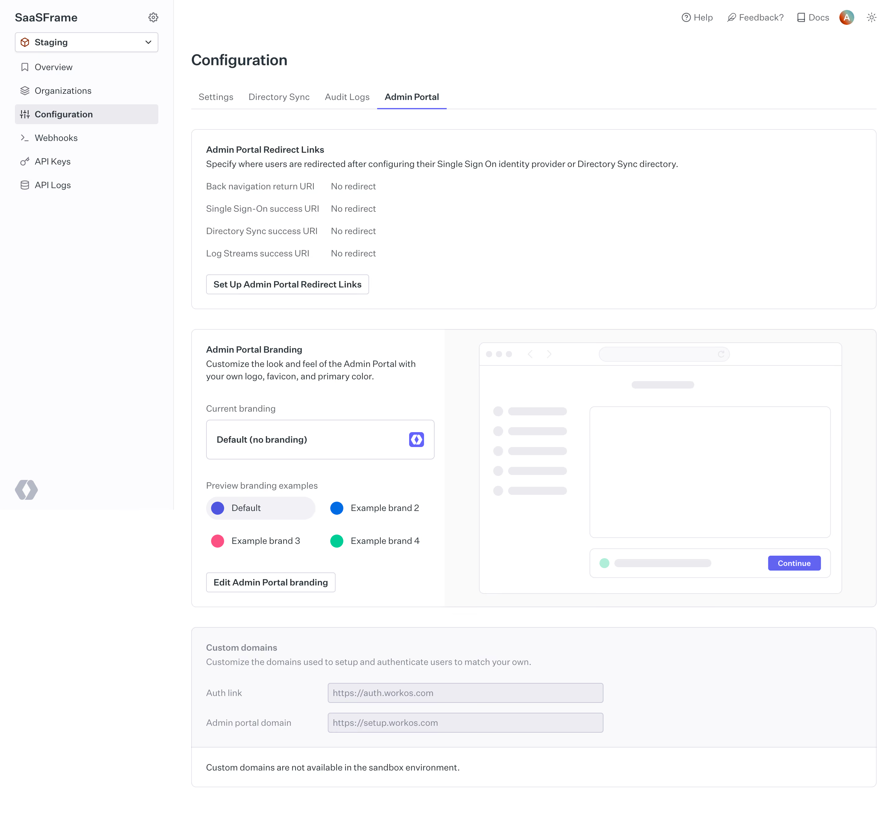
# Design from Reference: WorkOS Admin Portal Configuration
Create an original, high-fidelity visual design inspired by the reference. Prioritize composition, typography, colors, spacing, and component styling over technical implementation.
## Reference
- **Product:** WorkOS
- **Category:** Settings
- **Screenshot:** https://cdn.prod.website-files.com/5e9dc792e1210c5325f7ebbc/6acb6a4503442b22fb62a9ea_6acb694f3f1023ca3770ea4e_cms-09276cf210e728644655c563.webp
Analyze the screenshot first. If inaccessible, request it rather than guessing.
## Content
{{content.instructions}}
{{content.data}}
Preserve essential messaging and factual accuracy. Adapt structure and copy length for visual balance; never invent product claims.
## Visual Design
### Overall aesthetic
- **Character:** Clean developer configuration dashboard with subtle gray panels, violet selections and a schematic branding preview.
### Page composition
- **Capture:** 2880 × 2664 screenshot pixels; estimated 2× CSS scale.
- **Structure:** Left project/environment navigation, top utilities, Configuration heading/tabs and three stacked panels for redirects, branding and custom domains.
### Information hierarchy
- **Priority:** Redirect summary/action comes first; branding panel pairs controls with a large browser mockup. Disabled custom-domain fields and environment note finish the page.
### Typography
- **Family:** Sans serif; exact family unverified.
- **Estimated CSS sizes:** Page heading 24px, panel labels/body 14px, navigation 14px and helper copy 13px.
### Colors & surfaces
- **Measured palette:** White #FFFFFF, sidebar #FCFCFD, muted surfaces #F9F9FB/#FAFAFA and borders #ECECF1/#EBEBEF.
- **Accents:** Violet active tab and preview button; blue, pink and mint branding-example swatches.
### Components
- **Elements:** Environment dropdown, horizontal tabs, label/value redirect rows, branding selector, color examples, outlined setup/edit buttons and disabled domain inputs.
- **Estimated geometry:** Sidebar 280px, content padding 28px, panel radius 8px, 24px panel padding and 32px controls.
### Visual rhythm
- **Spacing:** Broad stacked panels with consistent gutters; split branding layout gives the preview roughly two-thirds of the panel.
### Responsive
- **Suggested adaptation:** Collapse sidebar and stack branding controls above preview. Mobile layout is unverified.
### Adaptation guidance
- **Transfer:** Preserve summary/action pairs, a live-looking preview and explicit disabled-environment explanations.
Use this context to reproduce the reference's visual language: layout, typography, colors, spacing, borders, radii, and distinctive elements. The screenshot takes priority if descriptions conflict.
## Direction
{{preferences.fidelityInstructions}}
## Output
{{output.instructions}}
Deliver a polished, cohesive design with precise alignment, hierarchy, and spacing. Produce the requested visual artifact, not just a description. If unsupported, explain the limitation.