Design with AI
Generate a new design based on this screen using your own content.
# Design from Reference: Woopra New Features Emails
Create an original, high-fidelity visual design inspired by the reference. Prioritize composition, typography, colors, spacing, and component styling over technical implementation.
## Reference
- **Product:** Woopra
- **Category:** Product Update Emails
- **Screenshot:** https://cdn.prod.website-files.com/5e9dc792e1210c5325f7ebbc/6acbc147b7ca13cf70095c3c_6acbc042436a6cc27afed762_cms-cbd43472e20853a742d740a3.webp
Analyze the screenshot first. If inaccessible, request it rather than guessing.
## Content
{{content.instructions}}
{{content.data}}
Preserve essential messaging and factual accuracy. Adapt structure and copy length for visual balance; never invent product claims.
## Visual Design
### Overall aesthetic
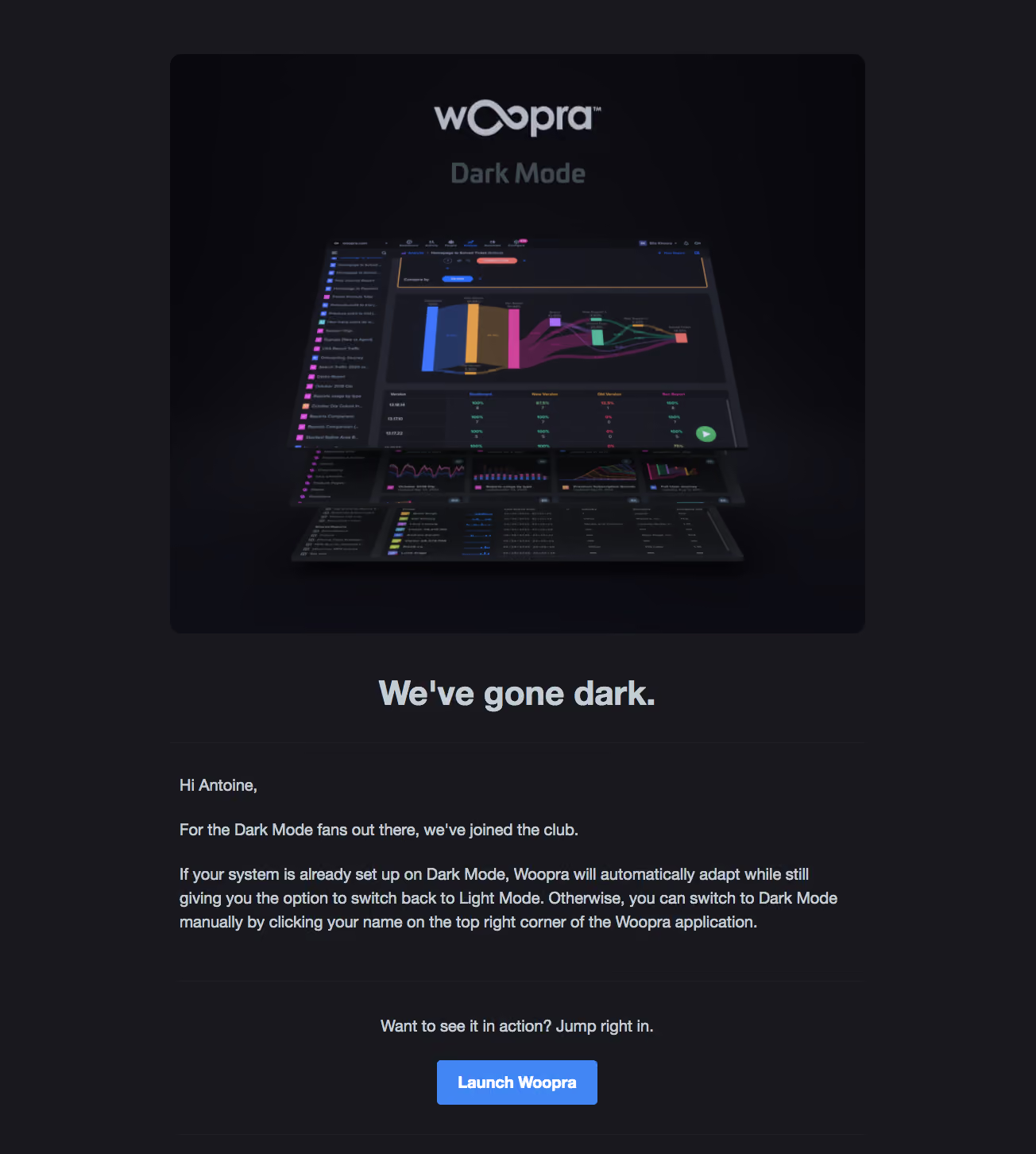
- **Character:** Dark feature-announcement email whose palette directly reinforces its dark-mode subject.
### Page composition
- **Canvas:** 1304 × 1452 screenshot pixels; rendered CSS scale is unverified.
- **Structure:** Centered broad reading column with large rounded product montage, centered announcement heading, explanatory text and closing launch action.
### Information hierarchy
- **Priority:** Layered dashboard imagery leads, followed by bold title, greeting, concise activation instructions and blue Launch button.
### Typography
- **Family:** Conventional sans-serif with bold title/action; exact font is unverified.
- **Scale:** Estimated rendered title 40–44px, body 20px with 30px leading and button 20px.
### Colors & surfaces
- **Sampled palette:** Charcoal #18181D; deeper image tones #0C0C12, #0B0B11 and #08080D.
- **Contrast:** Light blue-gray text and a saturated blue CTA stand out; chart colors provide small multicolor highlights inside the montage.
### Components
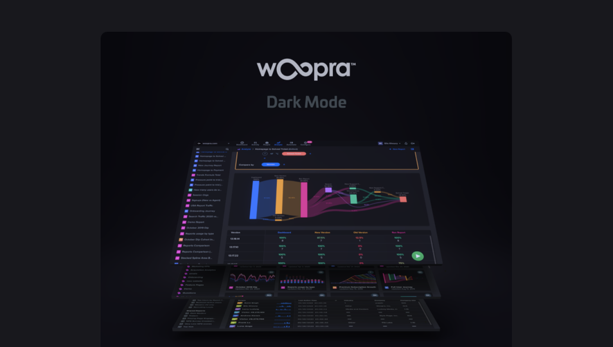
- **Hero artwork:** Perspective-stacked dark analytics screens below brand and Dark Mode label.
- **Action:** Compact blue rounded rectangle; thin dark separators divide heading, copy and conversion area.
- **Geometry:** Estimated 14–16px hero radius and 4–6px action radius.
### Visual rhythm
- **Spacing:** Large 48–64 screenshot-pixel separation around the title; paragraphs remain in a single left-aligned block while CTA is centered.
### Responsive
- **Guidance:** Mobile is not shown. Scale the montage fluidly and retain readable instructions and strong button contrast.
### Adaptation guidance
- **Transfer:** Match announcement atmosphere to the feature being introduced. Use original product imagery and accurate activation instructions.
Use this context to reproduce the reference's visual language: layout, typography, colors, spacing, borders, radii, and distinctive elements. The screenshot takes priority if descriptions conflict.
## Direction
{{preferences.fidelityInstructions}}
## Output
{{output.instructions}}
Deliver a polished, cohesive design with precise alignment, hierarchy, and spacing. Produce the requested visual artifact, not just a description. If unsupported, explain the limitation.