Generate a new design based on this screen using your own content.
Thank you! Your submission has been received!
Oops! Something went wrong while submitting the form.
# Design from Reference: Webflow Thank You Page
Create an original, high-fidelity visual design inspired by the reference. Prioritize composition, typography, colors, spacing, and component styling over technical implementation.
## Reference
- **Product:** Webflow
- **Category:** Thank You Page
- **Screenshot:** https://cdn.prod.website-files.com/5e9dc792e1210c5325f7ebbc/6acad849b3daa04f54276316_6acad7cc53d9f68d7c3836a2_cms-133841febcaff90b3a552061.webp
Analyze the screenshot first. If inaccessible, request it rather than guessing.
## Content
{{content.instructions}}
{{content.data}}
Preserve essential messaging and factual accuracy. Adapt structure and copy length for visual balance; never invent product claims.
## Visual Design
Use this context to reproduce the reference's visual language: layout, typography, colors, spacing, borders, radii, and distinctive elements. The screenshot takes priority if descriptions conflict.
## Direction
{{preferences.fidelityInstructions}}
## Output
{{output.instructions}}
Deliver a polished, cohesive design with precise alignment, hierarchy, and spacing. Produce the requested visual artifact, not just a description. If unsupported, explain the limitation.
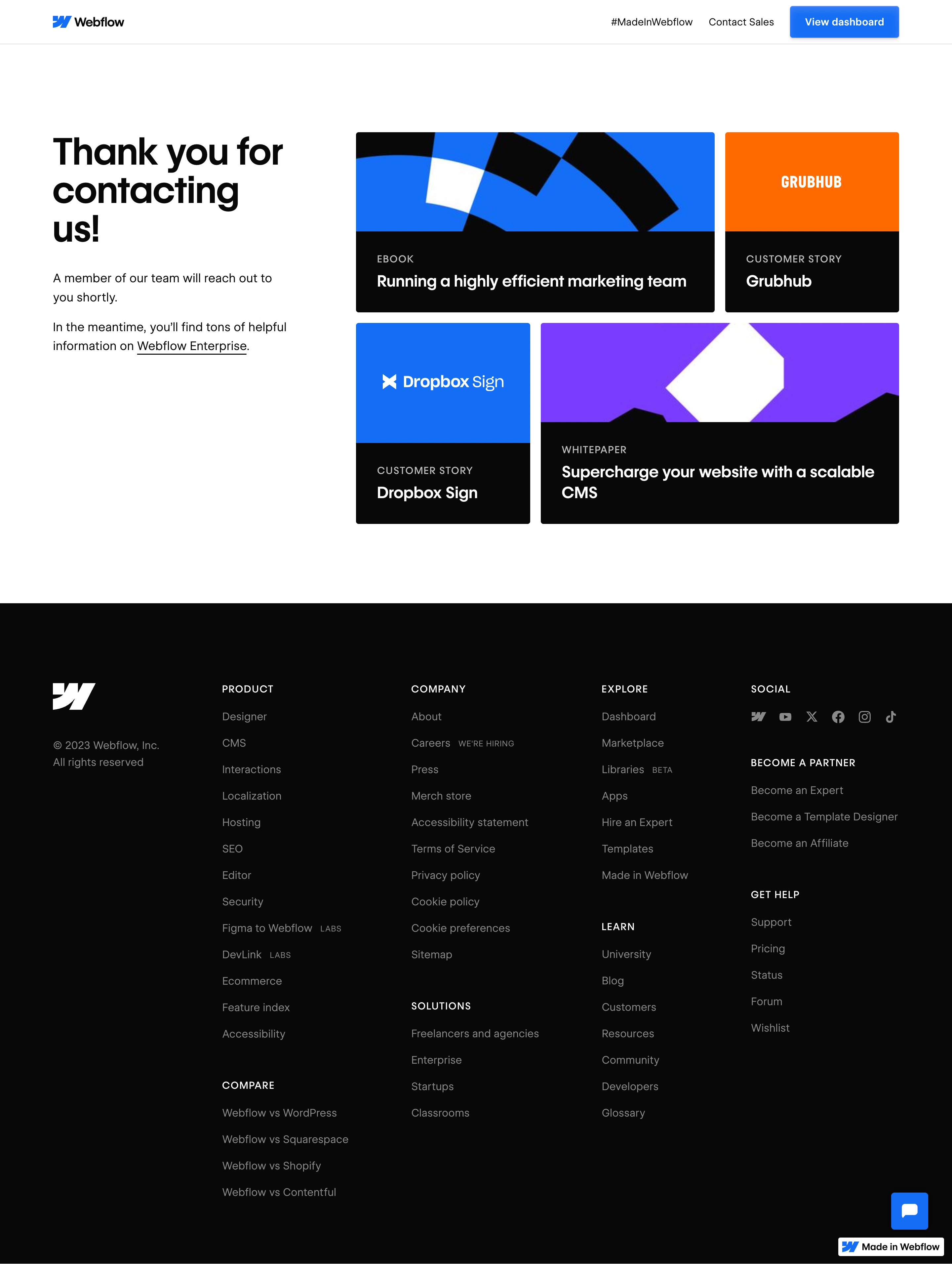
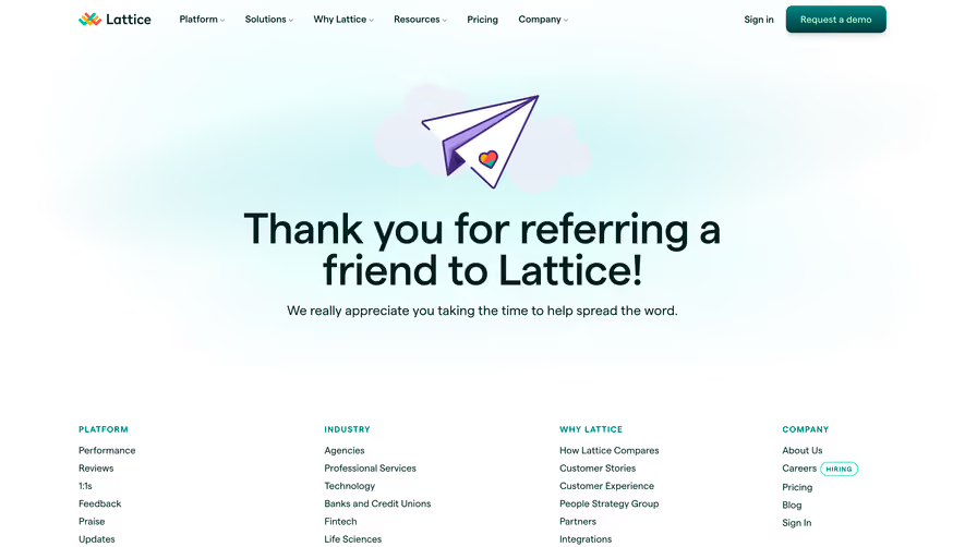
Webflow’s Enterprise Thank You page exudes a modern, polished, and understated sophistication. The minimalist approach emphasizes white space, ensuring a distraction-free and professional atmosphere that echoes trust and credibility—ideal for enterprise-level SaaS audiences.
Layout and Structure
The structure is streamlined for clarity. Centered on the page is a gratitude message and confirmation of form submission, placed within a hero-like section. There is no unnecessary clutter—only focused content that reassures and guides users forward. Supporting links and access to primary Webflow navigation are subtly available up top, keeping the user’s journey clear and uninterrupted.
Visual Elements
The page integrates abstract, softly animated background elements that add depth and motion without overwhelming the user. Refined, vector-style illustrations and dynamic gradients create visual interest, subtly reinforcing Webflow’s brand. Minimal iconography and the absence of heavy imagery keep the focus on the messaging.
Color Palette and Typography
A harmonious blend of whites and cool grays anchors the page, enlivened with Webflow’s signature purple-blue gradient accents. Sans-serif typography—likely from the Inter or a similar modern family—delivers strong legibility and hierarchy, with larger headings and clear, comfortable body text.
User Experience Patterns
Navigation sticks to the essentials, with primary access to main site areas, but gently guides users toward continued engagement (such as returning to the homepage or browsing resources). Interactive elements like CTA buttons are bold yet unobtrusive. Subtle hover effects and smooth transitions ensure interactions feel intuitive and polished.
Unique Design Choices and Tone
What stands out is the use of simple, tasteful animation to inject life into what could be a forgettable confirmation screen. The tone is quietly celebratory, balancing gratitude with ongoing engagement, leaving visitors with a sense of accomplishment and trust in the product’s professionalism and innovation.