Generate a new design based on this screen using your own content.
Thank you! Your submission has been received!
Oops! Something went wrong while submitting the form.
# Design from Reference: Visitors Add Project
Create an original, high-fidelity visual design inspired by the reference. Prioritize composition, typography, colors, spacing, and component styling over technical implementation.
## Reference
- **Product:** Visitors
- **Category:** Add & Edit
- **Screenshot:** https://cdn.prod.website-files.com/5e9dc792e1210c5325f7ebbc/697b75c7975f777f0b09678f_YQilntYLA_wraRPw1sd4HVntVJBW0kyuXkBP4-u1a28.avif
Analyze the screenshot first. If inaccessible, request it rather than guessing.
## Content
{{content.instructions}}
{{content.data}}
Preserve essential messaging and factual accuracy. Adapt structure and copy length for visual balance; never invent product claims.
## Visual Design
Use this context to reproduce the reference's visual language: layout, typography, colors, spacing, borders, radii, and distinctive elements. The screenshot takes priority if descriptions conflict.
## Direction
{{preferences.fidelityInstructions}}
## Output
{{output.instructions}}
Deliver a polished, cohesive design with precise alignment, hierarchy, and spacing. Produce the requested visual artifact, not just a description. If unsupported, explain the limitation.
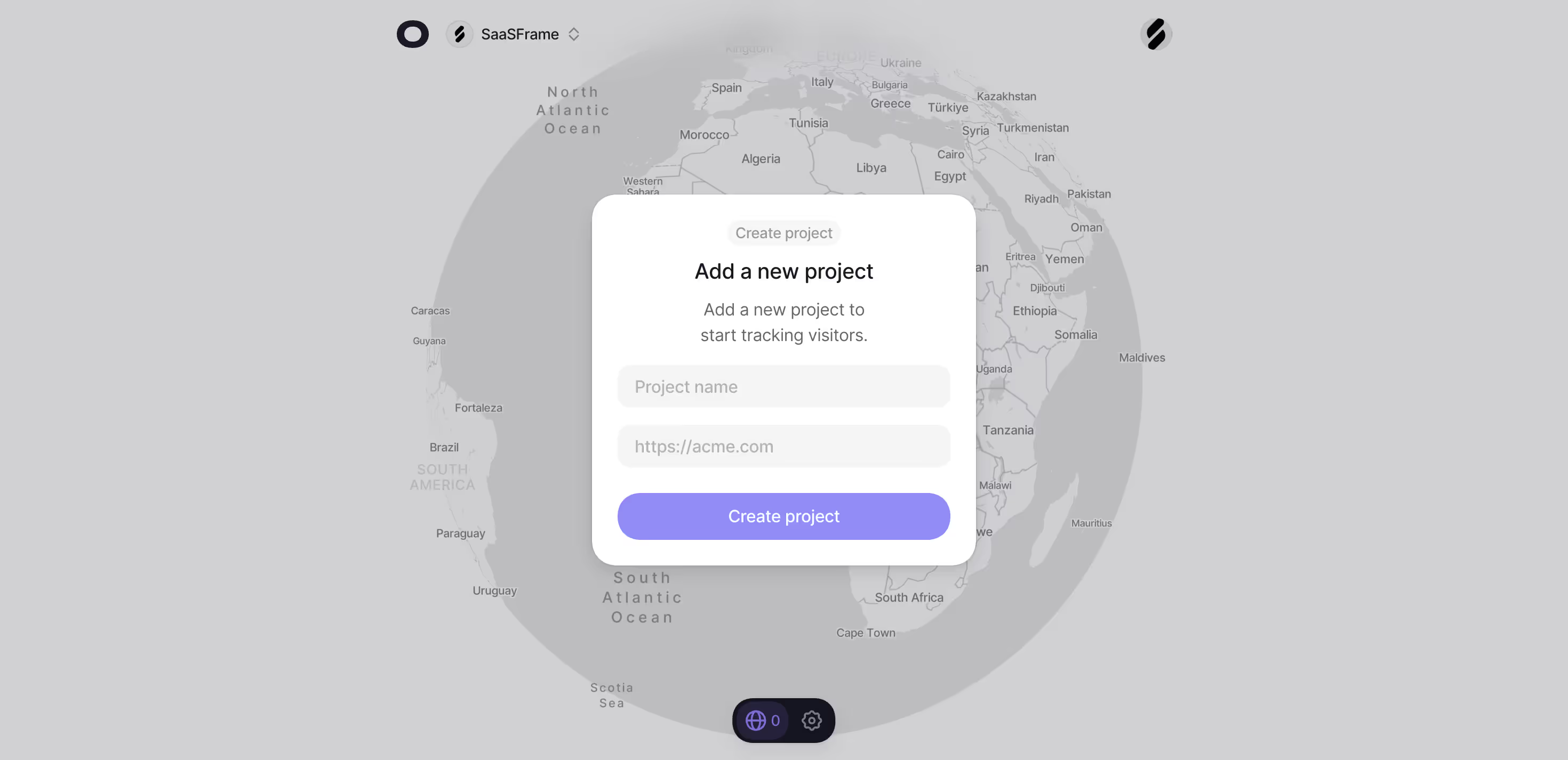
The first thing you notice is that massive 3D globe sitting behind everything. It immediately tells you this is about tracking visitors worldwide without saying a word. The semi-transparent overlay dims it just enough so the modal stays readable. Smart move.
Dead simple modal, zero friction
Two input fields. One button. That's it. The "Create project" modal is stripped down to the bare minimum, which makes the onboarding feel lightweight. The placeholder text "https://acme.com" is a small but effective touch that tells users exactly what format to use. Purple CTA button pops against the neutral grays and whites without being aggressive. The rounded corners on everything keep it soft and approachable.
Typography stays out of the way
The hierarchy is clean. "Add a new project" in bold, supporting copy in a lighter gray underneath. Nothing fancy, nothing distracting. The top nav is minimal too, just the SaaSFrame logo and a settings icon at the bottom. That floating visitor counter with the globe icon at the bottom center is a neat detail that reinforces the product's purpose even during setup.