Design with AI
Generate a new design based on this screen using your own content.
# Design from Reference: VideoAsk User Onboarding
Create an original, high-fidelity visual design inspired by the reference. Prioritize composition, typography, colors, spacing, and component styling over technical implementation.
## Reference
- **Product:** VideoAsk
- **Category:** User Onboarding
- **Screenshot:** https://cdn.prod.website-files.com/5e9dc792e1210c5325f7ebbc/6acbc77ba4008ddb74793473_6acbc5dc8892d3072b72bae9_cms-75c4610f3b878ffb27be2703.webp
Analyze the screenshot first. If inaccessible, request it rather than guessing.
## Content
{{content.instructions}}
{{content.data}}
Preserve essential messaging and factual accuracy. Adapt structure and copy length for visual balance; never invent product claims.
## Visual Design
### Overall aesthetic
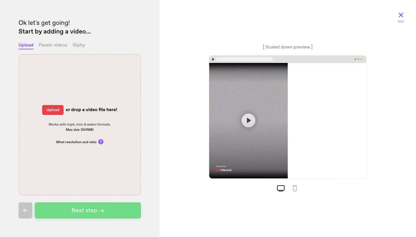
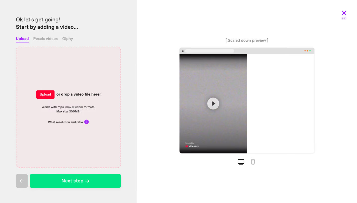
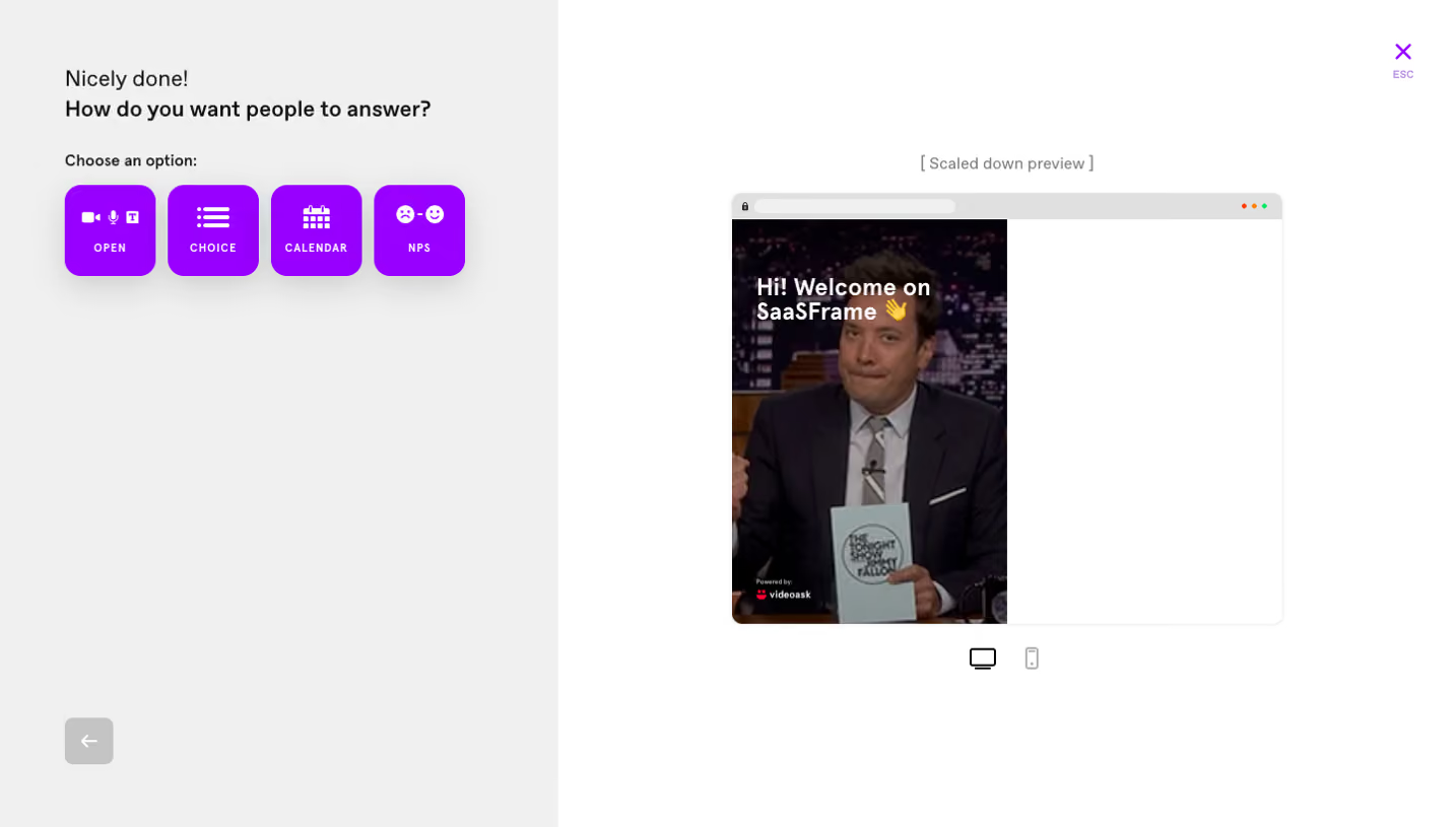
- **Character:** A sparse video-creation onboarding screen separates a practical upload panel from a large preview.
- **Accent language:** Purple tabs, a red upload control and green progression action distinguish roles against white and pale gray.
### Page composition
- **Capture:** The original is 1440 × 821 image pixels. Dimensions below approximate image pixels; CSS scale is unverified.
- **Left panel:** A roughly 550-pixel-wide pale-gray region contains introduction, three source tabs, a large upload drop zone and bottom navigation.
- **Right region:** A white workspace centers a scaled browser-style preview, with desktop/mobile icons below.
- **Dismissal:** A purple X and small ESC label occupy the upper-right corner.
### Information hierarchy
- **Task:** A short greeting precedes a bold instruction to add video.
- **Source selection:** Upload is selected above the drop zone, while Pexels videos and Giphy remain muted.
- **Progression:** The wide green Next step action anchors the bottom; a smaller gray back arrow sits beside it.
- **Preview:** A large play symbol makes the video area recognizable, though no playback interaction is demonstrated.
### Typography
- **Family:** A clean sans serif is visible; exact identity is unverified.
- **Intro:** Approximately 22 pixels, with a bold second line.
- **Controls:** Tabs and drop-zone instruction are around 15–16 pixels; the green action label is about 20 pixels and semibold.
- **Helpers:** Format, size and resolution guidance use compact approximately 12-pixel text with some bold emphasis.
### Colors & surfaces
- **Measured foundation:** White #FFFFFF and pale gray #F0F0F0 divide preview and editor surfaces.
- **Measured drop zone:** Pale blush #F0E8E9 supports the dashed upload boundary.
- **Measured progression:** Green #6FDA83 supplies the bottom primary action.
- **Measured neutral:** #E0E0E0 appears in supporting interface details; purple and red provide distinct source/upload accents.
### Components
- **Drop zone:** Approximately 425 × 490 pixels, with a pink dashed border and roughly 18-pixel radius.
- **Upload control:** A small red rounded button sits beside bold drop instructions; centered helper lines follow below.
- **Preview window:** Approximately 545 × 430 pixels with browser chrome, a portrait video occupying its left half and blank white space on the right.
- **Playback mark:** A white circular disc and dark triangle sit over the video; a small brand watermark appears near its lower edge.
- **Navigation:** A roughly 370 × 56-pixel green next button pairs with a square gray back button.
### Visual rhythm
- **Insets:** About 64 pixels aligns left-panel headings, tabs, drop zone and navigation.
- **Open space:** The preview is surrounded by substantial white margins and a modest centered caption.
- **Grouping:** Source tabs sit close to the drop zone, while bottom actions have a clear separating gap.
### Responsive
- **Observed state:** Only desktop editing is shown; the mobile icon does not establish the site's responsive layout.
- **Recommended flow:** Stack editor and preview or provide a preview toggle on small screens.
- **Recommended controls:** Preserve tap targets, allow source tabs to wrap and reduce drop-zone height before narrowing instructions.
### Adaptation guidance
- **Preserve roles:** Keep source choice, upload action and next-step action visually distinct.
- **Preview fidelity:** Retain the visible split preview without inventing loaded content or successful uploads.
- **Scale estimates:** Start with a roughly 38/62 editor/preview split and tune against original pixels.
- **Accessibility:** Provide a keyboard-accessible file input, descriptive preview alternative and visible tab/focus states.
Use this context to reproduce the reference's visual language: layout, typography, colors, spacing, borders, radii, and distinctive elements. The screenshot takes priority if descriptions conflict.
## Direction
{{preferences.fidelityInstructions}}
## Output
{{output.instructions}}
Deliver a polished, cohesive design with precise alignment, hierarchy, and spacing. Produce the requested visual artifact, not just a description. If unsupported, explain the limitation.