Overall Style and Aesthetic
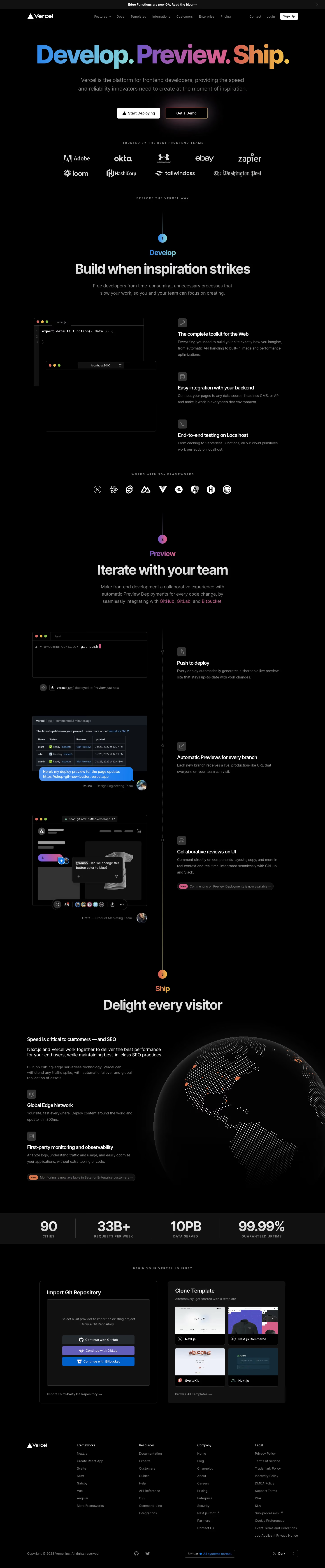
Vercel’s homepage exemplifies a modern, minimalist aesthetic that conveys precision and innovation. The design makes bold use of whitespace, lending an uncluttered, breathable feel that directs focus toward the brand’s core message. Subtly animated gradients in the hero and gentle motion cues throughout suggest cutting-edge technology while maintaining a professional tone. Layout and Structure
The layout is logical and modular, beginning with a commanding hero section featuring a concise headline, animated background, and an eye-catching call-to-action. Below, the features section arranges content into digestible blocks with ample spacing, each accompanied by crisp visuals. Testimonials and customer logos serve as social proof, and the site wraps with an informative, expandable footer integrating navigation, contact, and product links. Visual Elements
Dynamic and interactive code previews, minimalistic icons, and micro-animations reinforce the platform’s technical focus. A balance of vector illustrations and actual product UI screenshots provide credibility and help users visualize use cases. Motion is used sparingly—a shimmering “Deploy” button, or animated gradient backgrounds—to guide attention without overwhelming. Color Palette and Typography
The palette centers around deep blacks, clean whites, and accent gradients of blue, purple, and magenta, reinforcing a high-contrast, high-tech feel. Sleek, geometric sans-serif fonts (like “Inter”) build hierarchy with bold headlines and lighter body copy, ensuring readability and visual clarity. User Experience Patterns and Unique Choices
Sticky navigation with smooth scrolling anchors offers effortless exploration. Multiple, context-aware CTAs ("Start Deploying" and "Get Started") are visually distinct. Clever interactive code demos and seamless theme switching (dark/light mode) invite engagement and experimentation, setting Vercel apart as both user-centric and innovative. Tone and Feel
Overall, the site’s tone radiates trust, energy, and technical authority—an exemplar for SaaS platforms seeking a sleek, aspirational, and highly usable design.