
Thank you! Your submission has been received!
Oops! Something went wrong while submitting the form.
Get SaaSFrame Pro
Monthly
$18
Quarterly
$48
Yearly
$180
Upgrade to access this feature
Browse all screens & flows
Filter and search screens & flows
Access Figma files
Access mobile versions
Bookmark screens & flows
Join now
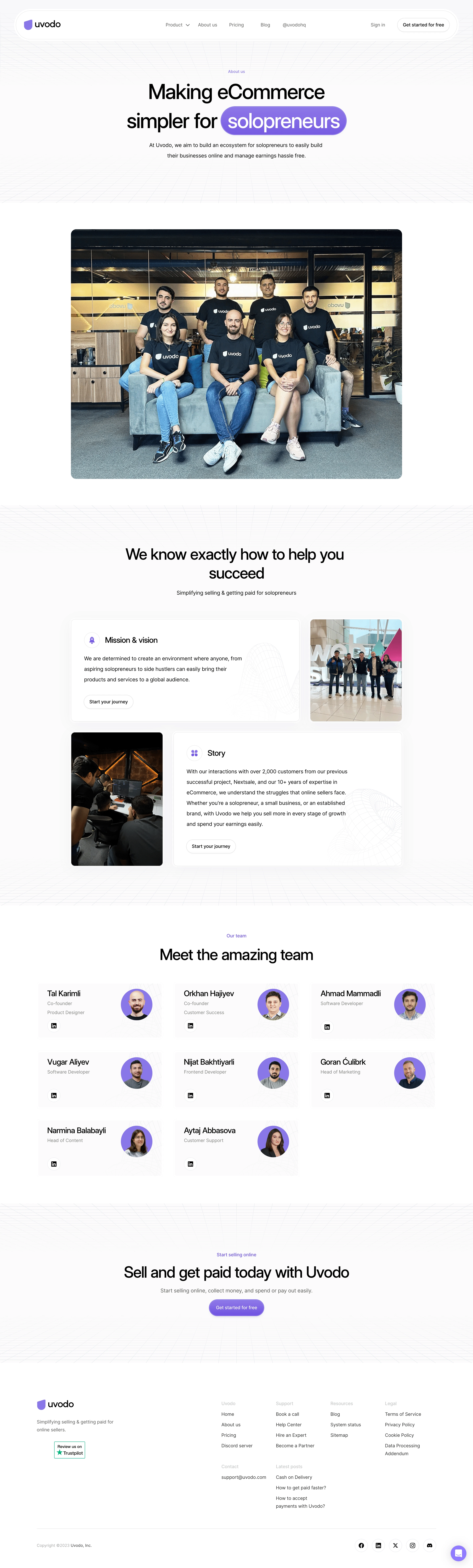

Uvodo About Page

Uvodo
eCommerce & payment for solopreneurs
Designed by
No items found.

Bookmark
Bookmark

Design with AI
Thank you! Your submission has been received!
Oops! Something went wrong while submitting the form.
# Design from Reference: Uvodo About Page
Create an original, high-fidelity visual design inspired by the reference. Prioritize composition, typography, colors, spacing, and component styling over technical implementation.
## Reference
- **Product:** Uvodo
- **Category:** About Page
- **Screenshot:** https://cdn.prod.website-files.com/5e9dc792e1210c5325f7ebbc/6acad66cd63d2caea65c635d_6acad5f8d05a3f53c0a6edd2_cms-1c9ef44dc40a817da4ed897e.webp
Analyze the screenshot first. If inaccessible, request it rather than guessing.
## Content
{{content.instructions}}
{{content.data}}
Preserve essential messaging and factual accuracy. Adapt structure and copy length for visual balance; never invent product claims.
## Visual Design
### Overall aesthetic
- **Character:** Spacious, polished commerce brand page combining restrained black typography, pale perspective grids and purple accents with candid team photography.
- **Evidence and scale:** Observed screenshot is 2880 × 9548 image pixels. Dimensions below estimate a 1440px CSS canvas at 2× capture scale; device ratio and font identities are unverified.
### Page composition
- **Header and hero:** A wide outlined capsule navigation contains the logo at left, centered links and account actions at right. The centered hero stacks a small purple eyebrow, oversized two-line headline, supporting paragraph and broad rounded team photograph.
- **Company narrative:** A centered section introduction leads into two asymmetric rows: a wide mission card beside a narrow photograph, followed by a narrow photograph beside a wide story card.
- **People and conversion:** Eight compact profile cards form three columns across three rows, with two cards in the final row. A full-width perspective-grid conversion band precedes a multi-column footer.
- **Footer:** Brand description and review badge occupy the left region; four link columns, contact/latest-post groups, a horizontal divider, copyright and circular social links fill the rest.
### Information hierarchy
- **Primary emphasis:** The hero headline dominates; its final term appears in white within a purple gradient capsule, giving the audience phrase a separate visual beat.
- **Section levels:** Centered section headlines introduce the narrative, team and closing action. Smaller card headings and muted body copy explain each region.
- **Action hierarchy:** Purple filled pills supply the strongest conversion cue; outlined account actions, neutral narrative pills and small circular social controls remain secondary.
### Typography
- **Display roles:** Heavy neutral sans-serif hero lettering is approximately 72–88px CSS with tight tracking and compact leading. Section headings appear around 44–48px with similarly tight letter spacing.
- **Cards:** Narrative titles and profile names are approximately 22–24px, medium to semibold. Paragraphs and role labels are approximately 14–16px; long narrative text uses generous leading near 28–32px.
- **Utility text:** Navigation, footer links and button labels are approximately 14px. Footer category labels are lighter gray; exact font family and computed weights cannot be confirmed from pixels.
### Colors & surfaces
- **Measured neutrals:** Converted screenshot samples include white #FFFFFF, off-white #FBFBFB and text black #000000. Closely related #F9F9F9 and #FAFAFA support subtle surface differences.
- **Measured accent:** Purple #8978E8 is a frequent saturated pixel color, especially around portraits and branded accents; the hero capsule and final button use varying purple tones rather than one flat fill.
- **Surface treatment:** Faint gray grid lines recede toward a horizon. Cards use nearly white surfaces, delicate borders and low-contrast wireframe ornament, keeping photography and typography prominent.
### Components
- **Navigation shell:** Broad pill silhouette with a thin double-outline effect and approximately 60–70px CSS height. Internal controls align vertically and retain generous horizontal separation.
- **Narrative panels:** Wide white cards, approximately 696px across, use rounded corners near 12–16px, restrained shadow/border treatment and roughly 32px internal padding. Small purple circular icons and pale torus wireframes add depth.
- **Profile cards:** Approximately 380 × 170px CSS cards pair left-aligned names/roles with upper-right circular portraits on purple discs. A small outlined circular professional-network control sits near the lower left.
- **Closing action and support:** The final purple pill is approximately 170 × 50px with white text, a pale inset edge and soft shadow. A purple circular chat control sits at the bottom-right edge of the captured page.
### Visual rhythm
- **Container:** Most content aligns to an approximately 1215px CSS centered region with side gutters around 110px; the major photograph is narrower.
- **Spacing:** Broad section gaps of roughly 80–140px contrast with 16–24px text-stack gaps. Profile cards use approximately 32–36px gutters in both directions.
- **Alternation:** Large photographs, asymmetric narrative pairs, repeated team cards and a centered CTA produce distinct page beats without introducing heavy background blocks.
### Responsive
- **Observed limit:** Only a wide desktop composition is visible; mobile navigation, stacking and interaction states are unobserved.
- **Recommended layout:** Collapse narrative pairs into a single column in reading order, reduce the profile grid from three columns to two and then one, and retain generous card padding.
- **Recommended type and footer:** Scale hero text fluidly, allow its highlighted phrase to wrap safely, replace the full navigation with a compact menu and stack footer groups. Crop team imagery deliberately rather than shrinking faces excessively.
### Adaptation guidance
- **Preserve the system:** Use one restrained purple accent, a neutral sans-serif hierarchy, thin outlined pills, circular portrait backdrops and extremely faint geometric grids.
- **Build the narrative:** Keep company story, human proof and final action as separate regions; use asymmetric photograph/text pairs to break up long copy.
- **Implementation:** Treat dimensions as visual estimates. Use responsive container widths, real text and semantic links, provide image alternatives and visible keyboard focus, and verify contrast on the pale footer labels and decorative boundaries.
Use this context to reproduce the reference's visual language: layout, typography, colors, spacing, borders, radii, and distinctive elements. The screenshot takes priority if descriptions conflict.
## Direction
{{preferences.fidelityInstructions}}
## Output
{{output.instructions}}
Deliver a polished, cohesive design with precise alignment, hierarchy, and spacing. Produce the requested visual artifact, not just a description. If unsupported, explain the limitation.


Category
Patterns
No items found.
Tech Stack

Added on
November 9, 2023
Similar screens
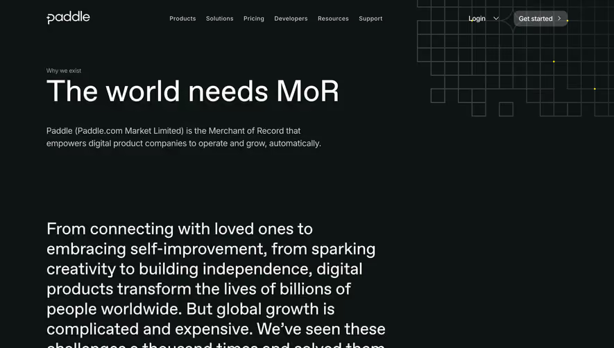


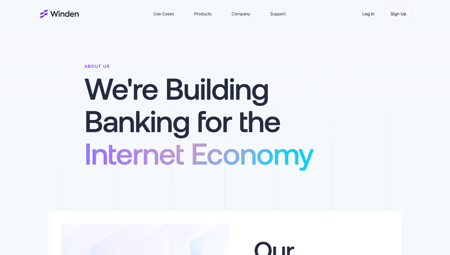

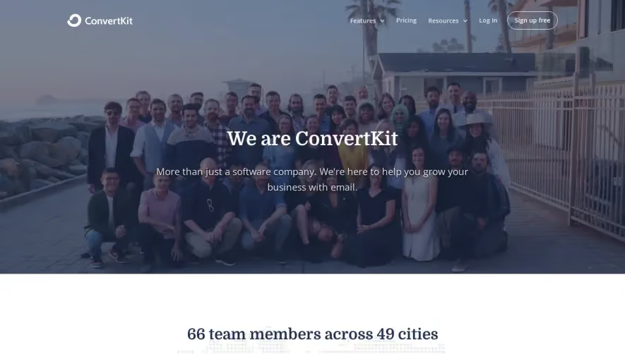

Upgrade to SaaSFrame Pro now to see similar examples.
Monthly
$18 /month
Billed $18 monthly
Browse all screens & flows
Filter and search screens & flows
Search text in screenshots
Access Figma files
Access mobile versions
Join now
Quarterly
$16 /month
Billed $48 quarterly
Browse all screens & flows
Filter and search screens & flows
Search text in screenshots
Access Figma files
Access mobile versions
Join now
Yearly
$15 /month
Billed $180 yearly
Browse all screens & flows
Filter and search screens & flows
Search text in screenshots
Access Figma files
Access mobile versions
Join now