Design with AI
Generate a new design based on this screen using your own content.
# Design from Reference: Typedesk Sign Up Flow
Create an original, high-fidelity visual design inspired by the reference. Prioritize composition, typography, colors, spacing, and component styling over technical implementation.
## Reference
- **Product:** Typedesk
- **Category:** Account Setup
- **Screenshot:** https://cdn.prod.website-files.com/5e9dc792e1210c5325f7ebbc/6acc0d678938256d024ec523_6acc0857356cc37944690a83_cms-0bb5aad3acd715868ee7411c-v3.webp
Analyze the screenshot first. If inaccessible, request it rather than guessing.
## Content
{{content.instructions}}
{{content.data}}
Preserve essential messaging and factual accuracy. Adapt structure and copy length for visual balance; never invent product claims.
## Visual Design
### Overall aesthetic
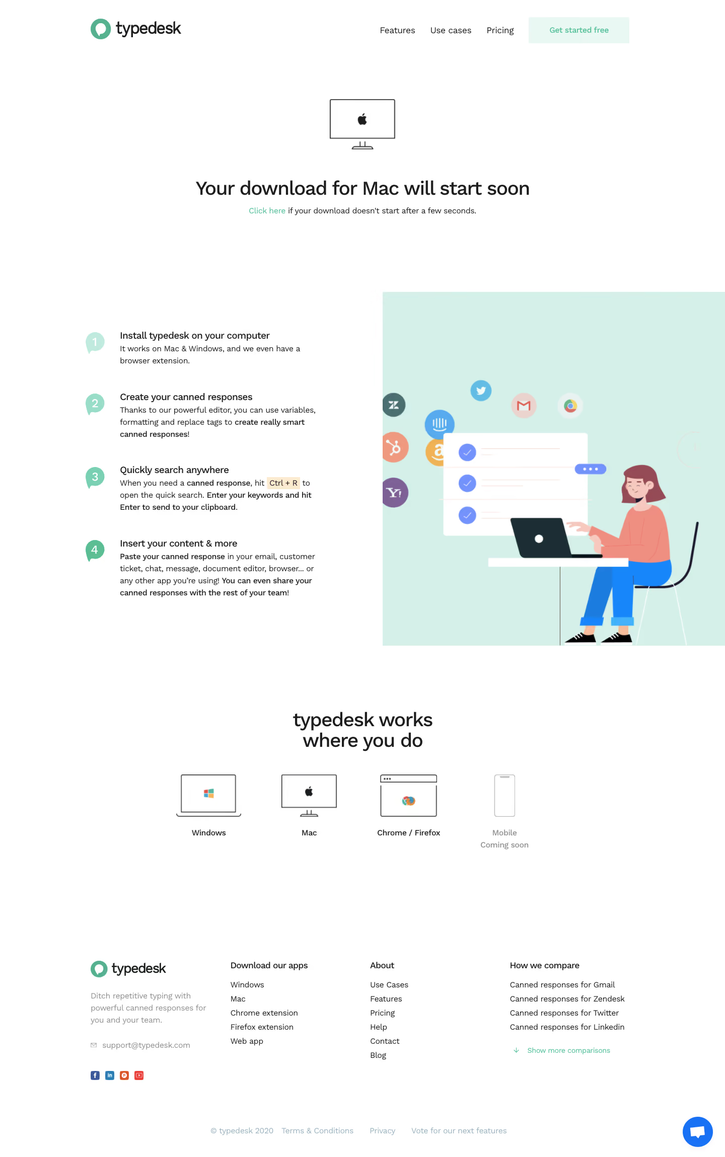
- **Character:** Airy white download/onboarding page with mint accents, friendly flat illustration and compact sans-serif typography.
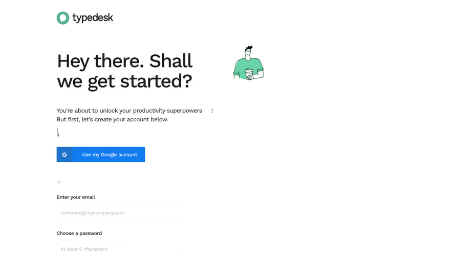
- **Observed content:** The visible screen announces a Mac download and explains installation/use; no signup form is shown.
- **Capture:** The image is 1440 × 2299 px and was inspected in two portions. Dimensions below are image estimates; CSS scale is unverified.
### Page composition
- **Header:** A centered wide row places the mint/black wordmark left and three links plus a pale-mint signup action right.
- **Download message:** A small outlined desktop icon sits above a centered bold download heading and short fallback-link sentence.
- **Instruction section:** Four numbered steps form a left column, paired with a large mint-backed illustration of a person using a laptop on the right.
- **Platform row:** A centered two-line compatibility heading leads to four device/platform icons with labels; the mobile option is faded and marked coming soon.
- **Footer:** Four columns contain brand/contact/social information, app destinations, company links and comparison links. A pale legal row and blue chat control sit near the bottom.
### Information hierarchy
- **Primary state:** The centered heading says the download will start soon; a mint inline link offers a fallback. The screenshot does not prove an actual download completed.
- **Steps:** Numbered mint speech-bubble markers introduce installation, response creation, search and insertion guidance.
- **Platform scope:** Desktop/browser choices are visually stronger than the muted mobile item.
- **Footer:** Compact navigation remains secondary to the instructional content.
### Typography
- **Family:** Rounded neutral sans-serif; exact identity is unverified.
- **Main headings:** Approximately 34–36 image px, medium-to-bold, with compact line-height.
- **Step headings:** Around 18–19 px medium weight; supporting copy about 15–16 px with 24 px leading.
- **Small roles:** Header/footer links and fallback text are roughly 14–16 px.
- **Emphasis:** Bold phrases highlight key instructions, while a pale keycap-like background marks a keyboard shortcut.
### Colors & surfaces
- **Measured base:** ICC-aware sRGB sampling yields #FFFFFF and mint #D4F0E9.
- **Measured text:** #1C1D1E and #1C2E34 appear in dark foregrounds.
- **Measured illustration accents:** Coral #EF8F82, blue #1886FB and #1C7BDE, and periwinkle #7392FC occur in the artwork.
- **Pale accent:** #E9F8F3 appears in subtle mint areas such as the header action.
- **Depth:** Most surfaces are flat; illustration app symbols and the chat button provide limited depth.
### Components
- **Download icon:** Thin outlined monitor with Apple symbol and stand, centered above the message.
- **Step markers:** Four mint speech-bubble shapes contain white numerals, aligned beside the text column.
- **Illustration:** A seated laptop user, white checklist, colored chat/check marks and circular app logos sit on a large mint rectangle.
- **Platform icons:** Outline laptop, monitor, browser window and phone drawings form a four-item row.
- **Footer comparison control:** A small mint downward arrow and text invite more comparison links.
- **Chat:** A blue circular support control with white message symbol floats at the lower right.
### Visual rhythm
- **Whitespace:** Large gaps separate download message, instructional split, platform row and footer.
- **Step cadence:** Each numbered item has a clear vertical interval and aligned heading/body text.
- **Balance:** The large illustration offsets the four compact instructions.
- **Footer:** Narrow text columns and generous gutters preserve the page's light density.
### Responsive
- **Evidence limit:** Only desktop is shown; recommendations follow.
- **Layout:** Stack instructions above illustration and wrap platform choices into two columns.
- **Message:** Keep fallback link visible and allow the main heading to wrap naturally.
- **Footer:** Reflow columns while keeping support/chat controls from covering links.
### Adaptation guidance
- **Reusable pattern:** Confirm an expected download, offer a fallback and explain the next four practical steps.
- **State truth:** Distinguish a displayed download message from a verified completed download.
- **Visual system:** Use mint for guidance and brand cues, leaving stronger colors inside illustrations.
- **Accessibility:** Provide text equivalents for platform icons, readable shortcut guidance and accessible link/button focus.
Use this context to reproduce the reference's visual language: layout, typography, colors, spacing, borders, radii, and distinctive elements. The screenshot takes priority if descriptions conflict.
## Direction
{{preferences.fidelityInstructions}}
## Output
{{output.instructions}}
Deliver a polished, cohesive design with precise alignment, hierarchy, and spacing. Produce the requested visual artifact, not just a description. If unsupported, explain the limitation.