Design with AI
Generate a new design based on this screen using your own content.
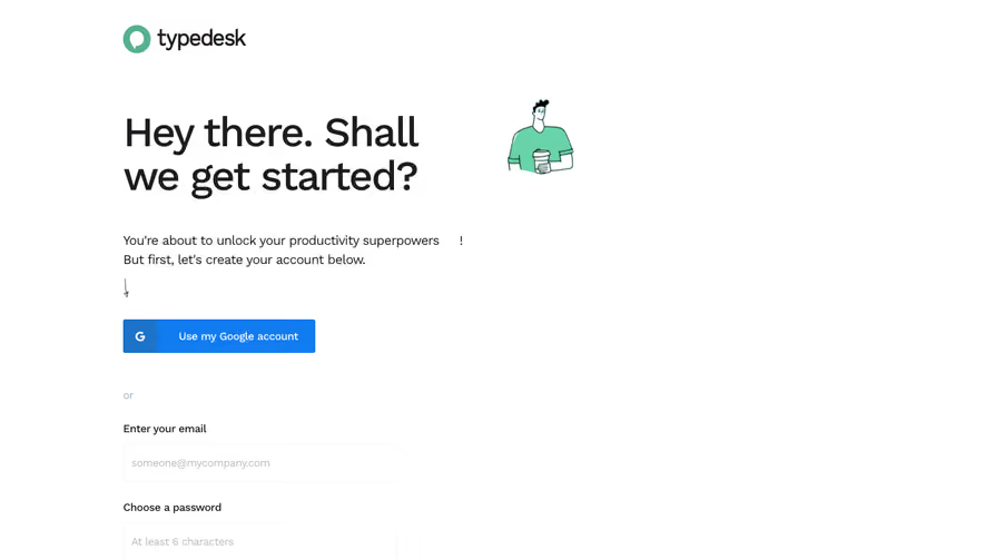
# Design from Reference: Typedesk Sign Up Flow
Create an original, high-fidelity visual design inspired by the reference. Prioritize composition, typography, colors, spacing, and component styling over technical implementation.
## Reference
- **Product:** Typedesk
- **Category:** Account Setup
- **Screenshot:** https://cdn.prod.website-files.com/5e9dc792e1210c5325f7ebbc/6acbc892d69dbc5db100923a_6acbc61c8fac5a614072372a_cms-0adc31c53094abedd7dee1cc.webp
Analyze the screenshot first. If inaccessible, request it rather than guessing.
## Content
{{content.instructions}}
{{content.data}}
Preserve essential messaging and factual accuracy. Adapt structure and copy length for visual balance; never invent product claims.
## Visual Design
### Overall aesthetic
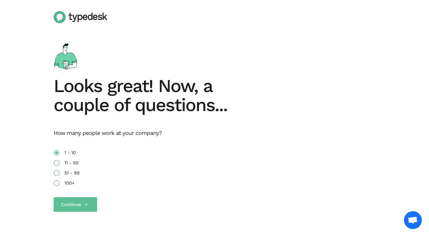
- **Style:** Friendly onboarding question with a white canvas, oversized dark headline and mint-green selection/action.
- **Scale:** Source 1440 × 789px; dimensions are screenshot pixels, CSS scale unverified.
### Page composition
- **Brand:** Typedesk logo sits near the upper-left content edge.
- **Question stack:** A small character illustration precedes a large two-line heading, company-size question, four radio choices and Continue.
- **Whitespace:** Content occupies the left-middle region with broad empty space right; blue chat floats lower right.
### Information hierarchy
- **Introduction:** Looks great! Now, a couple of questions... leads the screen.
- **Choice:** Company-size options are 1–10, 11–50, 51–99 and 100+, with the first selected.
- **Progression:** Continue is the only visible form action; no step count or back control is shown.
### Typography
- **Family:** Rounded sans-serif; exact font identity is unverified.
- **Roles:** Estimated headline 56px/62px medium, question 18px, options 14px and action 16px.
- **Alignment:** All content shares a left edge.
### Colors & surfaces
- **Sampled palette:** ICC-aware sRGB samples include white #FFFFFF, ink #1C1D1E, mint #5DBE93/#68D3A8 and chat blue #1972F5.
- **Treatment:** Flat white background without form card or shadow.
- **Selection:** Small mint center distinguishes the active radio.
### Components
- **Radio list:** Four compact rows with thin blue-gray circles and roughly 34px vertical spacing.
- **Action:** Mint rectangle around 145 × 50px, small corners, white Continue label and arrow.
- **Illustration:** Small outlined person holding a cup adds a human accent above the heading.
### Visual rhythm
- **Spacing:** Large gap separates headline and question; options are compact, followed by a clear action gap.
- **Balance:** Oversized typography anchors an otherwise sparse page.
### Responsive
- **Recommended adaptation:** Only desktop is observed. Reduce headline size and use consistent 24px mobile margins.
- **Controls:** Keep radio labels and touch areas readable without shrinking them.
### Adaptation guidance
- **Preserve:** Keep a single company-size question and clear selected state.
- **Adapt:** Use actual segmentation ranges and onboarding logic; do not infer later questions.
Use this context to reproduce the reference's visual language: layout, typography, colors, spacing, borders, radii, and distinctive elements. The screenshot takes priority if descriptions conflict.
## Direction
{{preferences.fidelityInstructions}}
## Output
{{output.instructions}}
Deliver a polished, cohesive design with precise alignment, hierarchy, and spacing. Produce the requested visual artifact, not just a description. If unsupported, explain the limitation.