Design with AI
Generate a new design based on this screen using your own content.
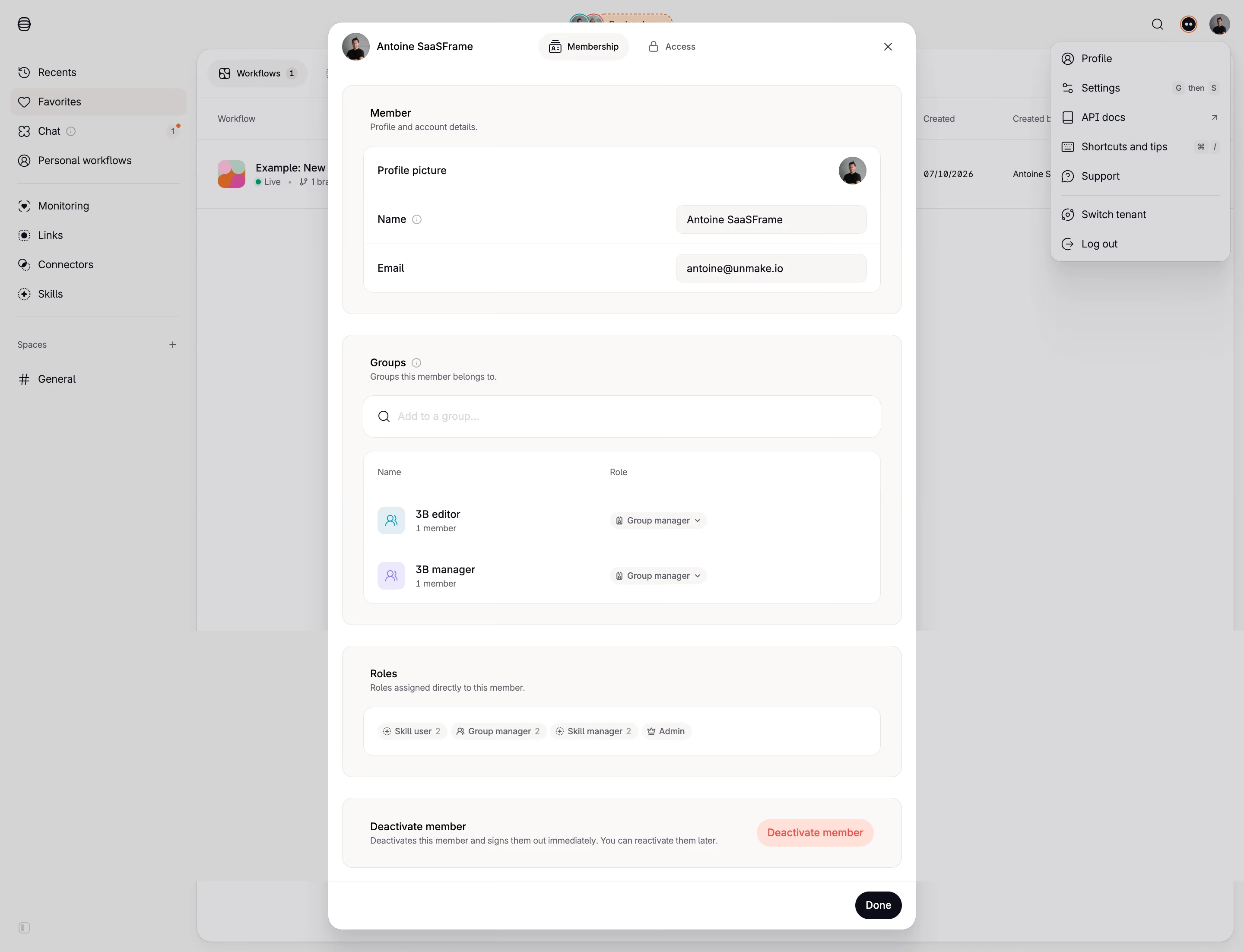
# Design from Reference: Tines Member Profile & Roles
Create an original, high-fidelity visual design inspired by the reference. Prioritize composition, typography, colors, spacing, and component styling over technical implementation.
## Reference
- **Product:** Tines
- **Category:** Settings
- **Screenshot:** https://cdn.prod.website-files.com/5e9dc792e1210c5325f7ebbc/6aca2625a3a034e38b3ee798_6aca22fc6b8182f1bf7495e6_cms-0e17529ba7ed366cc809b2bd.webp
Analyze the screenshot first. If inaccessible, request it rather than guessing.
## Content
{{content.instructions}}
{{content.data}}
Preserve essential messaging and factual accuracy. Adapt structure and copy length for visual balance; never invent product claims.
## Visual Design
### Overall aesthetic
- **Character:** A light membership-management dialog uses nested warm-neutral panels, white inner surfaces, fine borders, compact role chips, and a subdued destructive action.
- **Evidence:** The source is 2880 × 2204 px, inspected at 1400 px width. Dimensions below estimate a 1440 px CSS layout at 2× capture; ratio is unverified.
- **State:** A large modal overlays a dimmed workflow workspace, while an account menu remains visible at upper right.
### Page composition
- **Modal shell:** A centered tall white panel roughly 680 CSS px wide contains a header, four stacked settings groups, and bottom action bar.
- **Header:** Avatar/name sit left; Membership and Access tabs occupy the middle; close sits right.
- **Member group:** Profile picture, name, and email appear in three rows within a white inner panel.
- **Groups:** A search/add field precedes a two-row membership table with name and role columns.
- **Roles and deactivation:** Compact role chips occupy a separate panel; a final group pairs explanatory text with a pale-red deactivation control.
- **Background:** Navigation, workflow table, and account dropdown remain visible through the gray veil.
### Information hierarchy
- **Membership:** The selected tab and member identity establish context.
- **Group labels:** Bold section names and small descriptions introduce member details, groups, roles, and deactivation.
- **Values:** Labels align left and values or controls align right in the profile rows.
- **Completion:** A dark Done pill anchors the modal footer; destructive control is visually separate and lighter red.
### Typography
- **Family:** A clean sans serif is used; exact identity is unverified.
- **Section labels:** Approximately 13–14 CSS px semibold.
- **Values and rows:** Around 12–13 px with compact 18 px leading.
- **Helpers:** Approximately 10–11 px muted slate.
- **Tabs/chips:** Small text around 10–12 px, with role chips using compact labels and counts.
### Colors & surfaces
- **Measured palette:** Source samples include overlay gray #D8D8DA, white #FFFFFF, #D4D3D3, warm pale #FAF9F7, #F8F7F5, and #D7D7D9.
- **Semantic accents:** Pale cyan/purple group icons distinguish rows; red indicates deactivation; near-black marks Done.
- **Text:** Dark primary text and slate helper text create a restrained hierarchy.
- **Depth:** Rounded white modal and shadow separate the dialog from the dimmed workspace.
### Components
- **Shell:** Approximately 20 px corner radii with a narrow header and separated footer.
- **Outer groups:** Warm pale panels with 12–14 px radii, thin outlines, and roughly 24 px padding.
- **Profile rows:** White rounded inner table with horizontal rules and trailing value fields.
- **Group table:** Two rows pair colored square people icons, name/member count, and small role dropdown pills.
- **Role chips:** Pale neutral capsules with small icons and numerical counts.
- **Destructive action:** Pale-red pill with red label.
- **Done:** Small near-black pill, right-aligned at bottom.
### Visual rhythm
- **Nesting:** Repeated outer-group padding and inner white panels create clear containment.
- **Vertical spacing:** Roughly 24 px separates major groups; rows remain compact.
- **Alignment:** Labels and controls share consistent left/right columns.
- **Footer:** A thin divider separates the final commit/close action from settings content.
### Responsive
- **Observed limit:** Only desktop is visible; actual small-screen behavior is unverified.
- **Recommended fit:** Use a viewport-constrained dialog with internal scrolling and reachable footer.
- **Recommended rows:** Stack labels/values and wrap role chips when needed.
- **Recommended access:** Manage focus, label role dropdowns, and expose destructive consequences clearly.
### Adaptation guidance
- **Preserve:** Keep member identity, group membership, direct roles, and deactivation as distinct groups.
- **Implement:** Use accessible dialog/tabs, labeled fields, table headers, and named icon controls.
- **Privacy:** Substitute appropriate example identity data rather than copying personal values.
- **Validate:** Confirm fonts, CSS dimensions, scroll behavior, dropdown states, and confirmation flows. No membership change is shown.
Use this context to reproduce the reference's visual language: layout, typography, colors, spacing, borders, radii, and distinctive elements. The screenshot takes priority if descriptions conflict.
## Direction
{{preferences.fidelityInstructions}}
## Output
{{output.instructions}}
Deliver a polished, cohesive design with precise alignment, hierarchy, and spacing. Produce the requested visual artifact, not just a description. If unsupported, explain the limitation.