Design with AI
Generate a new design based on this screen using your own content.
# Design from Reference: The Org Create Job Offer
Create an original, high-fidelity visual design inspired by the reference. Prioritize composition, typography, colors, spacing, and component styling over technical implementation.
## Reference
- **Product:** The Org
- **Category:** Add & Edit
- **Screenshot:** https://cdn.prod.website-files.com/5e9dc792e1210c5325f7ebbc/6acbbc6e6325e7e23e4c95f8_6acbbbb5bdb014398c51f186_cms-252c946bf613edc477cc9392.webp
Analyze the screenshot first. If inaccessible, request it rather than guessing.
## Content
{{content.instructions}}
{{content.data}}
Preserve essential messaging and factual accuracy. Adapt structure and copy length for visual balance; never invent product claims.
## Visual Design
### Overall aesthetic
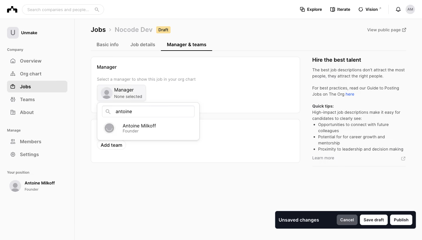
- **Style:** Restrained company-administration interface with a light canvas and clear modular form sections.
- **Visual character:** Neutral typography, thin outlines, small gray icons, and a prominent dark unsaved-changes bar.
- **Surface treatment:** White panels sit on a near-white workspace; a floating manager search popover adds subtle depth.
### Page composition
- **Screenshot size:** 1440 × 821 image px; capture-to-CSS scale is unverified. Dimensions below refer to screenshot pixels.
- **Shell:** Global header about 64 px tall and company sidebar approximately 255 px wide.
- **Page header:** Jobs breadcrumb, job title, yellow Draft badge, and public-page link above three tabs.
- **Main form:** Left column approximately 714 px wide; Manager section above a team-assignment panel.
- **Guidance:** Right column approximately 320 px wide contains hiring advice and short bullets.
- **Persistent actions:** Bottom-right dark bar holds Unsaved changes, Cancel, Save draft, and Publish.
### Information hierarchy
- **Active context:** Jobs navigation and Manager & teams tab are visibly selected.
- **Primary task:** Manager assignment is the first active form section; explanatory helper precedes the selector.
- **Open state:** Manager picker shows a search query and one matching person with Founder metadata.
- **Supporting task:** Add team appears in the section beneath.
- **Action hierarchy:** Save draft and Publish have high-contrast white buttons within the dark bar; Cancel is gray.
### Typography
- **Family:** Neutral proportional sans serif; exact family unverified.
- **Page title:** Approximately 22 screenshot px, weight 600–700, line-height 28 px.
- **Section titles:** Approximately 18 px, weight 600, line-height 24 px.
- **Navigation and controls:** Approximately 14–16 px; selected tabs use semibold dark text.
- **Helper and guidance:** Approximately 14 px with 20–22 px line-height; secondary copy is gray.
- **Precision:** Sizes and weights are visual estimates rather than extracted font metadata.
### Colors & surfaces
- **Workspace:** Sampled sRGB #FAFAFA.
- **Form/popover surfaces:** Sampled #FFFFFF.
- **Dark bar and emphasis:** Sampled #111421.
- **Borders:** Sampled #E5E5E5 and #E4E4E7.
- **Selected/subtle surface:** Sampled #F5F5F6.
- **Secondary text:** Sampled #53565E.
- **Local accents:** Yellow Draft badge and blue inline help link; these do not dominate the neutral form.
### Components
- **Form panels:** Thin neutral border, approximately 10 px corners, and roughly 20 px padding.
- **Manager selector:** Compact outlined tile with circular avatar, role label, and None selected secondary line.
- **Search popover:** Approximately 348 × 130 screenshot px, 10 px corners, white fill, and small shadow.
- **Popover contents:** Outlined search field with magnifier, followed by avatar/name/title result row.
- **Tabs:** Thin baseline with dark active underline.
- **Action bar:** Approximately 480 × 60 px, 6 px corners, and compact 36 px buttons.
- **Observed state:** Manager search is open; selection and publication outcomes are not shown.
### Visual rhythm
- **Alignment:** Breadcrumb, tabs, and form cards share the main content left edge.
- **Columns:** Approximately 40 px separates form and advice area.
- **Vertical rhythm:** About 20 px between form panels; compact spacing inside the manager control.
- **Whitespace:** Large unused lower workspace contrasts with the persistent bottom action group.
### Responsive
- **Observed version:** Desktop only.
- **Navigation recommendation:** Collapse company sidebar and simplify global header.
- **Form recommendation:** Place hiring guidance below editable sections on narrow screens.
- **Popover recommendation:** Keep search/result list within viewport width.
- **Actions recommendation:** Wrap or stack draft/publication actions while retaining clear labels.
### Adaptation guidance
- **Preserve:** Modular assignment panels, visible draft status, contextual advice, and explicit unsaved-change actions.
- **Starting dimensions:** Approximately 20 px card padding, 10 px card radius, and 36 px action height.
- **Content fidelity:** Use actual job, manager, team, and user data.
- **State fidelity:** Keep search suggestions separate from a committed manager selection.
- **Interaction fidelity:** Publishing behavior and save results are not demonstrated; implement according to the target workflow.
Use this context to reproduce the reference's visual language: layout, typography, colors, spacing, borders, radii, and distinctive elements. The screenshot takes priority if descriptions conflict.
## Direction
{{preferences.fidelityInstructions}}
## Output
{{output.instructions}}
Deliver a polished, cohesive design with precise alignment, hierarchy, and spacing. Produce the requested visual artifact, not just a description. If unsupported, explain the limitation.