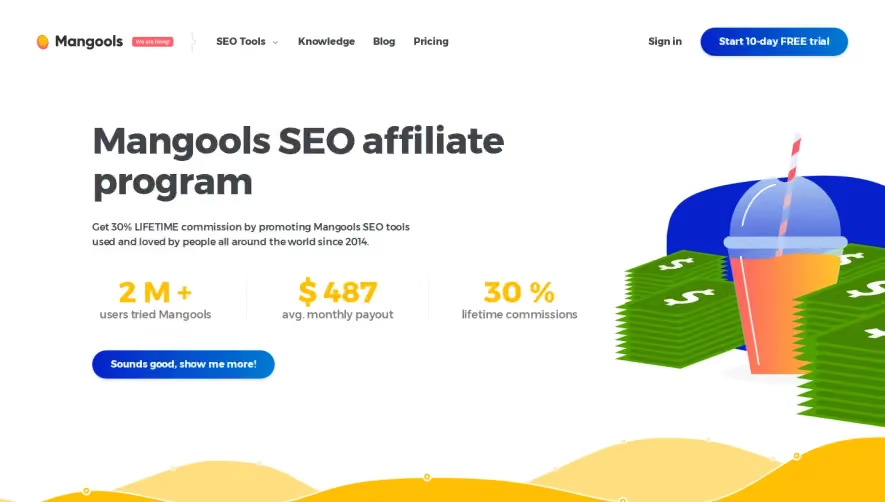
Generate a new design based on this screen using your own content.
Thank you! Your submission has been received!
Oops! Something went wrong while submitting the form.
# Design from Reference: Surfer SEO Affiliate Page
Create an original, high-fidelity visual design inspired by the reference. Prioritize composition, typography, colors, spacing, and component styling over technical implementation.
## Reference
- **Product:** Surfer SEO
- **Category:** Affiliate Page
- **Screenshot:** https://cdn.prod.website-files.com/5e9dc792e1210c5325f7ebbc/6acc0c3052f808a00f52b0b1_6acc0b84f82e9d26c7519b40_cms-b5355c760388a689ea0c0d79-optimized-v3.webp
Analyze the screenshot first. If inaccessible, request it rather than guessing.
## Content
{{content.instructions}}
{{content.data}}
Preserve essential messaging and factual accuracy. Adapt structure and copy length for visual balance; never invent product claims.
## Visual Design
Use this context to reproduce the reference's visual language: layout, typography, colors, spacing, borders, radii, and distinctive elements. The screenshot takes priority if descriptions conflict.
## Direction
{{preferences.fidelityInstructions}}
## Output
{{output.instructions}}
Deliver a polished, cohesive design with precise alignment, hierarchy, and spacing. Produce the requested visual artifact, not just a description. If unsupported, explain the limitation.
Surfer SEO’s affiliate program page showcases a sleek, modern aesthetic that’s both professional and energetic. A crisp white background keeps the interface clean, while vivid purple and gradient accents inject a sense of innovation and brand confidence. Subtle shadows, rounded card edges, and playful icons add a friendly yet authoritative character, striking a balance between trustworthiness and approachability.
Layout and Structure
The page unfolds with a visually-driven hero section, immediately making the offer clear with concise copy and a prominently styled CTA button. This transitions into clear, modular feature panels that outline the program’s benefits in digestible bites. Testimonials are scattered strategically, using real faces and short quotes to build credibility. The footer is informative and unobtrusive, echoing the overall minimalism.
Visual Elements
Custom illustrations and line-based icons support the text, making each section visually distinct and scannable. Soft, micro-animations enliven buttons and icons, reinforcing interactivity without distraction. Occasional use of avatar-style photos humanizes the offer, while animated transitions maintain user engagement as you scroll.
Color Palette and Typography
Key colors—deep purples, magenta gradients, and accent yellows—define the brand identity and highlight CTAs. Generous whitespace emphasizes hierarchy, while sans-serif fonts feel both modern and legible. Headlines pop with heavier weights and larger sizes, guiding the eye smoothly through the content.
User Experience Patterns & Unique Design Choices
Navigation is sticky and ultra-simple, ensuring constant access to core pages. CTAs are bold and repeated, increasing conversion opportunities. The sign-up form is shorthand and distraction-free, minimizing friction. Unique touches—like playful iconography and gradient-infused backgrounds—elevate the page, making the experience memorable and distinctively “Surfer.”