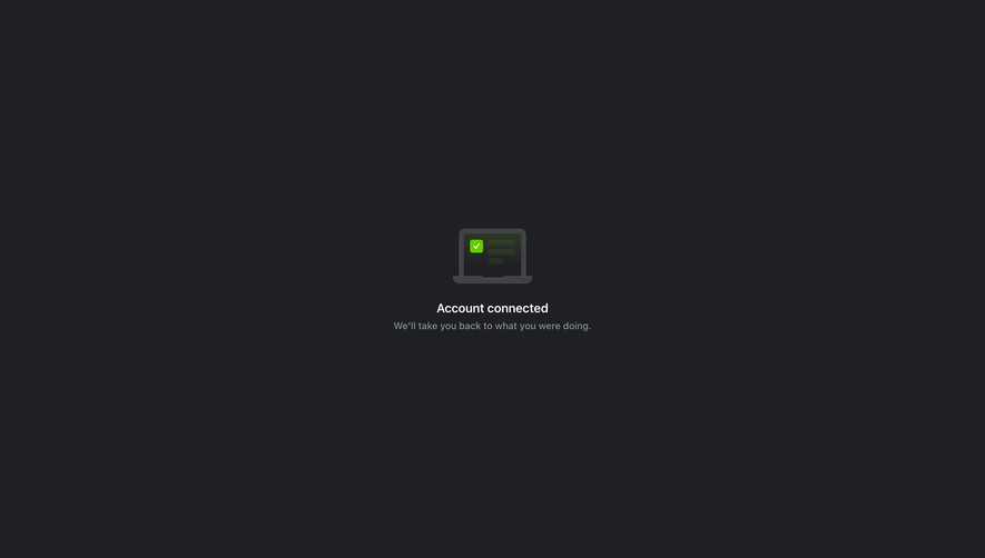
Design with AI
Generate a new design based on this screen using your own content.
# Design from Reference: Station Sign Up Flow
Create an original, high-fidelity visual design inspired by the reference. Prioritize composition, typography, colors, spacing, and component styling over technical implementation.
## Reference
- **Product:** Station
- **Category:** Success
- **Screenshot:** https://cdn.prod.website-files.com/5e9dc792e1210c5325f7ebbc/6acbc88cd69dbc5db100918a_6acbc610dccc599bece19839_cms-374928fb72e91f8b8a591bc1.webp
Analyze the screenshot first. If inaccessible, request it rather than guessing.
## Content
{{content.instructions}}
{{content.data}}
Preserve essential messaging and factual accuracy. Adapt structure and copy length for visual balance; never invent product claims.
## Visual Design
### Overall aesthetic
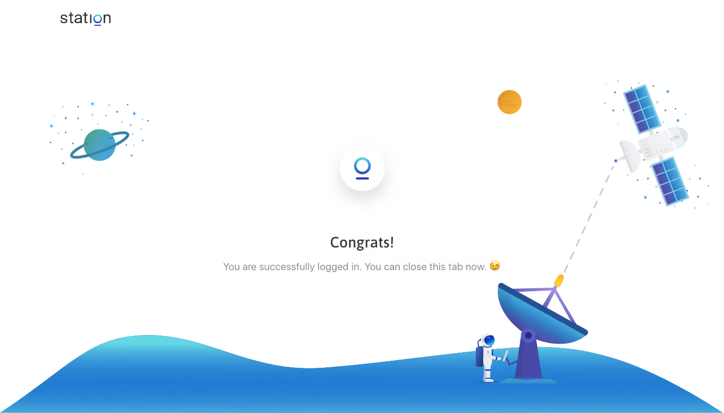
- **Style:** Sparse sign-in completion screen with playful space illustration.
- **Character:** White background, centered success message, small gradient logo, and blue illustrated scenery.
### Page composition
- **Canvas:** 1440 × 821 screenshot px.
- **Brand:** Wordmark at upper left.
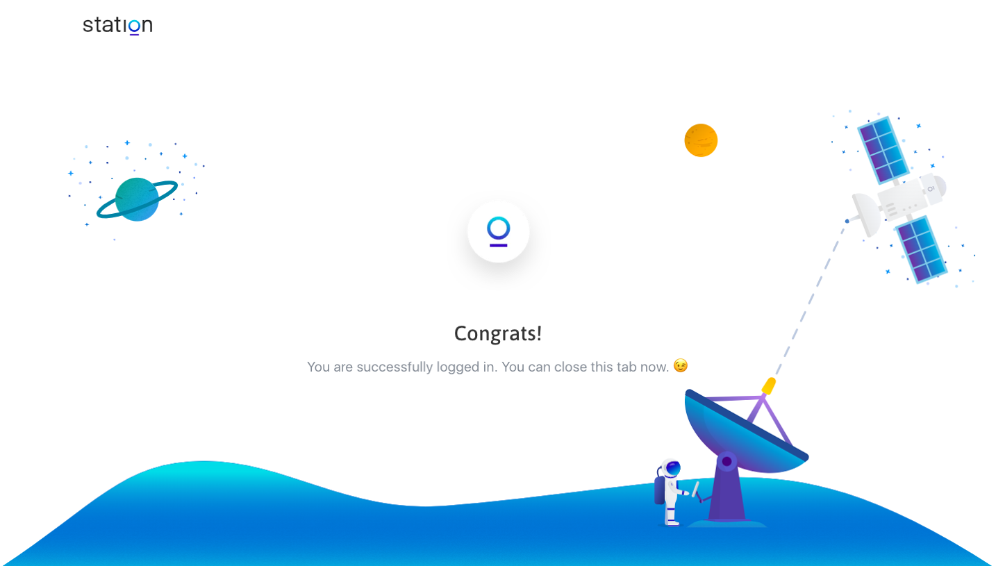
- **Success block:** Small circular icon above a centered heading and one-line completion message.
- **Illustration:** Planet at left, satellite at upper right, ground-station dish at lower right, and a blue wavy ground across the bottom.
- **Whitespace:** Most of the central canvas remains open.
### Information hierarchy
- **Primary:** Congrats! success heading.
- **Secondary:** Muted explanatory sentence telling the user the login succeeded and the tab can be closed.
- **Decoration:** Space imagery supports the completion state without adding another CTA.
### Typography
- **Family:** Friendly interface sans serif; exact family unverified.
- **Heading:** Approximately 28–30 screenshot px, medium weight.
- **Body:** Approximately 20px, regular weight, line-height around 28px.
- **Wordmark:** Approximately 28px.
- **Precision:** Font sizes are screenshot estimates; original CSS scale is unverified.
### Colors & surfaces
- **Canvas:** #FFFFFF.
- **Illustration blues:** Dominant sampled shades around #237CD2, #237DD3, and #247DD2.
- **Heading:** Dark neutral gray.
- **Secondary copy:** Muted blue-gray.
- **Art accents:** Cyan, violet, and warm yellow appear in the space objects.
- **Logo:** Cyan-to-indigo gradient; no single flat color describes it.
- **Precision:** Most sampled blue pixels belong to gradient artwork, not interface tokens.
### Components
- **Success icon:** White circular tile approximately 88px across, with soft shadow and centered product mark.
- **Heading:** Short centered line.
- **Body:** One line with a small celebratory emoji.
- **Illustration:** Flat/gradient vector-like space scene with dashed communication path.
- **Actions:** No visible form or primary button in this captured completion state.
### Visual rhythm
- **Vertical rhythm:** Icon, large gap, heading, then smaller gap to explanatory text.
- **Balance:** Left planet and right satellite counterweight the centered status.
- **Ground:** Broad wave anchors the lower edge while preserving central whitespace.
### Responsive
- **Observed:** Desktop only.
- **Recommendation:** Keep the success block centered, allow the message to wrap, and crop decorative scenery at edges.
- **Priority:** Ensure the heading and completion instruction remain visible above the illustration.
### Adaptation guidance
- **Preserve:** Simple completion hierarchy and generous breathing room.
- **Content:** Adapt the success instruction to the actual sign-in flow.
- **State fidelity:** This frame is completion feedback, not a full signup form.
- **Decoration:** Reuse a consistent illustration style and avoid adding unnecessary actions.
Use this context to reproduce the reference's visual language: layout, typography, colors, spacing, borders, radii, and distinctive elements. The screenshot takes priority if descriptions conflict.
## Direction
{{preferences.fidelityInstructions}}
## Output
{{output.instructions}}
Deliver a polished, cohesive design with precise alignment, hierarchy, and spacing. Produce the requested visual artifact, not just a description. If unsupported, explain the limitation.