Design with AI
Generate a new design based on this screen using your own content.
# Design from Reference: Sprout Social Sign Up Flow
Create an original, high-fidelity visual design inspired by the reference. Prioritize composition, typography, colors, spacing, and component styling over technical implementation.
## Reference
- **Product:** Sprout Social
- **Category:** Account Setup
- **Screenshot:** https://cdn.prod.website-files.com/5e9dc792e1210c5325f7ebbc/6acbc897d69dbc5db10092c5_6acbc624ceb0f22248304b14_cms-c2e83693a169836aa218c61e.webp
Analyze the screenshot first. If inaccessible, request it rather than guessing.
## Content
{{content.instructions}}
{{content.data}}
Preserve essential messaging and factual accuracy. Adapt structure and copy length for visual balance; never invent product claims.
## Visual Design
### Overall aesthetic
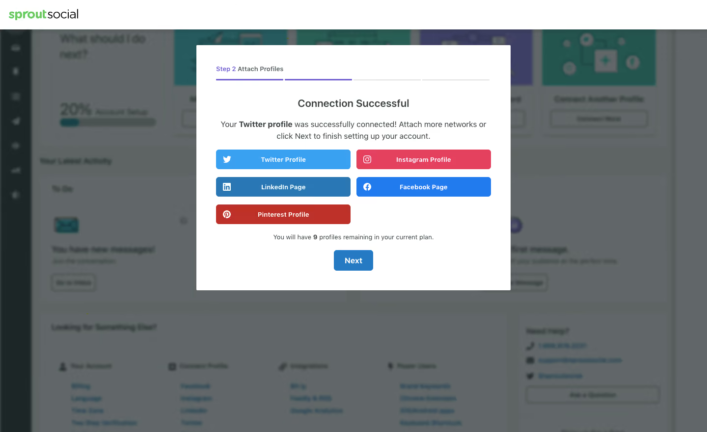
- **Style:** Social-profile connection success modal over a blurred/dimmed onboarding dashboard.
- **Character:** White rectangular panel, compact progress strip, centered confirmation copy, and brightly color-coded network actions.
- **Focus:** Confirmation and optional additional connections are grouped before a single Next action.
### Page composition
- **Capture and scale:** 1440 × 881 image px. CSS estimates assume approximately 1× capture; scale is unverified.
- **Header:** White brand strip above the dimmed application.
- **Dialog:** Approximately 640 × 500px, centered horizontally near the upper-middle.
- **Progress:** Step 2 Attach Profiles label and four-part horizontal line across the top.
- **Confirmation:** Centered success heading and two-line description.
- **Network grid:** Five actions in two columns, leaving the final lower-right position empty.
- **Footer:** Remaining-profile sentence and centered blue Next button.
### Information hierarchy
- **Step context:** Small step label precedes the success message.
- **Success:** Connection Successful is the primary dialog heading.
- **Connected network:** Bold network name appears within the explanation.
- **Additional choices:** Five colored network buttons invite further setup.
- **Progression:** Next is isolated below the remaining-profile message.
- **State fidelity:** The screen reports a connection success; no connection was performed during this description task.
### Typography
- **Family:** Neutral sans serif; exact identity is unverified.
- **Success heading:** Approximately 22px semibold.
- **Body:** Approximately 16px with 24px line-height.
- **Step / network labels:** Approximately 14px semibold.
- **Remaining count:** Approximately 13–14px regular, with count emphasized.
- **Next:** Approximately 16px bold.
- **Precision:** CSS sizes and weights are visual estimates.
### Colors & surfaces
- **Dialog:** Sampled #FFFFFF.
- **Backdrop composite:** Sampled #616768 and #5D6464.
- **Dark text:** Sampled #1B2626.
- **Twitter action:** Sampled #3AA1F2.
- **LinkedIn action:** Sampled #2977B5.
- **Facebook action:** Sampled #217BEE.
- **Instagram action:** Sampled #E4415F.
- **Pinterest action:** Sampled #BE3128.
- **Next blue:** Sampled #2679C3.
- **Progress violet:** Sampled #6F5ED3.
### Components
- **Modal shell:** White fill, nearly square 2–3px corners, about 40px padding.
- **Progress line:** Four thin segments; first two violet and final two pale gray.
- **Network actions:** Approximately 274 × 40px with 5px radius, white platform icon left, and centered bold label.
- **Grid spacing:** About 12px between columns and 16px between rows.
- **Next action:** Approximately 80 × 42px, blue fill, white label, and 6px radius.
- **State limits:** No network authorization chooser, error, or later setup step is shown.
### Visual rhythm
- **Centering:** Heading, explanation, remaining-count line, and Next share a central axis.
- **Grid regularity:** Equal network actions provide consistent comparison despite distinct colors.
- **Vertical spacing:** Progress/header group, confirmation, network grid, and footer form clear bands.
- **Backdrop restraint:** Blurred dashboard remains contextual rather than readable detail.
### Responsive
- **Observed state:** Desktop only; mobile behavior is unverified.
- **Dialog recommendation:** Use viewport gutters and allow vertical scrolling.
- **Grid recommendation:** Stack network actions on narrow screens.
- **Progress recommendation:** Retain readable step text alongside the segmented line.
- **Accessibility recommendation:** Use labeled buttons and text confirmation beyond color.
### Adaptation guidance
- **Preserve:** Explicit success message, optional additional-network choices, visible setup progress, and single continuation action.
- **Starting geometry:** Approximately 640px dialog, 40px padding, 40px network actions, and 42px Next under the unverified 1× assumption.
- **State modeling:** Populate connected network and plan capacity from real account state.
- **Brand fidelity:** Use approved platform names/icons/colors appropriate to the actual product.
- **Implementation recommendation:** Provide accessible authorization feedback and deliberate navigation; static pixels do not establish connection behavior.
Use this context to reproduce the reference's visual language: layout, typography, colors, spacing, borders, radii, and distinctive elements. The screenshot takes priority if descriptions conflict.
## Direction
{{preferences.fidelityInstructions}}
## Output
{{output.instructions}}
Deliver a polished, cohesive design with precise alignment, hierarchy, and spacing. Produce the requested visual artifact, not just a description. If unsupported, explain the limitation.