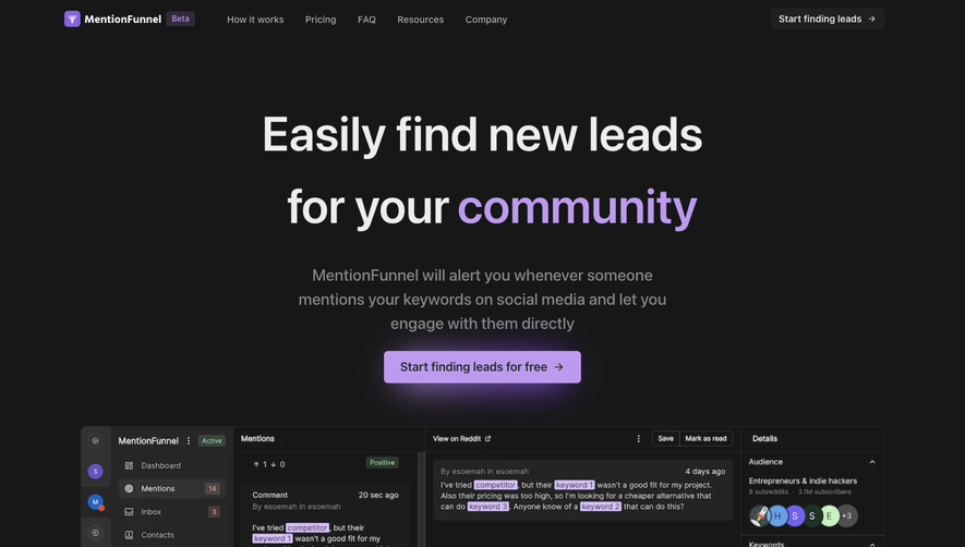
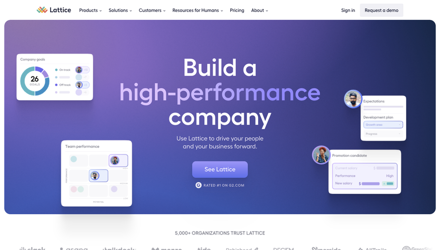
Overall Style and Aesthetic
Speakeasy.com exudes a confident, modern minimalism that feels professional yet accessible. The deliberate use of whitespace and crisp lines fosters a calm, clutter-free interface, allowing key content to take center stage. The mood strikes a balance between trustworthy and innovative, projecting technical sophistication without alienating newcomers. Layout and Structure
The layout is anchored by a powerful hero section with succinct, value-driven messaging paired with a single, attention-grabbing call-to-action button. Sequential sections guide visitors through product benefits, interactive feature highlights, and social proof via recognizable brand logos rather than lengthy testimonials. Pricing and onboarding details are visible without excessive scrolling, streamlining the path to conversion. The persistent header and well-composed footer offer straightforward navigation and quick access to essential pages. Visual Elements
Speakeasy employs custom vector illustrations and subtle micro-animations to convey abstract technical concepts in a friendly, digestible manner. Bold, geometric icons reinforce product features, while smooth transition effects and a few micro-interactions add sophistication. The absence of busy stock photography keeps the focus on the UI and product value. Color Palette and Typography
A deep, saturated aquatic blue dominates the interface, punctuated by soft gradients and energetic accent hues (like teal and violet) for CTAs and highlights. The typography is tech-forward yet highly legible, with a clear hierarchy: bold sans-serifs for headings and clean, understated body text that aids scannability. User Experience Patterns & Notable Choices
Speakeasy employs sticky navigation, prominent CTAs, and frictionless forms, ensuring momentum from landing to sign-up. Notably, the hero’s dynamic illustration and interactive feature cards encourage engagement. This site is an exemplar of SaaS clarity—inviting, thoroughly modern, and visually cohesive.