Design with AI
Generate a new design based on this screen using your own content.
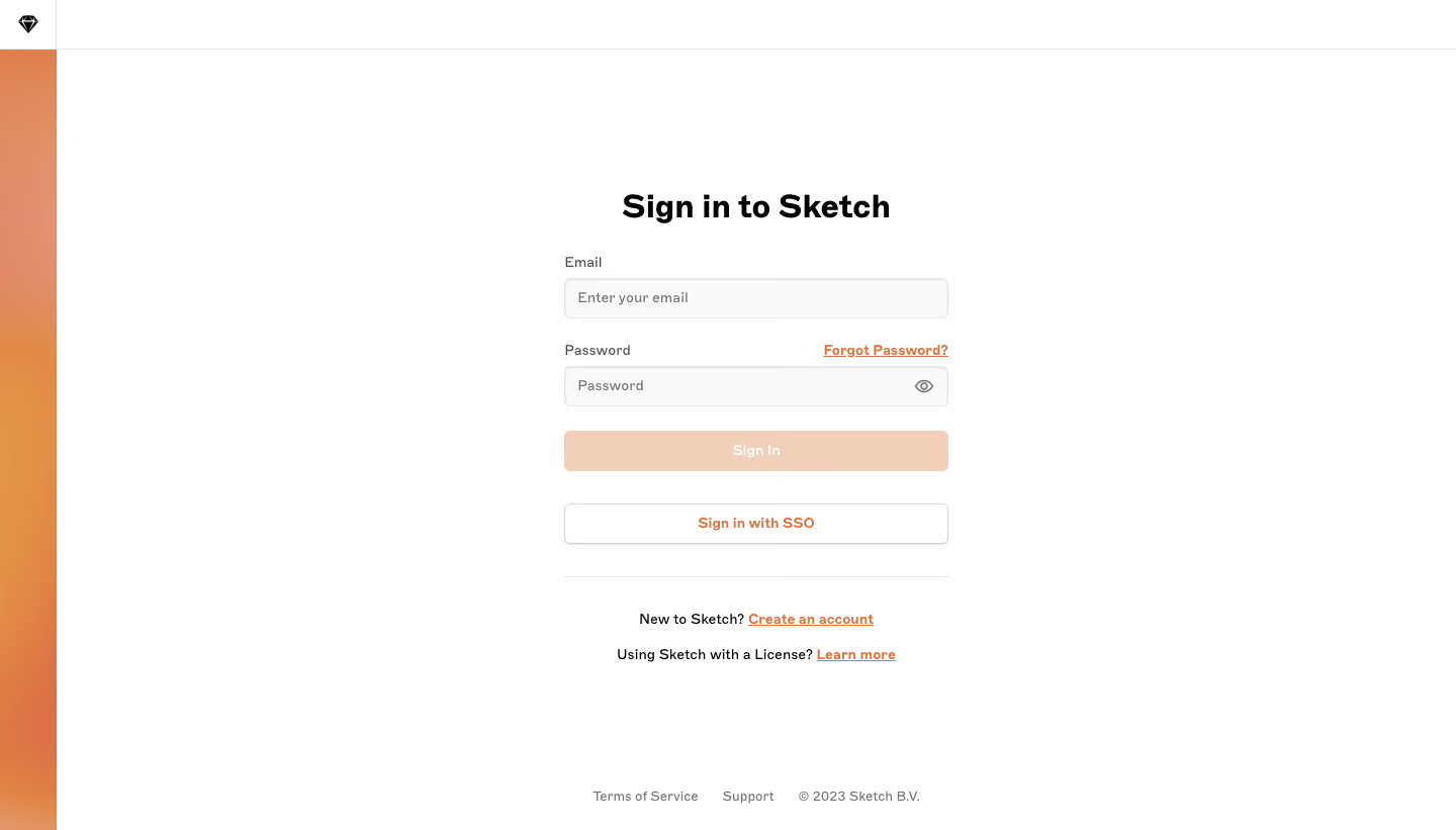
# Design from Reference: Sketch Login
Create an original, high-fidelity visual design inspired by the reference. Prioritize composition, typography, colors, spacing, and component styling over technical implementation.
## Reference
- **Product:** Sketch
- **Category:** Login
- **Screenshot:** https://cdn.prod.website-files.com/5e9dc792e1210c5325f7ebbc/6acb6df10e8221f130836683_6acb6bdfb5df5d2dd4cf9907_cms-e1a4cf91466c67af5c7e449a.webp
Analyze the screenshot first. If inaccessible, request it rather than guessing.
## Content
{{content.instructions}}
{{content.data}}
Preserve essential messaging and factual accuracy. Adapt structure and copy length for visual balance; never invent product claims.
## Visual Design
### Overall aesthetic
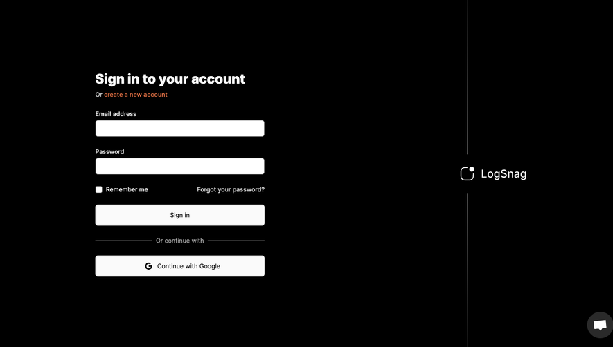
- **Character:** A minimal login screen with a narrow orange gradient rail, white canvas and compact centered form.
- **Evidence scale:** Original 1440 × 821 pixels. Dimensions are image-pixel estimates; CSS scale is unverified.
### Page composition
- **Frame:** Approximately 56 px left rail with small diamond mark at top; thin horizontal rule spans the page header.
- **Form:** Roughly 380 px column centered in the remaining canvas, beginning around y190.
- **Order:** Heading, email, password with recovery link, sign-in action, SSO action, divider and two account/license prompts.
- **Footer:** Terms, support and copyright sit in one small centered row near the bottom.
### Information hierarchy
- **Heading:** Bold sign-in title leads.
- **Fields:** Explicit labels sit above inputs; password recovery aligns right on the password-label row.
- **Actions:** Pale-peach Sign In appears low-emphasis; white outlined SSO follows.
- **Secondary:** Orange underlined account/license links sit below the divider.
- **State:** Fields are empty; functional disabled state is unverified.
### Typography
- **Heading:** Unverified sans-serif around 32 px bold, 40 px line height.
- **Labels/inputs:** Approximately 14 px regular/medium.
- **Buttons:** Around 14 px semibold.
- **Prompts:** Approximately 14 px regular with stronger linked phrases.
- **Footer:** Around 12 px muted gray.
### Colors & surfaces
- **Base:** White #FFFFFF.
- **Fields:** Near-white #FAFAFA with pale #E6E6E6 borders.
- **Action:** Pale peach #F1CFB9 sign-in fill.
- **Accent:** Orange gradient rail and orange link family, including sampled #E39046/#E39346 artwork tones.
- **Text:** Black #000000 heading and dark-gray labels.
### Components
- **Inputs:** Approximately 380 × 40 px, 5 px radii, thin borders and light inset/shadow edges.
- **Password utility:** Small eye icon at trailing edge.
- **Sign-in button:** Matching full-width 40 px pale-peach rectangle with white label.
- **SSO:** White outlined 40 px button with orange text and subtle shadow.
- **Divider:** Thin gray rule above account/license prompts.
- **Brand rail:** Full-height warm gradient below the small white logo cell.
### Visual rhythm
- **Field spacing:** Roughly 24 px separates field groups.
- **Action spacing:** About 24 px before Sign In and 32 px before SSO.
- **Prompts:** Two centered lines use around 20 px separation.
- **Whitespace:** Broad empty margins keep the form uncluttered.
### Responsive
- **Observed limit:** Desktop only; mobile login behavior is unverified.
- **Recommendation:** Reduce decorative rail width and make the form fluid within 20–24 px gutters.
- **Short viewport:** Allow vertical scrolling while retaining visible footer links.
### Adaptation guidance
- **Retain:** Offer a clear password path and separate SSO option with quiet recovery/account links.
- **Implement:** Use consistent input/button widths and warm orange accents.
- **Verify:** Confirm fonts, scale, validation and enabled states separately; no login was attempted.
Use this context to reproduce the reference's visual language: layout, typography, colors, spacing, borders, radii, and distinctive elements. The screenshot takes priority if descriptions conflict.
## Direction
{{preferences.fidelityInstructions}}
## Output
{{output.instructions}}
Deliver a polished, cohesive design with precise alignment, hierarchy, and spacing. Produce the requested visual artifact, not just a description. If unsupported, explain the limitation.