Overall Style and Aesthetic
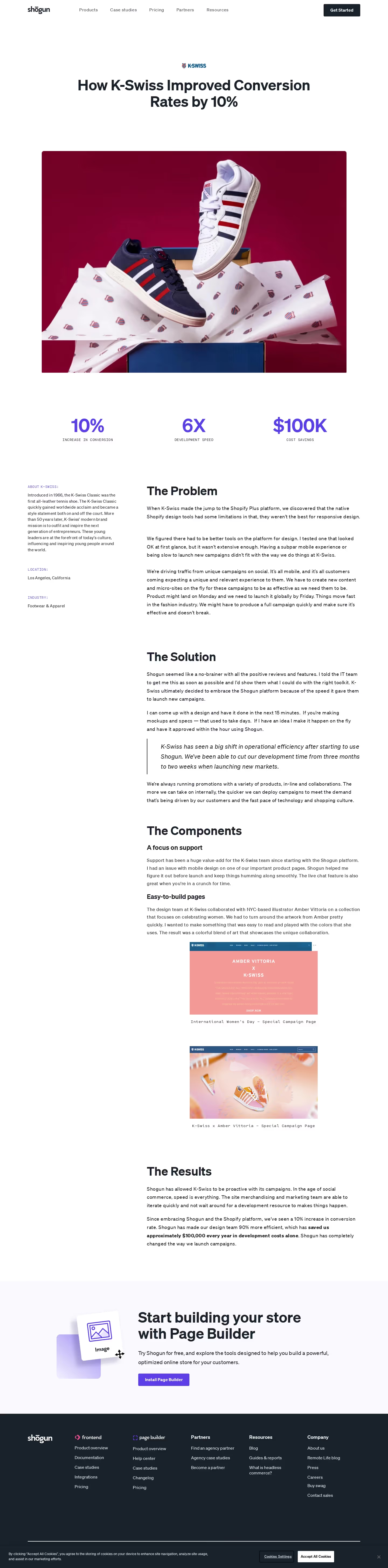
GetShogun’s K-Swiss case study page embraces a clean, professional aesthetic that feels both modern and inviting. The minimalist design is elevated by crisp whitespace, bold product imagery, and concise copy, yielding a polished, trustworthy impression. Visuals are prioritized over heavy text, showcasing the SaaS product in a striking but accessible way that inspires confidence. Layout and Structure
The layout leads with an engaging hero section: a full-width banner featuring the K-Swiss logo, headline, and a lush product photo, immediately communicating the story. Content is broken into digestible sections—client background, challenges, results, and key features—each mastering visual hierarchy with ample breathing room. Subtle testimonials, a summary sidebar, and sticky CTAs create intuitive focal points that keep visitors oriented and engaged. Visual Elements
Photography steals the spotlight here, leveraging high-quality lifestyle and product shots that add authenticity and sophistication. Discreet iconography supports key messages without clutter. Occasional on-scroll animations draw attention to stats and milestones, adding a dynamic touch that never overwhelms the overall calm. Color Palette and Typography
A restrained color palette—dominated by whites and grays with pops of K-Swiss’s brand blue and red—builds visual unity while allowing CTAs and key information to “pop.” Clear, modern sans-serif typography delivers crisp legibility; headings use generous sizing and bold weights for scannability, while body copy remains light and readable. User Experience Patterns
Navigation is sticky and intuitive, with a clean top-bar and streamlined page anchors. Prominent call-to-action buttons are consistent and inviting. Smooth scrolling and logical content progression keep users engaged. Interactive elements, like video embeds or quick-glance fact boxes, provide succinct, actionable insights. Unique or Notable Design Choices
The case study uses real-world photography and brand integration in a masterfully subtle way, ensuring the SaaS platform’s value is always front and center. The absence of overwhelming graphics enables the story—and the client’s success—to take precedence, creating a uniquely user-centric showcase that feels genuinely collaborative and results-driven.