
Thank you! Your submission has been received!
Oops! Something went wrong while submitting the form.
Get SaaSFrame Pro
Monthly
$18
Quarterly
$48
Yearly
$180
Upgrade to access this feature
Browse all screens & flows
Filter and search screens & flows
Access Figma files
Access mobile versions
Bookmark screens & flows
Join now
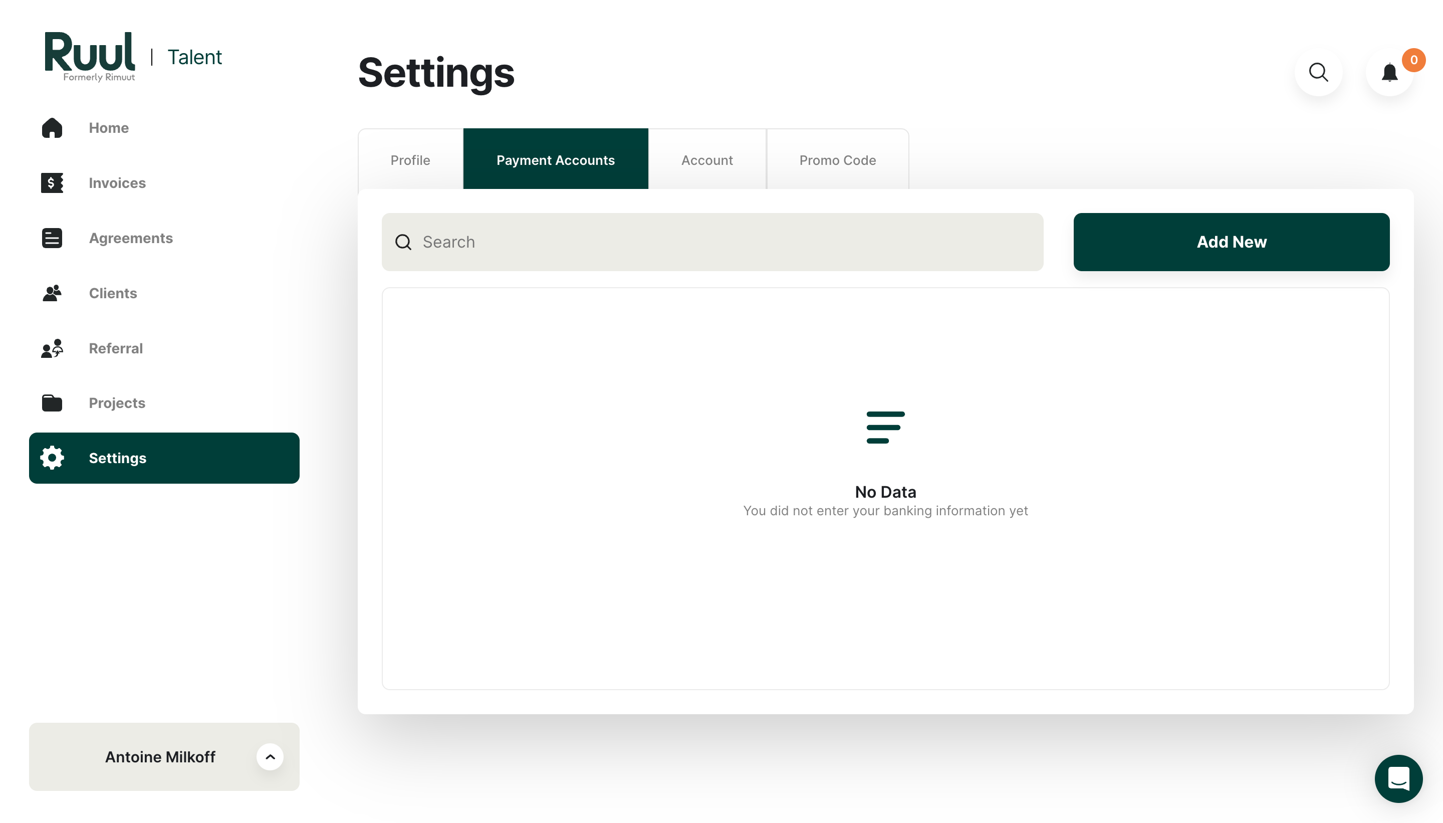
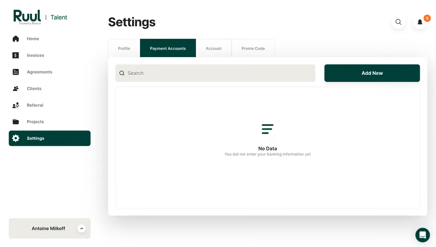
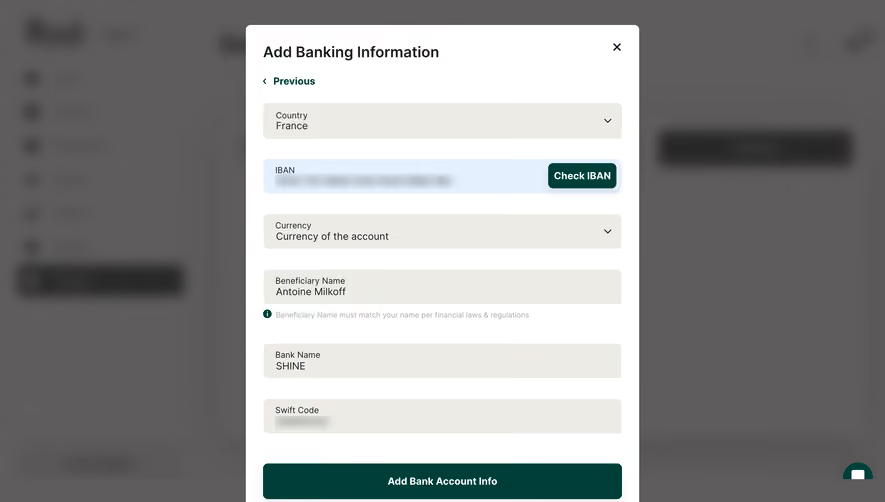
Ruul Add Banking Information

Ruul
Worktech Solutions for Modern and Global Work
Designed by
No items found.

Bookmark
Bookmark

Design with AI
Thank you! Your submission has been received!
Oops! Something went wrong while submitting the form.
# Design from Reference: Ruul Add Banking Information
Create an original, high-fidelity visual design inspired by the reference. Prioritize composition, typography, colors, spacing, and component styling over technical implementation.
## Reference
- **Product:** Ruul
- **Category:** Add & Edit
- **Screenshot:** https://cdn.prod.website-files.com/5e9dc792e1210c5325f7ebbc/6acb6d88b206c0d3f8f39f82_6acb6b9418ad202d01d8b046_cms-c7ead5ae79777a79dc997ed5.webp
Analyze the screenshot first. If inaccessible, request it rather than guessing.
## Content
{{content.instructions}}
{{content.data}}
Preserve essential messaging and factual accuracy. Adapt structure and copy length for visual balance; never invent product claims.
## Visual Design
### Overall aesthetic
- **Style:** Light financial/freelancer administration screen with a deep-green navigation accent and a prominent white payment-accounts panel.
- **Character:** Bold black page title, muted sidebar labels, warm gray controls and generous whitespace. Strong soft shadows give the main panel more depth than the surrounding navigation.
- **Captured state:** Payment Accounts is selected and the content area is empty. The screenshot shows the starting point for adding banking information, not an open banking form.
### Page composition
- **Capture scale:** 2880 × 1642 image px. CSS estimates assume an unverified 2× capture, corresponding to approximately 1440 × 821 CSS px.
- **Sidebar:** Approximately 320 CSS px wide. Ruul/Talent branding sits at the top, seven icon-led navigation items follow, and a pale account selector sits near the bottom.
- **Page heading:** Settings begins around x=357, y=55 CSS px, with two circular utility controls at the far upper right.
- **Tab strip:** Four horizontal tabs sit below the title. Payment Accounts uses a dark-green fill while Profile, Account and Promo Code remain white.
- **Main panel:** A broad white rounded surface begins just below/overlapping the tab strip and extends nearly to the right viewport edge.
- **Panel toolbar:** A wide warm-gray search field occupies the left two-thirds, with a large green Add New button on the right.
- **Empty content:** A thin outlined inner rectangle spans almost the full panel. A small green stacked-line symbol, No Data title and gray explanatory sentence are centered inside it.
- **Floating assistance:** A dark-green circular chat control sits near the bottom-right corner, outside the main panel.
### Information hierarchy
- **Primary location:** The bold Settings title, active sidebar item and selected Payment Accounts tab reinforce the current position.
- **Primary action:** Add New is the strongest action within the panel and the only visible route to create a payment account.
- **Empty-state hierarchy:** Small icon, bold No Data label and one explanatory line communicate the absence of banking information without a table skeleton.
- **Secondary utility:** Search and notification controls sit apart from the payment-account content. A small orange notification badge shows zero.
- **Evidence limit:** No bank fields, account types, validation messages or completed accounts are visible.
### Typography
- **Family:** Neutral sans serif, with heavier weights used for title and primary actions. Exact family is unverified.
- **Page title:** Approximately 40 px, bold around 700, with 46–48 px leading.
- **Sidebar labels:** Approximately 14 px semibold, muted except for the selected white-on-green item.
- **Tabs:** Approximately 13–14 px, medium weight; selected tab uses white text.
- **Toolbar:** Search text around 16 px; Add New around 16 px bold.
- **Empty state:** Title approximately 16–18 px medium/semibold; supporting sentence around 14 px in gray.
- **Measurement qualification:** Sizes and weights are visual CSS estimates under the assumed 2× capture.
### Colors & surfaces
- **Canvas and panel:** Sampled sRGB #FFFFFF supplies the page and panel interiors.
- **Primary green:** Sampled #003F39 supplies the selected navigation, active tab, main action and green empty-state mark.
- **Warm neutral:** Sampled #ECECE5 supplies the search field and lower account-selector surface.
- **Neutral text:** The title and stronger labels appear charcoal; secondary navigation and empty-state explanation are visibly gray. Exact text hex values are not established by the dominant-color sample.
- **Borders:** Very pale neutral outlines frame tabs and the inner empty region without strong contrast.
- **Accent detail:** A small orange notification badge is the only conspicuous warm status accent.
### Components
- **Selected sidebar row:** Approximately 270 × 52 CSS px with 7–8 px corner radii, green fill, white gear icon and bold white label.
- **Navigation icons:** Simple filled dark symbols, roughly 20–24 px, aligned in a stable leading column.
- **Tabs:** Boxed rectangular controls around 60 px high. The active payment tab is wider to fit its label; thin vertical borders separate inactive items.
- **Main panel:** Approximately 1050 × 525 CSS px, modest 8–10 px radii and a broad soft gray shadow extending below.
- **Search field:** Approximately 660 × 58 CSS px, warm-gray fill, magnifier at left and small-radius corners.
- **Add New button:** Approximately 315 × 58 CSS px, green fill, white bold label and matching small radius.
- **Inner region:** White outlined rectangle, approximately 1000 × 400 CSS px, with lightly rounded corners.
- **Account selector:** Wide warm-gray rounded block at the sidebar bottom, centered name and a small white circular chevron control at right.
- **Utility controls:** White circular search/notification buttons with subtle shadows; the chat launcher uses green fill and a white speech symbol.
### Visual rhythm
- **Hierarchy through depth:** Flat sidebar and tabs contrast with the elevated content panel.
- **Spacing:** Large title-to-content and sidebar gaps keep the page calm; toolbar controls use a tighter shared baseline.
- **Alignment:** Main title, tabs and panel share an approximate left edge; search and empty region share a consistent panel inset.
- **Empty-state focus:** Broad white space around the centered symbol and message makes the Add New route easy to discover.
### Responsive
- **Evidence limit:** Only desktop is visible; the following are recommendations.
- **Navigation recommendation:** Collapse the sidebar to a drawer and preserve a clear Settings location indicator.
- **Tabs recommendation:** Allow the tab strip to scroll or wrap without truncating Payment Accounts.
- **Toolbar recommendation:** Stack Search and Add New on narrow screens, keeping the action clearly accessible.
- **Panel recommendation:** Reduce outer margins and shadow spread; keep the empty-state explanation readable with natural wrapping.
- **Touch recommendation:** Maintain at least 44 px effective targets for utility icons and account controls.
### Adaptation guidance
- **Preserve the empty-state pattern:** Explain what is missing and provide one clear creation action.
- **Use accurate terminology:** Replace payment-account labels with the target workflow's real entities and avoid showing nonexistent banking details.
- **Retain the palette roles:** Use one deep brand color for active navigation and main actions, warm neutrals for search/account surfaces and white for content.
- **Match complexity:** Add table columns or form fields only when actual data or workflow requirements demand them.
- **Accessibility recommendation:** Label search and icon actions, expose active navigation/tab state and provide useful creation feedback. These behaviors are not verified by the screenshot.
Use this context to reproduce the reference's visual language: layout, typography, colors, spacing, borders, radii, and distinctive elements. The screenshot takes priority if descriptions conflict.
## Direction
{{preferences.fidelityInstructions}}
## Output
{{output.instructions}}
Deliver a polished, cohesive design with precise alignment, hierarchy, and spacing. Produce the requested visual artifact, not just a description. If unsupported, explain the limitation.


Category
Patterns



Added on
May 3, 2023
Found in 1 flow



Similar screens



Upgrade to SaaSFrame Pro now to see similar examples.
Monthly
$18 /month
Billed $18 monthly
Browse all screens & flows
Filter and search screens & flows
Search text in screenshots
Access Figma files
Access mobile versions
Join now
Quarterly
$16 /month
Billed $48 quarterly
Browse all screens & flows
Filter and search screens & flows
Search text in screenshots
Access Figma files
Access mobile versions
Join now
Yearly
$15 /month
Billed $180 yearly
Browse all screens & flows
Filter and search screens & flows
Search text in screenshots
Access Figma files
Access mobile versions
Join now