
Thank you! Your submission has been received!
Oops! Something went wrong while submitting the form.
Get SaaSFrame Pro
Monthly
$18
Quarterly
$48
Yearly
$180
Upgrade to access this feature
Browse all screens & flows
Filter and search screens & flows
Access Figma files
Access mobile versions
Bookmark screens & flows
Join now
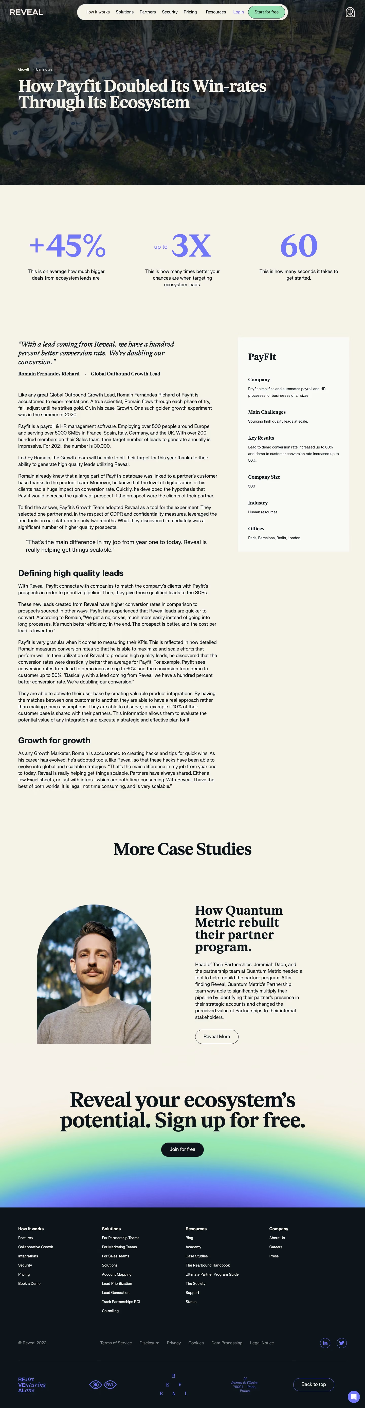

Reveal Customer Stories

Reveal
Partnership, Growth, and Sales Ecosystem Solution
Designed by
No items found.

Bookmark
Bookmark

Design with AI
Thank you! Your submission has been received!
Oops! Something went wrong while submitting the form.
# Design from Reference: Reveal Customer Stories
Create an original, high-fidelity visual design inspired by the reference. Prioritize composition, typography, colors, spacing, and component styling over technical implementation.
## Reference
- **Product:** Reveal
- **Category:** Customer Stories
- **Screenshot:** https://cdn.prod.website-files.com/5e9dc792e1210c5325f7ebbc/6acbbe39476aea3982e3fa4c_6acbbd653a787595fbdced16_cms-e493c4eab9f4b5c8090a4c1e.webp
Analyze the screenshot first. If inaccessible, request it rather than guessing.
## Content
{{content.instructions}}
{{content.data}}
Preserve essential messaging and factual accuracy. Adapt structure and copy length for visual balance; never invent product claims.
## Visual Design
### Overall aesthetic
- **Character:** An editorial customer case study combines a dark photographic hero, warm cream reading surface, lavender statistics and a dark footer.
- **Capture evidence:** The screenshot measures 1440 × 5554 pixels and was inspected in four portions through the bottom controls. Dimensions are approximate image pixels; near-1× CSS scale is estimated.
- **Tone:** Large serif headlines, broad spacing and soft gradient accents give a polished publication-like feel.
### Page composition
- **Hero navigation:** A white brand sits upper left, a cream capsule navigation floats across the center and a small outlined brand symbol sits right.
- **Hero title:** A full-width team photograph with a dark overlay contains category/read-time metadata and a large two-line white serif title.
- **Statistics:** Three equally spaced metric blocks occupy a broad cream band below the image.
- **Article region:** A left reading column around 790px wide contains an opening quote, attribution, paragraphs and bold subheadings. A pale right sidebar summarizes company details.
- **Related case:** A centered More Case Studies heading leads to a two-column feature with an arched portrait, serif title, paragraph and outlined action.
- **Conversion and footer:** A large centered signup message overlays a soft mint-to-purple gradient, followed by a dark four-column footer and decorative brand/legal area.
### Information hierarchy
- **Hero message:** The white serif headline is the principal entry point, supported by small metadata.
- **Metrics:** Oversized lavender values lead each of the three proof blocks; explanatory captions sit beneath.
- **Editorial structure:** The opening italic serif quote and bold attribution contrast with sans-serif body paragraphs.
- **Sidebar summary:** Company, challenges, results, size, industry and offices are separate labeled groups.
- **Closing emphasis:** The related-story title and final signup message restore large serif typography after the long article.
### Typography
- **Family pairing:** A heavy editorial serif serves hero, quotes and major promotional headings; a neutral sans-serif serves body and navigation. Exact identities are unverified.
- **Hero title:** Approximately 64px bold serif with close 64–68px line-height.
- **Metrics:** Approximately 120px lavender numerals, mixing display forms; captions are around 20px with 26px line-height.
- **Article body:** Approximately 20px with 26px line-height.
- **Article headings:** Around 32px bold sans-serif; opening quote approximately 28px italic serif.
- **Related feature:** Approximately 50–56px bold serif title; its paragraph is around 20px.
- **Footer:** Approximately 14–16px sans-serif with small bold group headings.
### Colors & surfaces
- **Reading canvas:** Sampled #F6F2E8 supplies the warm cream page.
- **Primary ink and footer:** Sampled #0C151B supplies dark blue-black text and the footer background.
- **Sidebar:** Sampled #FAFAF6 creates a subtly lighter summary panel.
- **Lavender accent:** Sampled #7177F9 supplies the statistics and footer decorative marks.
- **Navigation action:** A pale mint-green signup pill contrasts with the cream capsule.
- **Conversion gradient:** Soft mint, cyan and lavender blend beneath the final headline; the hero photograph is darkened to support white type.
### Components
- **Navigation capsule:** A long cream pill encloses plain links, a lavender login link and a mint signup action with dark outline.
- **Metric blocks:** Three centered groups use no card borders; large values and short captions sit directly on cream.
- **Summary panel:** A square-corner pale rectangle around 440px wide has approximately 40px padding and generous gaps between metadata groups.
- **Article quotes:** The opening quote is italic serif; a later quotation is slightly inset and larger than body copy.
- **Related image:** A large portrait uses a rounded arch top and square lower corners.
- **Actions:** Outlined Reveal More and Back to top controls use pill shapes; the final signup action is a dark filled pill.
- **Footer utilities:** Four link columns precede a legal/social row, fine divider and decorative brand motifs. A lavender chat circle sits lower right.
### Visual rhythm
- **Outer gutters:** Approximately 72px side padding frames the article and footer.
- **Hero scale:** The photograph occupies roughly 730px of vertical space, creating a strong opening.
- **Reading spacing:** Paragraphs have around 24px gaps; major sections receive larger 48–64px breaks.
- **Open transitions:** Large cream gaps separate article, related case and conversion modules.
- **Column balance:** A broad reading column and narrower summary panel contrast with the equal-width statistic blocks.
### Responsive
- **Evidence limit:** Only a desktop view is observed; navigation behavior and responsive transitions are unverified.
- **Article recommendation:** Move the summary panel into the reading flow and reduce side gutters on narrow screens.
- **Metric recommendation:** Stack or wrap the three metric groups without shrinking captions excessively.
- **Hero recommendation:** Scale the title to roughly 40–48px and maintain a sufficient dark image overlay.
- **Related/footer recommendation:** Stack portrait and text, then reduce footer columns to a readable vertical flow.
### Adaptation guidance
- **Editorial template:** Reuse the photographic hero, three-metric band, article/sidebar layout and related-case feature.
- **Type system:** Keep serif display roles distinct from sans-serif body roles and maintain consistent heading levels.
- **Evidence discipline:** Treat displayed customer results as article content rather than independently validated performance claims.
- **Accessibility:** Provide image alternatives, readable overlay contrast, semantic quotations and visible focus for all actions.
- **Visual restraint:** Preserve cream whitespace and use lavender/mint mainly for proof, conversion and brand details.
Use this context to reproduce the reference's visual language: layout, typography, colors, spacing, borders, radii, and distinctive elements. The screenshot takes priority if descriptions conflict.
## Direction
{{preferences.fidelityInstructions}}
## Output
{{output.instructions}}
Deliver a polished, cohesive design with precise alignment, hierarchy, and spacing. Produce the requested visual artifact, not just a description. If unsupported, explain the limitation.


Category
Patterns
No items found.
Tech Stack

Added on
February 11, 2023
Similar screens
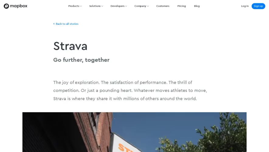




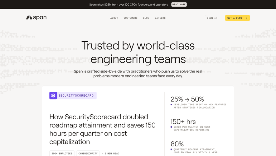

Upgrade to SaaSFrame Pro now to see similar examples.
Monthly
$18 /month
Billed $18 monthly
Browse all screens & flows
Filter and search screens & flows
Search text in screenshots
Access Figma files
Access mobile versions
Join now
Quarterly
$16 /month
Billed $48 quarterly
Browse all screens & flows
Filter and search screens & flows
Search text in screenshots
Access Figma files
Access mobile versions
Join now
Yearly
$15 /month
Billed $180 yearly
Browse all screens & flows
Filter and search screens & flows
Search text in screenshots
Access Figma files
Access mobile versions
Join now