Generate a new design based on this screen using your own content.
Thank you! Your submission has been received!
Oops! Something went wrong while submitting the form.
# Design from Reference: Resend Blog Feed
Create an original, high-fidelity visual design inspired by the reference. Prioritize composition, typography, colors, spacing, and component styling over technical implementation.
## Reference
- **Product:** Resend
- **Category:** Blog Feed
- **Screenshot:** https://cdn.prod.website-files.com/5e9dc792e1210c5325f7ebbc/6acb676b994832179b560728_6acb66c30dc9c19aeb92d8b1_cms-2f37a00774c34f1f1d238234.webp
Analyze the screenshot first. If inaccessible, request it rather than guessing.
## Content
{{content.instructions}}
{{content.data}}
Preserve essential messaging and factual accuracy. Adapt structure and copy length for visual balance; never invent product claims.
## Visual Design
Use this context to reproduce the reference's visual language: layout, typography, colors, spacing, borders, radii, and distinctive elements. The screenshot takes priority if descriptions conflict.
## Direction
{{preferences.fidelityInstructions}}
## Output
{{output.instructions}}
Deliver a polished, cohesive design with precise alignment, hierarchy, and spacing. Produce the requested visual artifact, not just a description. If unsupported, explain the limitation.
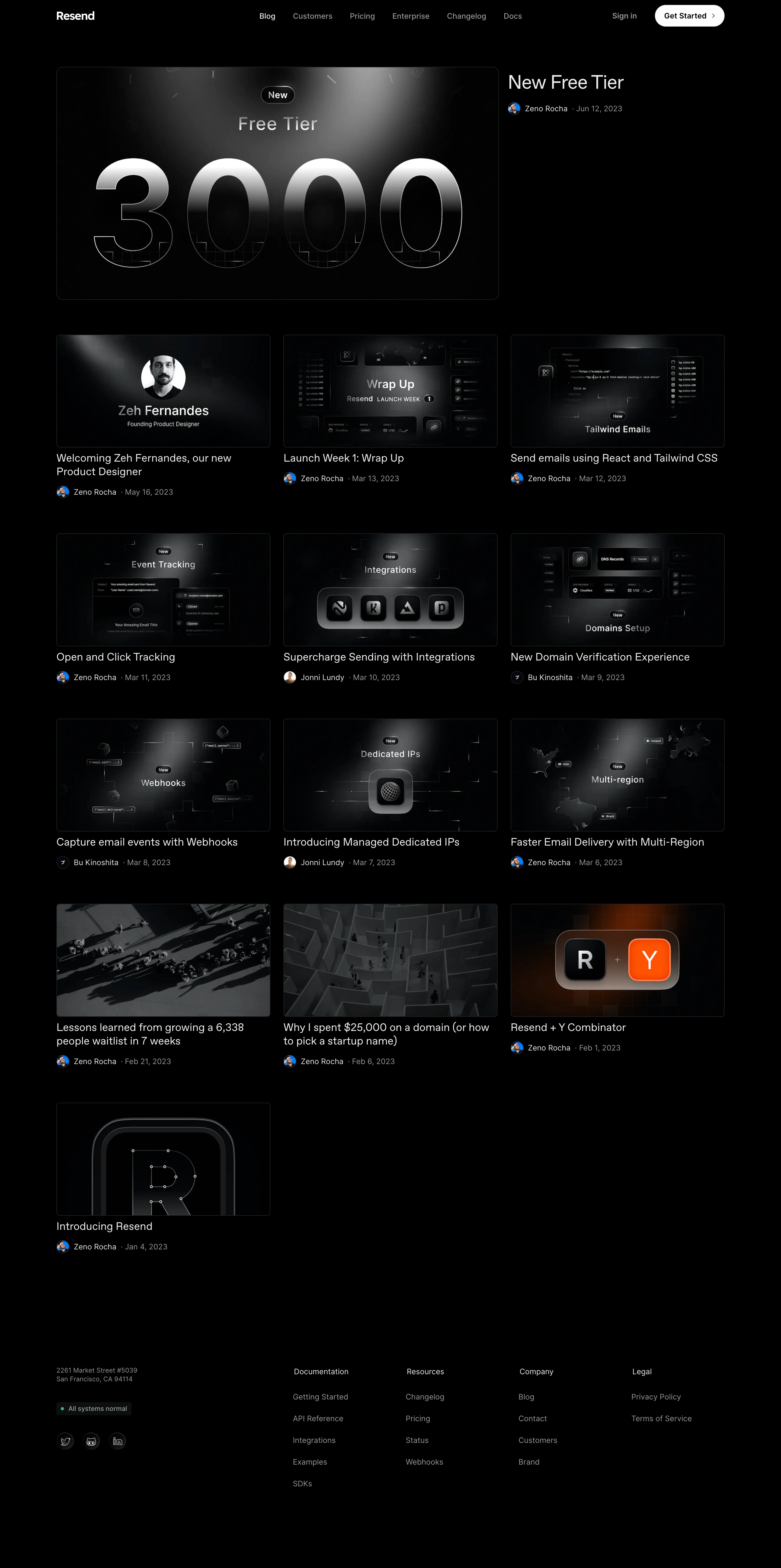
Resend’s blog page embodies a crisp, modern minimalism that radiates sophistication and clarity. The design feels polished and professional yet inviting, thanks to generous white space, subtle microinteractions, and a visually calming atmosphere. The tone aligns with trustworthy, innovative SaaS brands—transparent yet forward-thinking.
Layout and Structure
There’s an immediate sense of order. The page opens without a classic hero section, instead highlighting a prominent "Blog" header and a featured post, drawing users into fresh content right away. Blog entries are grid-aligned with balanced spacing, making scanning effortless. The sticky header aids navigation, while a clean footer consolidates site links and branding, maintaining visual coherence throughout.
Visual Elements
Deliberate restraint defines the visual language. Instead of distracting stock photography or loud illustrations, Resend uses sparse icons and subdued cover images, keeping the focus on content. Soft shadows and card layouts provide tactile separation without clutter, while hover states add a layer of interactivity.
Color Palette and Typography
A balanced monochromatic palette—primarily whites, deep grays, and subtle accents—amplifies readability and elegance. Rounded sans-serif typography (such as Inter or a similar modern font) ensures legibility. Font size hierarchy is thoughtfully executed, with bold titles, concise summaries, and clear metadata.
User Experience Patterns and Standout Choices
Navigation is seamless via a persistent, minimal header. Each post tile is clickable, with a satisfying hover effect. Absence of form fields or intrusive CTAs removes friction, making browsing fast and pleasant. The blog’s understated design lets content shine—a refreshing approach that’s both visually striking and user-first.