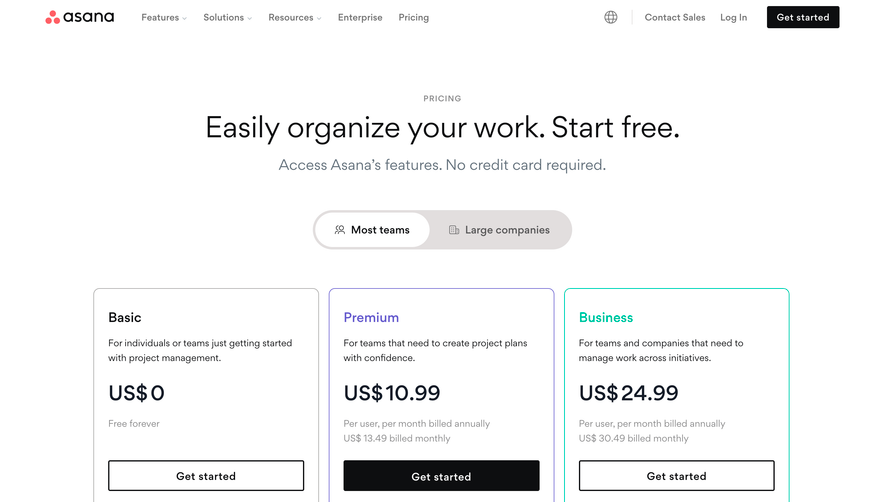
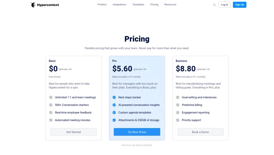
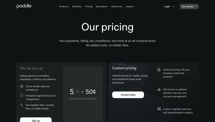
Generate a new design based on this screen using your own content.
Thank you! Your submission has been received!
Oops! Something went wrong while submitting the form.
# Design from Reference: Remote Pricing Page
Create an original, high-fidelity visual design inspired by the reference. Prioritize composition, typography, colors, spacing, and component styling over technical implementation.
## Reference
- **Product:** Remote
- **Category:** Pricing Page
- **Screenshot:** https://cdn.prod.website-files.com/5e9dc792e1210c5325f7ebbc/6acad676d63d2caea65c6541_6acad608d05a3f53c0a6f591_cms-a8f2d6aef3321ca3c1b3e5d4.webp
Analyze the screenshot first. If inaccessible, request it rather than guessing.
## Content
{{content.instructions}}
{{content.data}}
Preserve essential messaging and factual accuracy. Adapt structure and copy length for visual balance; never invent product claims.
## Visual Design
Use this context to reproduce the reference's visual language: layout, typography, colors, spacing, borders, radii, and distinctive elements. The screenshot takes priority if descriptions conflict.
## Direction
{{preferences.fidelityInstructions}}
## Output
{{output.instructions}}
Deliver a polished, cohesive design with precise alignment, hierarchy, and spacing. Produce the requested visual artifact, not just a description. If unsupported, explain the limitation.
Remote’s pricing page embraces a clean, modern design that radiates professionalism with a touch of warmth. Employing ample white space and smooth lines, the aesthetic feels approachable yet authoritative—striking a careful balance between businesslike clarity and engaging friendliness.
Layout and Structure
The structure follows a familiar yet effective SaaS flow: a clear hero section introduces their call to action and value proposition, immediately orienting users. Pricing tables dominate the page, segmented for clarity, complemented by expandable features breakdowns. Testimonials, FAQs, and trust signals support decision-making, while a comprehensive footer offers additional navigation.
Visual Elements
Vivid, custom illustrations add a friendly visual layer—diverse avatar graphics and abstract motifs reinforce inclusivity and approachability. Interactive pricing toggles and well-crafted icons guide users intuitively through plan options. Subtle micro-animations breathe life into CTAs and transitions without becoming distracting.
Color Palette and Typography
A refreshing palette of white backgrounds punctuated by Remote’s signature blues and inviting accent colors draws the eye to important sections. Bold, modern sans-serif fonts emphasize hierarchy—large headlines grab attention, while concise body text maintains legibility across devices.
User Experience Patterns
Sticky navigation ensures that plan exploration remains effortless, while persistent and highly visible CTAs encourage users to take action from any scroll position. Toggle switches, expandable FAQs, and straightforward comparison tables speed up product evaluation, reducing friction throughout the user journey.
Unique or Notable Design Choices
Noteworthy are the interactive plan modules, which adapt content dynamically based on selections, and the use of real-customer photographs in testimonials—boosting trust and emotional connection. The overall tone communicates reliability, global scale, and progressive innovation, encouraging confidence in both the brand and product.