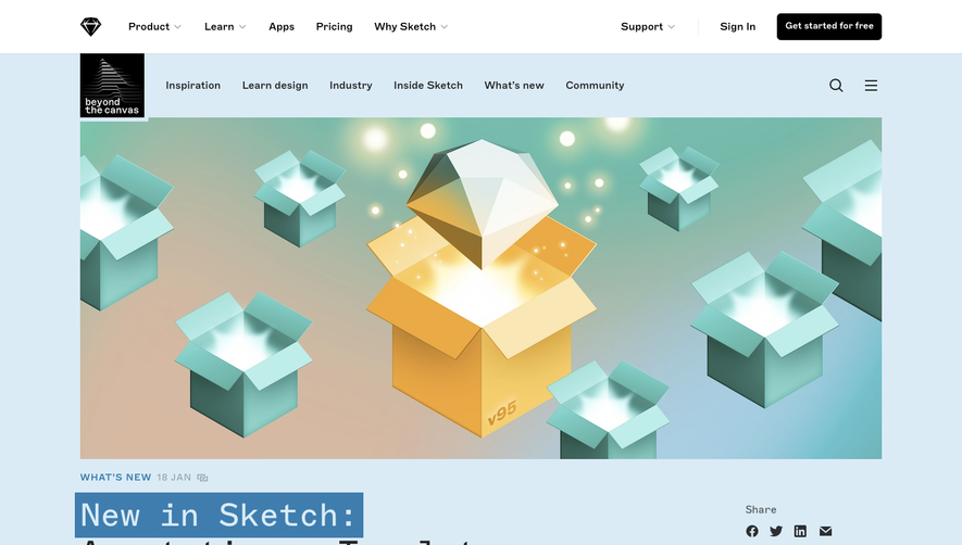
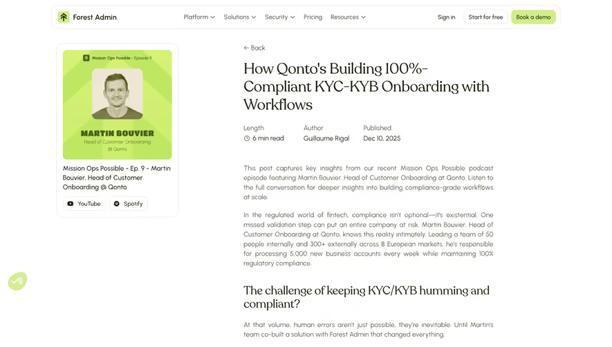
Overall Style and Aesthetic
Raycast’s Launch Week Summary page adopts a clean, modern, and professional aesthetic, blending minimalist design with subtle energetic touches. The interface feels fresh and approachable, characterized by generous white space, rounded corners, and balanced contrasts. The overall vibe is innovative yet polished, instilling immediate trust for SaaS users seeking a forward-thinking solution. Layout and Structure
The layout is meticulously structured for intuitive scanning. It opens with a strong hero section featuring concise, headline-focused copy alongside engaging visual cues. Below, concise summary blocks highlight daily launches, blended with interactive tabs that reveal more details without overwhelming the page. A sticky navigation bar ensures seamless access to different launch days, while the consistently styled footer rounds out the user journey. Visual Elements
Custom illustrations and micro-animations breathe life into the page, contributing both clarity and personality. Each day’s summary is accompanied by expressive icons, screenshots, and subtle GIF-like product previews. These visuals are thoughtfully integrated, enhancing comprehension without cluttering the interface. Color Palette and Typography
A sophisticated monochrome base is energized with signature accent colors—mainly purples and blues—strategically applied to CTAs, icons, and highlights. The sans-serif typography is crisp, layered with clear headings, high legibility, and well-considered hierarchy, guiding users naturally through the content. User Experience Patterns
The navigation experience is frictionless, with persistent menus and anchor links simplifying content discovery. Primary CTAs pop visually and remain accessible, while transitions and hover states provide tactile feedback. There are no intrusive forms; instead, engagement centers on exploring product updates interactively. Unique or Notable Design Choices
Interactive daily summaries and subtle animations set this design apart, as does the playful but sophisticated illustration style. The page masterfully balances detail and simplicity, making complex updates easily digestible while maintaining an energetic, innovative tone throughout.