Generate a new design based on this screen using your own content.
Thank you! Your submission has been received!
Oops! Something went wrong while submitting the form.
# Design from Reference: Prelude Overview
Create an original, high-fidelity visual design inspired by the reference. Prioritize composition, typography, colors, spacing, and component styling over technical implementation.
## Reference
- **Product:** Prelude
- **Category:** Dashboard
- **Screenshot:** https://cdn.prod.website-files.com/5e9dc792e1210c5325f7ebbc/697b76472fb494e1c95322c5_BOUfMsu3snRZXyr4WFdlTTtypRA033Ddtn12_ou4Xr8.avif
Analyze the screenshot first. If inaccessible, request it rather than guessing.
## Content
{{content.instructions}}
{{content.data}}
Preserve essential messaging and factual accuracy. Adapt structure and copy length for visual balance; never invent product claims.
## Visual Design
Use this context to reproduce the reference's visual language: layout, typography, colors, spacing, borders, radii, and distinctive elements. The screenshot takes priority if descriptions conflict.
## Direction
{{preferences.fidelityInstructions}}
## Output
{{output.instructions}}
Deliver a polished, cohesive design with precise alignment, hierarchy, and spacing. Produce the requested visual artifact, not just a description. If unsupported, explain the limitation.
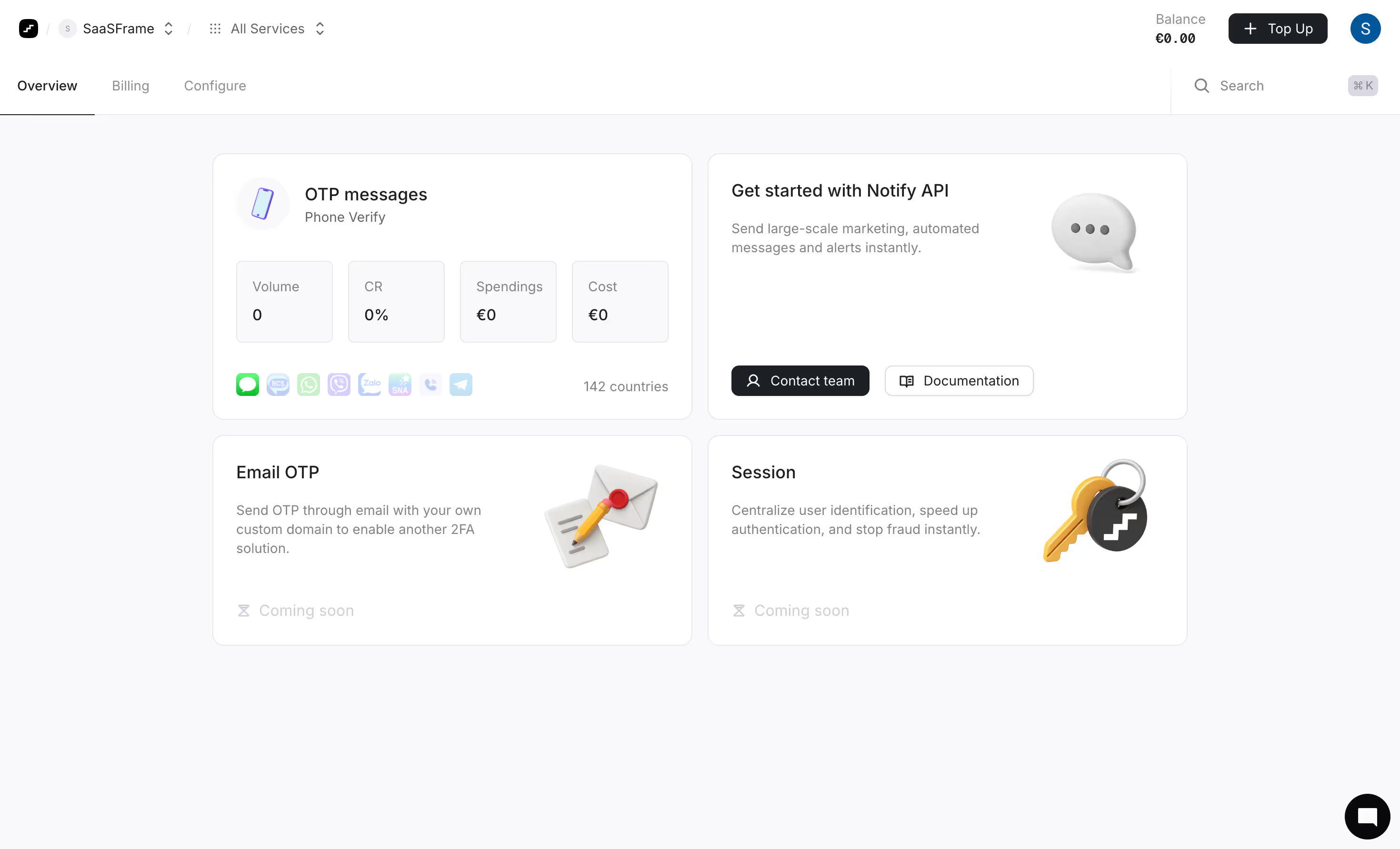
First thing you notice is how much whitespace this thing has. The overview page for what looks like a verification/OTP service doesn't try to cram everything above the fold. Four stat boxes (Volume, CR, Spendings, Cost) sit in a neat row with zero data, and it still looks intentional. That's hard to pull off.
Card-Based Layout Done Right
The grid uses a clear two-column structure up top, then mirrors it below with "Email OTP" and "Session" cards marked "Coming soon" in faded text. The Notify API card pulls you in with a subtle 3D chat bubble illustration. Each card has its own little illustration style that feels cohesive without being matchy-matchy. The channel icons row under OTP messages is a smart touch showing SMS, WhatsApp, Viber, Zalo and others at a glance.
Typography and Restraint
The type hierarchy is dead simple. Bold headings, light descriptions, muted secondary labels. Everything is grayscale and soft shadows with that single green accent from the messaging icons. The top nav with "SaaSFrame" breadcrumb and €0.00 balance keeps things functional without visual noise. It's confident minimalism.