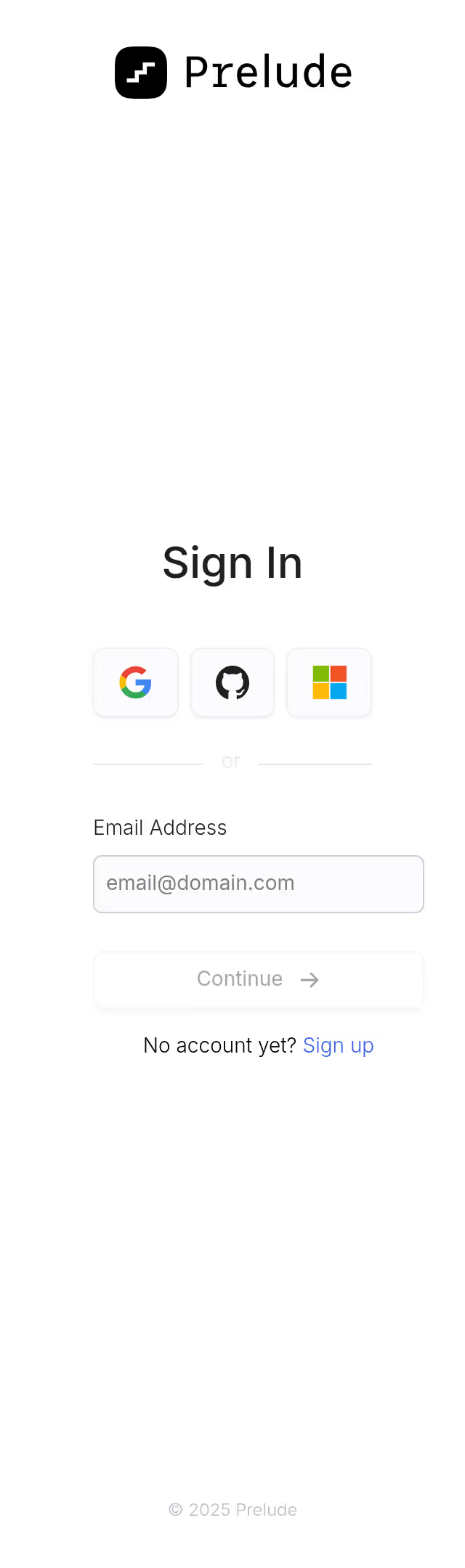
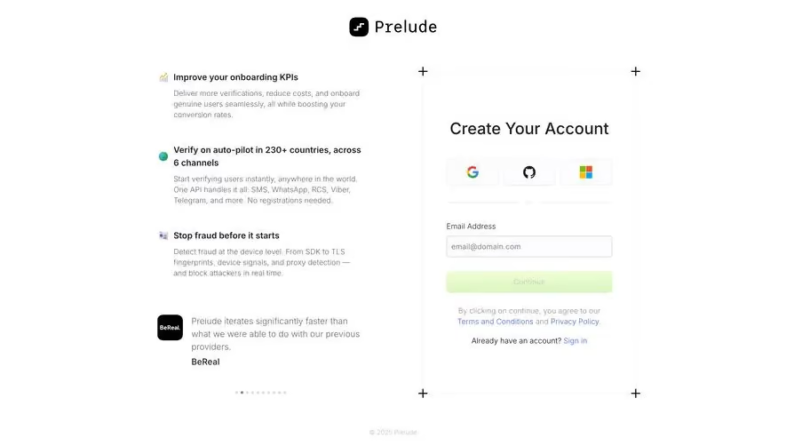
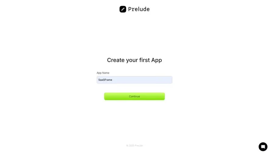
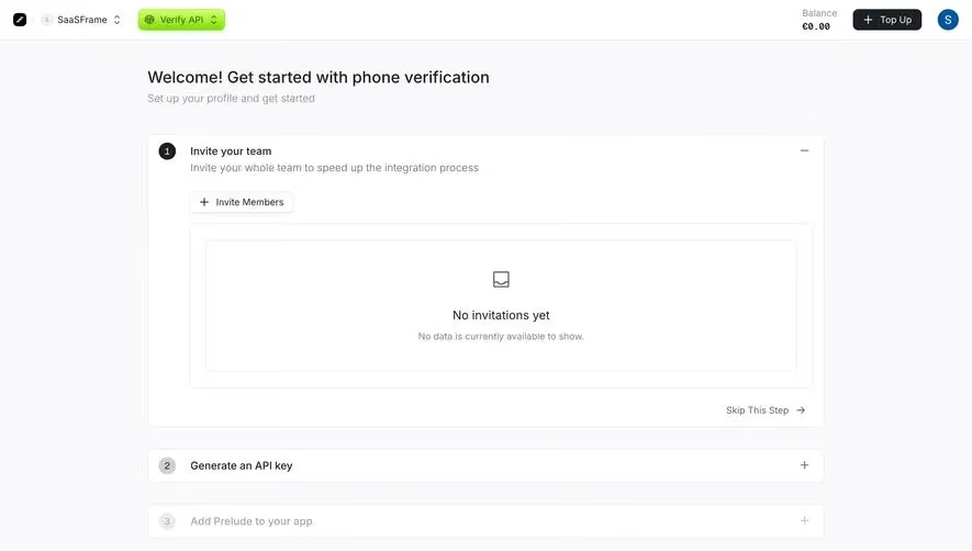
Generate a new design based on this screen using your own content.
Thank you! Your submission has been received!
Oops! Something went wrong while submitting the form.
# Design from Reference: Prelude Generate Key
Create an original, high-fidelity visual design inspired by the reference. Prioritize composition, typography, colors, spacing, and component styling over technical implementation.
## Reference
- **Product:** Prelude
- **Category:** Add & Edit
- **Screenshot:** https://cdn.prod.website-files.com/5e9dc792e1210c5325f7ebbc/697b7637bf1a30e1acbd8f35_dVw9LVj1Kw0MYjYyjMaPMqd3N3V8OeLcgF45DNOBz_g.avif
Analyze the screenshot first. If inaccessible, request it rather than guessing.
## Content
{{content.instructions}}
{{content.data}}
Preserve essential messaging and factual accuracy. Adapt structure and copy length for visual balance; never invent product claims.
## Visual Design
Use this context to reproduce the reference's visual language: layout, typography, colors, spacing, borders, radii, and distinctive elements. The screenshot takes priority if descriptions conflict.
## Direction
{{preferences.fidelityInstructions}}
## Output
{{output.instructions}}
Deliver a polished, cohesive design with precise alignment, hierarchy, and spacing. Produce the requested visual artifact, not just a description. If unsupported, explain the limitation.
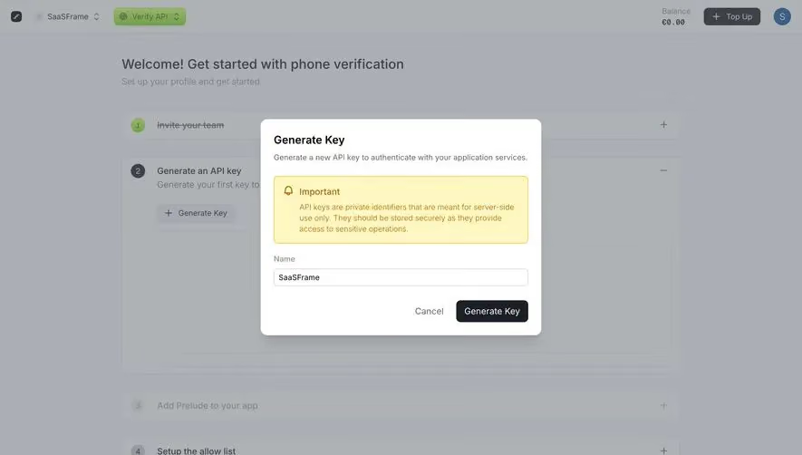
First thing you notice is that yellow warning box. It pops hard against the otherwise neutral palette and does exactly what it should: grab attention before you do something irreversible. The hierarchy inside the modal is tight. Title, description, warning, input, actions. No fluff.
Guided Setup Done Right
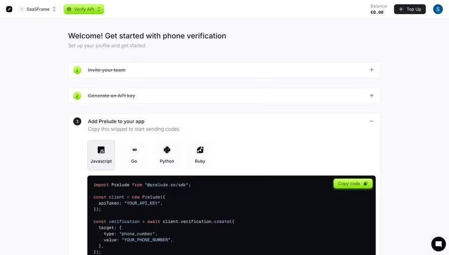
Behind the modal, there's a numbered onboarding flow with expandable sections. Steps 1 through 4 with plus/minus toggles. It's simple but it works. The green numbered circles give just enough visual progression without feeling like a homework assignment. That "Skip to Dashboard" link at the bottom is a smart pressure release valve for impatient users.
Typography and Spacing Carry the Weight
The type is clean and readable. Nothing fancy. The button contrast between "Cancel" as plain text and "Generate Key" as a solid black pill creates a clear primary/secondary action split. The Resources section at the bottom with three cards feels like a thoughtful addition rather than an afterthought. Prelude's balance indicator and green "Top Up" button in the header are subtle but functional touches.