
Thank you! Your submission has been received!
Oops! Something went wrong while submitting the form.
Get SaaSFrame Pro
Monthly
$18
Quarterly
$48
Yearly
$180
Upgrade to access this feature
Browse all screens & flows
Filter and search screens & flows
Access Figma files
Access mobile versions
Bookmark screens & flows
Join now
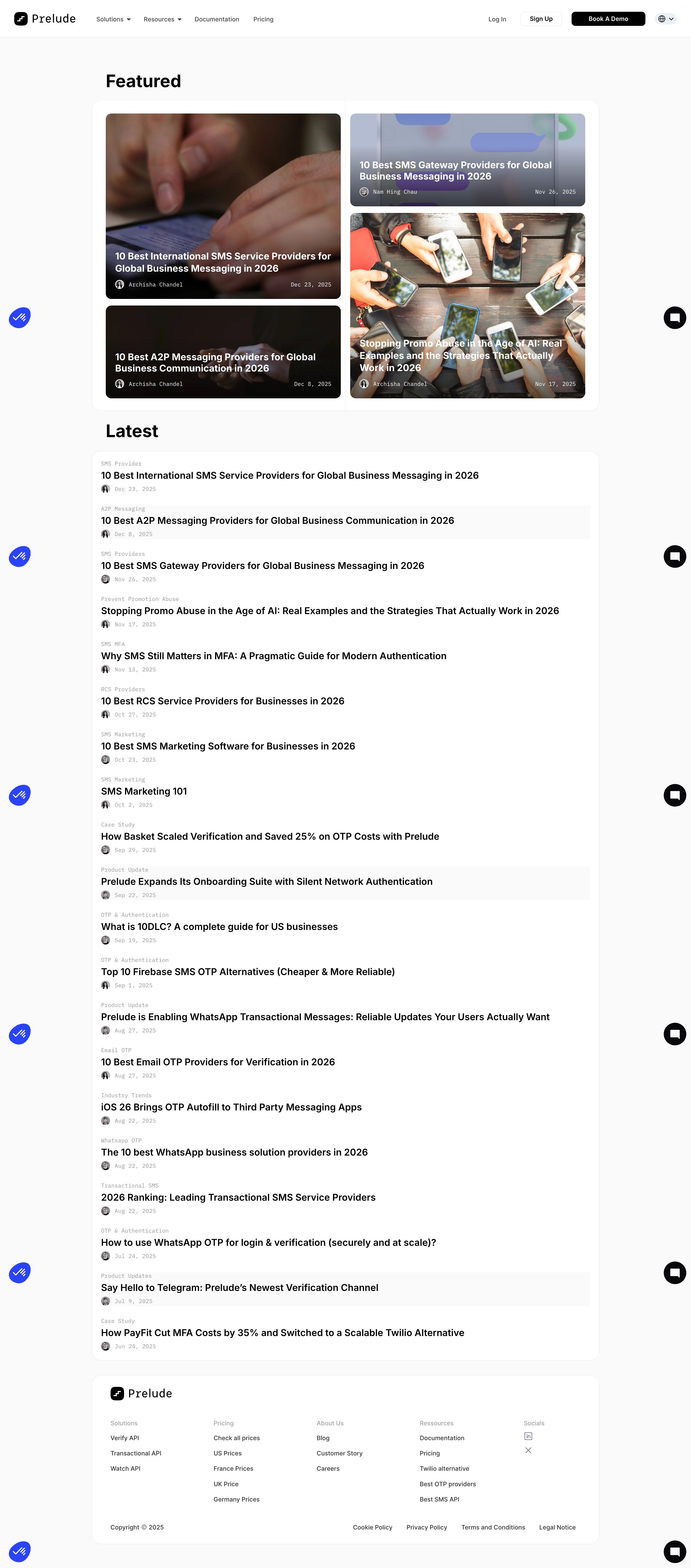

Prelude Blog Feed

Prelude
Send verification phone messages
Designed by
No items found.

Bookmark
Bookmark

Design with AI
Thank you! Your submission has been received!
Oops! Something went wrong while submitting the form.
# Design from Reference: Prelude Blog Feed
Create an original, high-fidelity visual design inspired by the reference. Prioritize composition, typography, colors, spacing, and component styling over technical implementation.
## Reference
- **Product:** Prelude
- **Category:** Blog Feed
- **Screenshot:** https://cdn.prod.website-files.com/5e9dc792e1210c5325f7ebbc/6acad3a8c2028efdec71aff7_6acad1518b7c605a8f56f72e_cms-28179a016fde5549f6ec1392.webp
Analyze the screenshot first. If inaccessible, request it rather than guessing.
## Content
{{content.instructions}}
{{content.data}}
Preserve essential messaging and factual accuracy. Adapt structure and copy length for visual balance; never invent product claims.
## Visual Design
### Overall aesthetic
- **Style:** Clean blog feed with a white navigation bar, very pale gray canvas and rounded white content shells.
- **Character:** Featured photography and bold overlaid article titles contrast with the restrained, text-heavy latest-post list.
- **Brand treatment:** Black actions, monospaced metadata and small blue utility accents create a technical editorial feel.
### Page composition
- **Canvas:** Source 2940 × 6672 pixels, inspected throughout in three crops at 1400px width. Geometry uses inspection pixels; approximate 2× CSS capture is plausible but unverified.
- **Header:** Full-width bar with logo/menus left, account/demo actions and language selector right.
- **Content wrapper:** Roughly 1028px wide, centered near x186–1214.
- **Featured:** Large section heading above a rounded white shell containing four image tiles in two columns with alternating tall/short heights.
- **Latest:** Another heading precedes a long rounded white list panel, with repeated category/title/avatar/date groups.
- **Footer:** A separate rounded white shell contains logo, five link/social groups and bottom copyright/legal row.
### Information hierarchy
- **Featured stories:** White bold titles overlay darkened lower image areas; compact author/date metadata runs below each title.
- **Latest list:** Small gray category labels precede bold black article titles and a small avatar/date line.
- **Editorial scope:** Visible posts span messaging providers, authentication, product updates and case studies; content is described visually rather than treated as verified current claims.
- **Navigation:** Book A Demo is the strongest header action; Sign Up is outlined and Log In is plain text.
### Typography
- **Section headings:** Approximately 38px bold sans serif with around 46px line height.
- **Featured titles:** Approximately 20px bold, around 24px line height.
- **Latest titles:** Around 20px medium-to-semibold, typically one line but allowed to wrap.
- **Metadata:** Around 11–12px monospaced, light gray on white and white on dark imagery.
- **Header/footer:** Around 13–14px regular-to-medium. Exact font families are unverified.
### Colors & surfaces
- **Measured base:** #FFFFFF content surfaces and #FAFAFA canvas.
- **Measured darks:** #000000 primary actions/text and #09090B near-black foreground.
- **Measured boundary:** #EDEDED pale outlines.
- **Measured accent:** #2942FC blue utility mark; #1E1613 and #1D1512 occur in dark photographic areas, not general page-surface tokens.
- **Images:** Warm phone-use photography and a cool messaging illustration provide most color; dark gradients preserve white headline contrast.
### Components
- **Featured shell:** Approximately 1028px wide, around 20px radius, thin border and 27px internal padding.
- **Image tiles:** Roughly 477px wide, 12px radius, with approximately 375px and 189px heights arranged in alternating columns.
- **Overlay text:** Around 19px side/bottom inset; avatar and author align left, date right.
- **Latest rows:** Borderless stacked article groups with roughly 20px inner side padding and about 90px vertical pitch; a few rows have faint gray background strips.
- **Header actions:** Compact rounded buttons around 29px tall; demo is black with white label, signup white with a pale outline.
- **Footer:** Five spaced groups with simple text links and small social icons; legal links align along the bottom.
- **Overlay artifacts:** Blue utility and black chat circles repeat down the stitched long capture; do not reproduce them as multiple inline widgets.
- **States:** No category filter, pagination, expanded navigation or article-detail state is visible.
### Visual rhythm
- **Opening:** Featured heading sits around 70px below the navigation.
- **Featured cadence:** Small consistent gaps separate tiles, while alternating heights create a balanced mosaic.
- **Latest cadence:** Category, title and metadata form repeated compact groups with broader gaps between posts.
- **Section spacing:** Roughly 28px separates the featured shell and Latest heading; footer follows the long list with a modest gap.
- **Alignment:** Both major content shells and footer share the same wrapper width.
### Responsive
- **Observed scope:** Desktop feed only; narrow layouts are unverified.
- **Recommended featured:** Stack image tiles or use a simple two-column grid with readable minimum widths.
- **Recommended list:** Allow long titles to wrap and keep metadata below rather than forcing one-line truncation.
- **Recommended header/footer:** Collapse navigation menus and wrap footer groups.
- **Recommended overlays:** Keep a single instance of each floating utility and ensure they do not cover article links.
### Adaptation guidance
- **Preserve:** Featured mosaic, strong title overlays, compact monospaced metadata and simple latest-post list.
- **Content:** Use supplied article images, authors, categories and dates; avoid inventing editorial facts.
- **Implementation:** Model cards and list rows as semantic article links with responsive text height.
- **Accessibility:** Maintain image-overlay contrast, meaningful thumbnail alternatives and visible keyboard focus.
Use this context to reproduce the reference's visual language: layout, typography, colors, spacing, borders, radii, and distinctive elements. The screenshot takes priority if descriptions conflict.
## Direction
{{preferences.fidelityInstructions}}
## Output
{{output.instructions}}
Deliver a polished, cohesive design with precise alignment, hierarchy, and spacing. Produce the requested visual artifact, not just a description. If unsupported, explain the limitation.


Category
Patterns
No items found.


Added on
January 7, 2026
Similar screens




Upgrade to SaaSFrame Pro now to see similar examples.
Monthly
$18 /month
Billed $18 monthly
Browse all screens & flows
Filter and search screens & flows
Search text in screenshots
Access Figma files
Access mobile versions
Join now
Quarterly
$16 /month
Billed $48 quarterly
Browse all screens & flows
Filter and search screens & flows
Search text in screenshots
Access Figma files
Access mobile versions
Join now
Yearly
$15 /month
Billed $180 yearly
Browse all screens & flows
Filter and search screens & flows
Search text in screenshots
Access Figma files
Access mobile versions
Join now