Overall Style and Aesthetic
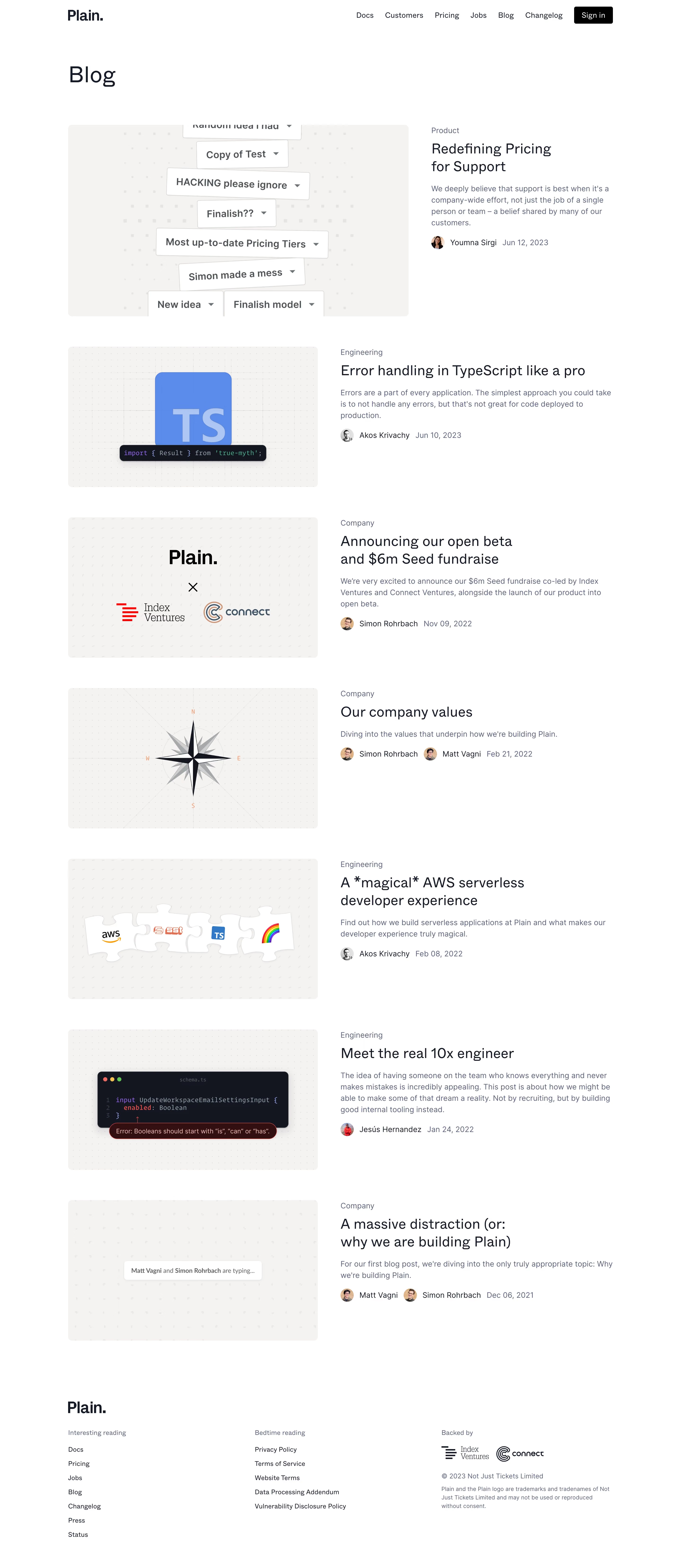
Plain’s blog page effortlessly channels a modern, minimalist vibe. Its design exudes confidence and professionalism, relying on abundant white space to let content breathe. The aesthetic is sophisticated but approachable, making it appealing for SaaS brands aiming for a clean, focused look. Layout and Structure
The layout greets users with succinct, oversized headlines and a spacious grid of blog cards—eschewing a traditional hero image for immediate utility. Each card prioritizes clarity, presenting titles, summaries, and dates with flawless alignment. There’s no visual clutter; the structure lures users deeper into content with subtle hover effects, guiding exploration without distraction. Visual Elements
Instead of heavy graphics or photography, visual hierarchy is established through typography, soft shadows, and crisp dividers. The absence of illustrations or icons keeps the experience editorial and unembellished, ensuring full attention on the written word. Color Palette and Typography
A monochromatic color palette reigns—mostly soft whites, muted grays, and deep blacks—accentuating clarity and composure. Typography is bold and geometric, using generous sizing and weight for headlines, while lighter body text aids readability. Hierarchy is instantly apparent, directing users effortlessly from overview to specifics. User Experience Patterns
Navigation is streamlined, pocketed in a discreet top bar, with persistent access to other key areas. Calls to action are understated, letting curiosity drive interaction. The scrolling experience is smooth and frictionless, and pagination is intuitive and discreet. Unique or Notable Design Choices
The standout feature is Plain’s deliberate restraint: it trusts in content and layout over ornamentation. This refined minimalism feels both innovative and timeless. The result is a serene digital environment—inviting, efficient, and distinctly SaaS-forward.