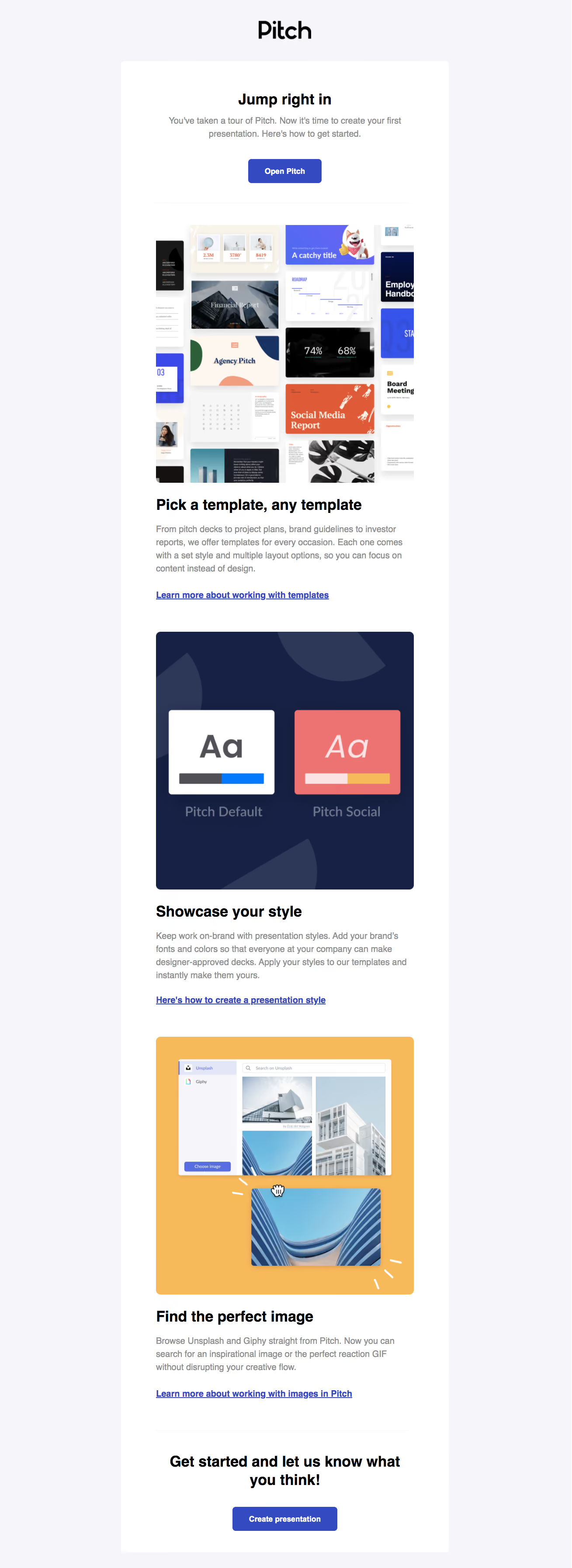
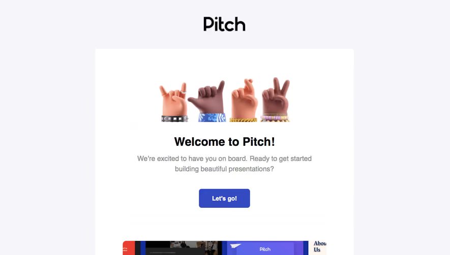
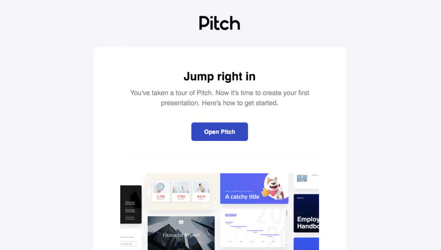
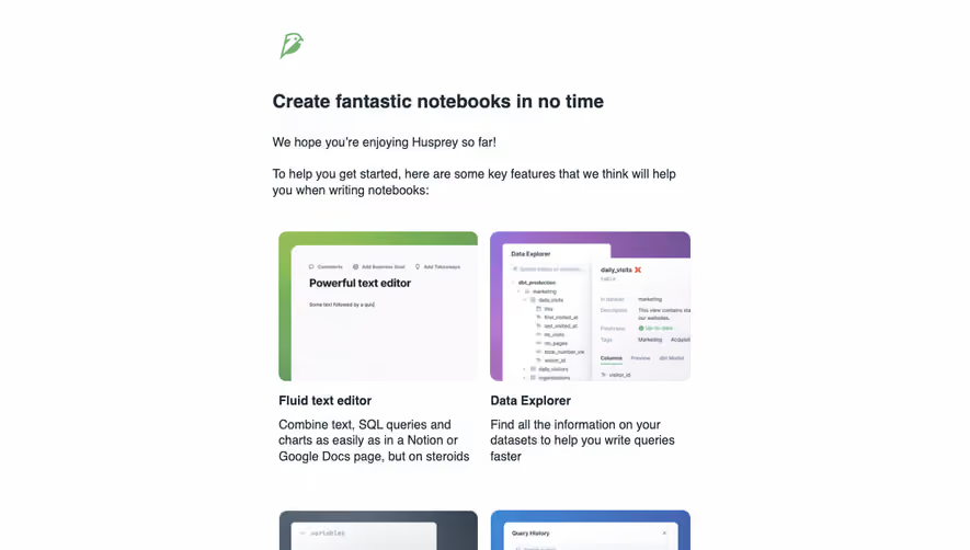
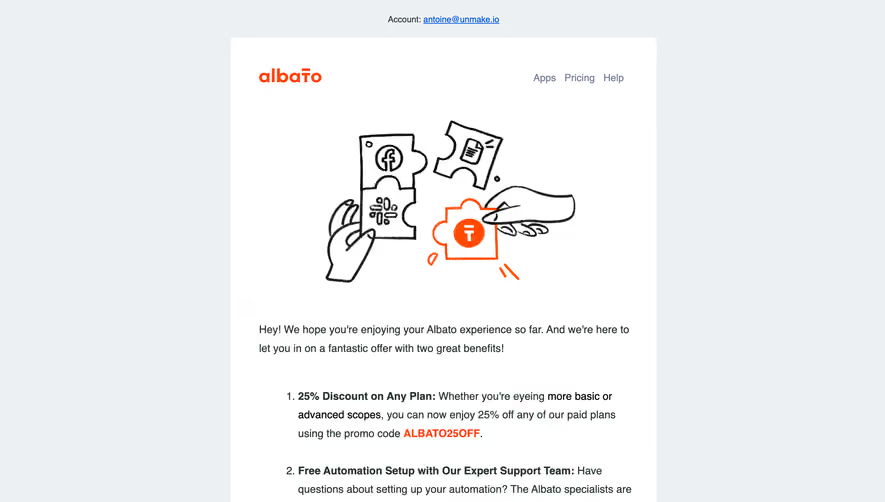
Generate a new design based on this screen using your own content.
Thank you! Your submission has been received!
Oops! Something went wrong while submitting the form.
# Design from Reference: Pitch Onboarding Email Flow
Create an original, high-fidelity visual design inspired by the reference. Prioritize composition, typography, colors, spacing, and component styling over technical implementation.
## Reference
- **Product:** Pitch
- **Category:** Onboarding Email
- **Screenshot:** https://cdn.prod.website-files.com/5e9dc792e1210c5325f7ebbc/6acbc897d69dbc5db10092c2_6acbc6237ce271b1287188e5_cms-b371e27184043604f0115390.webp
Analyze the screenshot first. If inaccessible, request it rather than guessing.
## Content
{{content.instructions}}
{{content.data}}
Preserve essential messaging and factual accuracy. Adapt structure and copy length for visual balance; never invent product claims.
## Visual Design
### Overall aesthetic
- **Character:** Polished onboarding email with a pale outer canvas, white reading panel and colorful presentation examples.
### Page composition
- **Canvas:** 1309 × 3589 screenshot pixels; rendered CSS scale is unverified.
- **Sequence:** Brand; centered opening action; template collage; style guidance; image-search guidance; centered closing creation action.
### Information hierarchy
- **Priority:** Jump right in heading and Open Pitch lead into three image-led instructional sections with blue underlined learning links.
### Typography
- **Family:** Plain sans-serif with bold black headings; exact font is unverified.
- **Scale:** Estimated rendered headings 32–34px, body 20px with 30px leading and action 18px bold.
### Colors & surfaces
- **Sampled palette:** Background #F6F6F9; white #FFFFFF; dark illustration #162145 and #2D3758; gold #F6BA5B; coral #EC7371; blue #334AC0.
### Components
- **Images:** Tall template collage, navy style-comparison panel and golden image-library demonstration, each with soft 8–10px radii.
- **Actions:** Blue rounded rectangles; thin pale rules separate opening/closing areas.
### Visual rhythm
- **Spacing:** Approximately 72–80 screenshot-pixel side padding and 64–80px between image/text sections.
### Responsive
- **Guidance:** Mobile is not shown. Keep fluid single-column images and comfortable link/body size.
### Adaptation guidance
- **Transfer:** Preserve action/education/action structure and concrete visual examples. Use relevant target onboarding steps and imagery.
Use this context to reproduce the reference's visual language: layout, typography, colors, spacing, borders, radii, and distinctive elements. The screenshot takes priority if descriptions conflict.
## Direction
{{preferences.fidelityInstructions}}
## Output
{{output.instructions}}
Deliver a polished, cohesive design with precise alignment, hierarchy, and spacing. Produce the requested visual artifact, not just a description. If unsupported, explain the limitation.