

```html

Thank you! Your submission has been received!
Oops! Something went wrong while submitting the form.
Get SaaSFrame Pro
Monthly
$18
Quarterly
$48
Yearly
$180
Upgrade to access this feature
Browse all screens & flows
Filter and search screens & flows
Access Figma files
Access mobile versions
Bookmark screens & flows
Join now
Pipe Solution Page

Pipe
Instant access to your annual cash flow
Designed by
No items found.

Bookmark
Bookmark
Design with AI
Thank you! Your submission has been received!
Oops! Something went wrong while submitting the form.
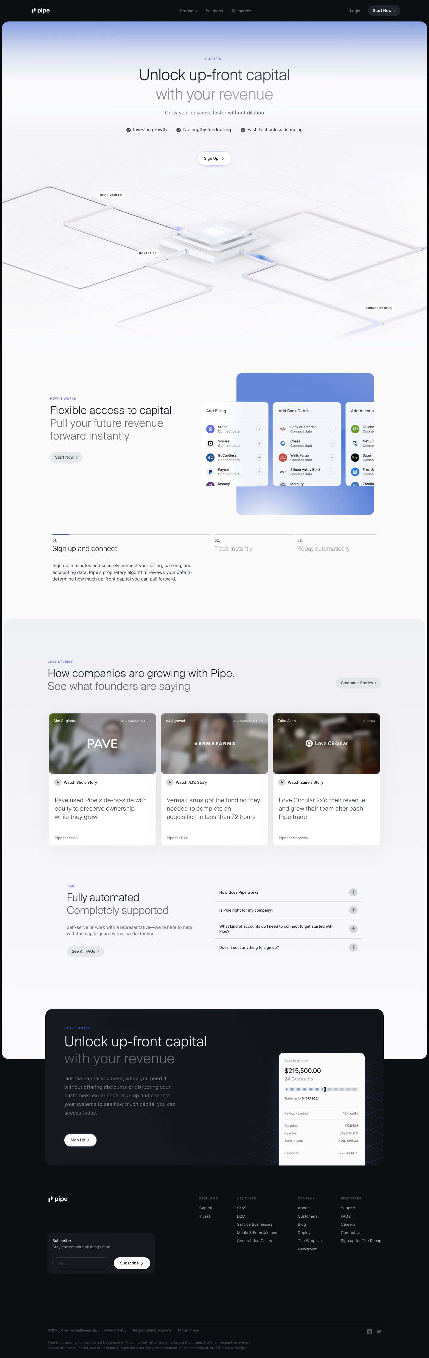
# Design from Reference: Pipe Solution Page
Create an original, high-fidelity visual design inspired by the reference. Prioritize composition, typography, colors, spacing, and component styling over technical implementation.
## Reference
- **Product:** Pipe
- **Category:** Landing Page
- **Screenshot:** https://cdn.prod.website-files.com/5e9dc792e1210c5325f7ebbc/6acbbd0f3b6b24eada54892e_6acbbc46151c40fa4074dd6c_cms-a2d79fdccfe5d2d5f8546ab3.webp
Analyze the screenshot first. If inaccessible, request it rather than guessing.
## Content
{{content.instructions}}
{{content.data}}
Preserve essential messaging and factual accuracy. Adapt structure and copy length for visual balance; never invent product claims.
## Visual Design
### Overall aesthetic
- **Character:** A polished finance-solution page uses pale blue/white gradients, lightweight dark typography, glass-like 3D line artwork and a black outer/footer frame.
- **Evidence:** The original is 1440 × 4557 pixels. All four readable portions were inspected; CSS sizes assume an unverified 1× capture density.
### Page composition
- **Header/hero:** A black navigation bar precedes a large rounded light hero with category eyebrow, two-line headline, supporting text, three benefits and signup pill.
- **Hero artwork:** A broad isometric grid of translucent pipes converges on a glowing central platform, with small revenue-source labels.
- **Process:** A split how-it-works region pairs copy and account-connection UI artwork, followed by three numbered steps with the first expanded.
- **Proof/help:** Three customer-video cards sit in a rounded pale region; a split FAQ section follows.
- **Closing:** A dark signup panel overlaps the light content boundary, with a financing-widget illustration right. Dark footer includes newsletter, four link groups and small legal copy.
### Information hierarchy
- **Hero:** Large lightweight headline leads; the second line is muted gray.
- **Process:** Small blue uppercase eyebrows identify sections, while medium headings and short paragraphs explain the sequence.
- **Proof:** Customer cards combine blurred portrait thumbnails/logo overlays, story actions and outcome summaries.
- **Conversion:** White signup pills contrast against pale and dark surfaces; FAQ links provide a secondary support route.
### Typography
- **Hero:** Approximately 52–56 pixels, light weight with tight tracking and around 1.2 line-height.
- **Sections:** Roughly 36 pixels, similarly lightweight; secondary lines are muted.
- **Body/cards:** Approximately 16 pixels with 24-pixel leading; customer outcome summaries are around 22 pixels.
- **Metadata:** Eyebrows are small uppercase blue with increased tracking. Exact sans-serif family is unverified.
### Colors & surfaces
- **Measured base:** ICC-to-sRGB sampling identifies #FAFAFB as the light canvas and #0D0E12 as the dark outer/footer surface.
- **Measured supporting surfaces:** #FFFFFF, #EFF0F2, #F5F4F8 and #F8F8F9 occur in cards, gradients and pale interface areas.
- **Accents:** Periwinkle blue marks eyebrows, process indication and gradient artwork; most controls remain monochrome.
- **Depth:** Soft shadows, translucent edges and subtle glows create dimensionality in illustrations and cards.
### Components
- **Hero signup:** A compact white pill includes a right chevron and faint blue glow.
- **Connection artwork:** Rounded billing/bank/accounting panels contain service logos and small plus controls over a blue gradient slab.
- **Process tabs:** Three numbered headings align beneath thin rules; only the first shows a paragraph and short blue active segment.
- **Story cards:** Three white rounded panels have wide blurred video thumbnails, small play/story rows and larger outcome text.
- **FAQ:** Four collapsed rows use thin dividers and circular plus icons beside a left explanatory block.
- **Closing widget:** A pale financing card shows amount, slider and summary rows as illustration, not an established live form.
- **Footer:** A dark newsletter card groups email field and white Subscribe pill beside link columns.
### Visual rhythm
- **Shared container:** Major content uses roughly 1120-pixel centered bounds inside the black frame.
- **Rounded sections:** Broad corner radii distinguish light content and dark closing panels.
- **Pacing:** Large gaps separate hero, process, stories and FAQ; small labels provide consistent entry points.
- **Alternation:** Centered hero, split process, three-column proof and split FAQ vary the reading pattern.
### Responsive
- **Observed scope:** One desktop first-process-step state is shown; sliders, video playback and FAQ expansion are not visible.
- **Recommended layout:** Stack split regions, story cards and process steps; scale 3D artwork without crowding copy.
- **Recommended controls:** Keep signup/newsletter targets usable and provide accessible alternatives for decorative finance UI.
- **Recommended contrast:** Ensure muted text remains legible on gradients and dark footer surfaces.
### Adaptation guidance
- **Solution narrative:** Explain the capital offer, show connection/process steps, add customer evidence and answer practical questions before signup.
- **Visual system:** Reuse restrained blue gradients, lightweight typography and translucent technical artwork.
- **Content accuracy:** Verify financial terms and outcomes before live reuse; screenshot values are illustrative evidence.
- **Implementation:** Confirm fonts/density and specify real interaction states separately from embedded interface artwork.
Use this context to reproduce the reference's visual language: layout, typography, colors, spacing, borders, radii, and distinctive elements. The screenshot takes priority if descriptions conflict.
## Direction
{{preferences.fidelityInstructions}}
## Output
{{output.instructions}}
Deliver a polished, cohesive design with precise alignment, hierarchy, and spacing. Produce the requested visual artifact, not just a description. If unsupported, explain the limitation.
Category
Patterns
No items found.
Tech Stack
Added on
February 18, 2023
Similar screens
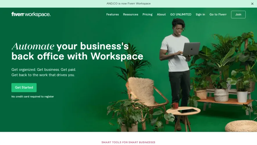


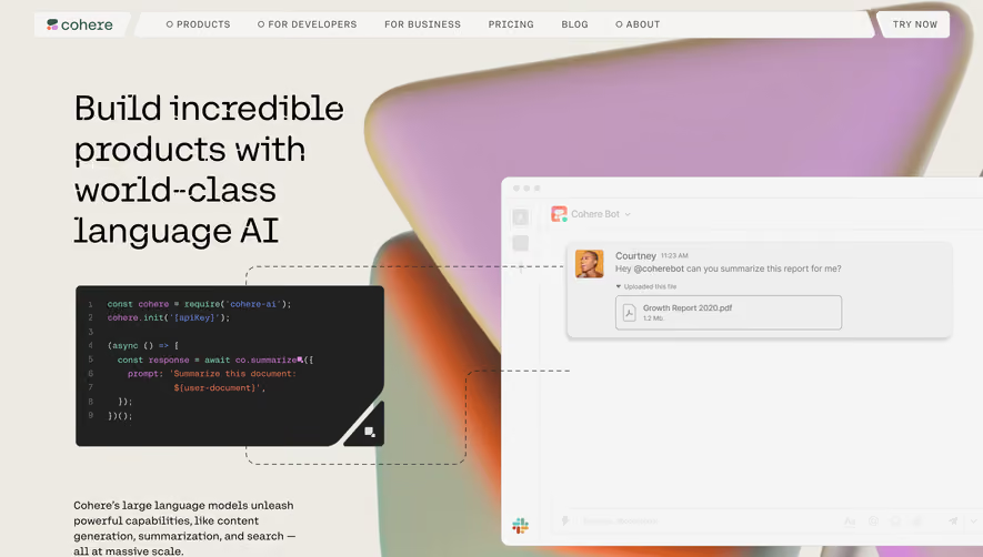

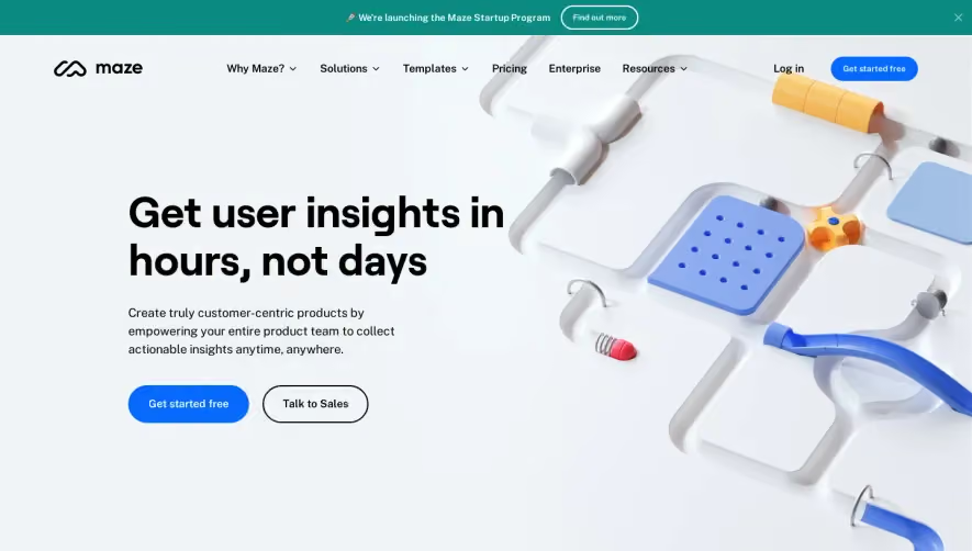

Upgrade to SaaSFrame Pro now to see similar examples.
Monthly
$18 /month
Billed $18 monthly
Browse all screens & flows
Filter and search screens & flows
Search text in screenshots
Access Figma files
Access mobile versions
Join now
Quarterly
$16 /month
Billed $48 quarterly
Browse all screens & flows
Filter and search screens & flows
Search text in screenshots
Access Figma files
Access mobile versions
Join now
Yearly
$15 /month
Billed $180 yearly
Browse all screens & flows
Filter and search screens & flows
Search text in screenshots
Access Figma files
Access mobile versions
Join now