Prompt 1,355 words Copy
# Design from Reference: Maze Landing Page

Create an original, high-fidelity visual design inspired by the reference. Prioritize composition, typography, colors, spacing, and component styling over technical implementation.

## Reference

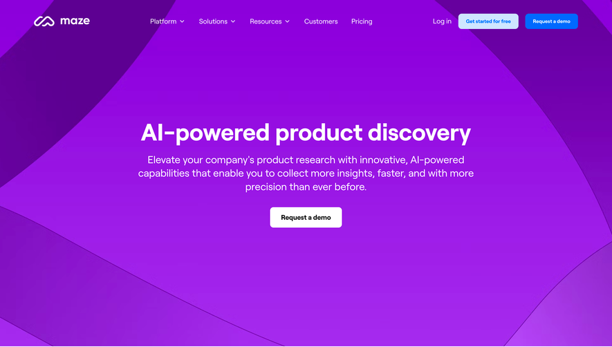
- **Product:** Maze
- **Category:** Landing Page
- **Screenshot:** attached to this message (also available at https://media.saasframe.io/o/6f85a2cb6f03ded59342.webp)
- **Source:** https://maze.design/

Analyze the attached screenshot first. If no image is attached, open the screenshot link; if neither is accessible, ask for it rather than guessing.

## Visual Design Context

### Overall aesthetic
- **Character:** A spacious research-software landing page combines bold black sans-serif headlines, bright blue pill actions and polished pastel 3D illustrations.
- **Visual identity:** Repeated channels, tracks, spheres and connected paths create a consistent maze metaphor. White sections alternate with a pale hero, peach testimonial and blue closing band.

### Page composition
- **Capture:** The source measures 1440 × 10036 image pixels. Observed dimensions below approximate CSS only under an unverified 1× capture assumption.
- **Top region:** A narrow teal announcement strip precedes a horizontal navigation bar. The hero pairs left-aligned copy/actions with a large 3D pathway composition extending across the right.
- **Brand proof:** A centered trust heading sits above twelve customer marks arranged in two rows.
- **Product overview:** A centered heading introduces a large interface illustration at the left and four vertically stacked use-case labels/descriptions at the right, with progress strips beneath the visual.
- **Feature narrative:** Four alternating image/text rows cover real-time testing, design-tool integrations, collaboration and reporting. Each pairs a rounded 3D illustration with a heading, paragraph and outlined action.
- **Lower narrative:** A centered positioning statement leads into a full-width peach customer testimonial, then a staggered two-column grid of four audience cards.
- **Ending:** A blue patterned conversion band precedes a five-part footer. A small cookie panel and privacy launcher appear near the lower-left corner of the captured page.

### Information hierarchy
- **Hero:** A large two-line promise dominates the opening, followed by a short three-line explanation and paired primary/secondary actions.
- **Product education:** Section headings introduce broad themes; feature-row headings and short paragraphs explain one benefit at a time.
- **Proof:** Customer logos, a portrait testimonial and role-specific cards provide distinct supporting layers.
- **Conversion:** Blue filled pills recur throughout, while black outlined pills support deeper exploration. The closing band uses a white action against blue.
- **Footer:** Bold group labels sit above long columns of muted links; legal and social items form the final row.

### Typography
- **Family:** A clean sans serif is used throughout; exact font identity is unverified.
- **Hero scale:** The main heading appears approximately 60–64 px, bold, with tight tracking and about 70 px line height.
- **Section headings:** Centered and feature-row headings are approximately 38–42 px, bold, with compact leading.
- **Body:** Supporting copy is around 18 px with 27 px line height. Navigation and button labels are approximately 14–16 px and medium/semibold.
- **Audience cards:** White card headings are around 30–32 px; descriptions use a smaller regular weight with generous leading.

### Colors & surfaces
- **Measured foundation:** ICC-aware sRGB sampling yields #FFFFFF, pale gray-blue #F0F4F7 and icy blue #F3F9FE.
- **Measured warm regions:** Peach #FEE7CF supports the testimonial; orange #FEAD62 appears in the decorative/audience palette.
- **Measured card colors:** Deep purple #3D2E5C, dark teal #34595A and muted rose #AC5862 distinguish audience cards.
- **Measured closing band:** Blue #6D8FD3 forms the final conversion surface.
- **Action accents:** Saturated blue buttons stand out against the white page, while black text and outlined pills maintain high visual clarity.

### Components
- **Announcement strip:** A full-width teal band contains compact white copy, a small outlined action and a far-right close icon.
- **Hero actions:** A solid blue rounded pill and a black outlined companion use generous horizontal padding and approximately 56 px observed height.
- **Product illustration:** A framed app-builder screenshot sits over pale blue shapes, with floating survey blocks and a stacked report graphic. Four thin horizontal progress tracks sit beneath it.
- **Feature media:** Large approximately 510 × 575 px rounded image panels contain softly lit 3D tracks, balls and channels, with corners around 20–24 px.
- **Testimonial:** A cutout portrait fills the left half against peach/orange curved shapes; the right combines a customer mark, quote, attribution and outlined action.
- **Audience cards:** Four tall rounded cards use colored backgrounds, subtle curved patterns, small 3D icons, white text and an outlined arrow capsule. The right column is vertically offset.
- **Closing band:** Pale path lines and circular nodes decorate the blue surface behind a centered white heading and white pill action.
- **Cookie panel:** A small white shadowed box contains concise copy, a policy link and Customize/No/Yes controls; it is peripheral to the main page.

### Visual rhythm
- **Section spacing:** Broad vertical gaps, often roughly 120–180 observed px, separate major narratives and give illustrations breathing room.
- **Alternating alignment:** Image/text positions reverse across feature rows, creating a steady left-right cadence.
- **Content widths:** Wide logo/product regions contrast with narrower feature copy and centered statements.
- **Card rhythm:** The audience grid introduces a staggered pattern after the more regular feature rows, while the full-width blue band creates a clear final break.

### Responsive
- **Evidence boundary:** Only the desktop page is captured; responsive behaviors are recommendations.
- **Stacked sections:** Collapse hero, product overview, feature rows and testimonial into a single column, preserving a logical text/image order.
- **Grids:** Wrap customer logos and reduce audience cards to one column; remove the staggered offset where it creates unnecessary scrolling.
- **Navigation and overlays:** Collapse navigation accessibly and reposition cookie controls so they do not cover content or actions.
- **Media scaling:** Scale 3D artwork proportionally and maintain readable text outside images rather than shrinking complete desktop compositions.

### Adaptation guidance
- **Narrative system:** Reuse the progression from promise to proof, product overview, four benefits, testimonial, audience paths and final conversion.
- **Consistent illustration grammar:** Keep channels, spheres, soft materials and pastel lighting coherent across assets.
- **Action hierarchy:** Reserve filled blue pills for primary conversion and outlined pills for supporting exploration.
- **Reusable audience cards:** Support variable copy lengths while retaining icon, heading, description and arrow positions.
- **Content and scale:** Treat visible customer claims and product details as captured content, and validate source-pixel dimensions against the intended CSS viewport before implementation.
- **Accessibility:** Provide text alternatives for product/3D imagery, semantic navigation and clear consent-control focus states.

## Content

**Instructions:**

Generate realistic example content that fits the selected design reference.

Create appropriate headlines, descriptions, labels, buttons, and supporting copy based on the type of interface being designed.

If a product or business description is provided, use it to guide the content.

Otherwise, invent a plausible fictional SaaS product appropriate for the reference.

Keep the content concise, coherent, and visually balanced.

Do not present fictional statistics, customer names, or testimonials as verified facts.

## Design Direction

**Instructions:**

Use the reference screenshot as the main source of visual inspiration rather than a strict layout template.

Preserve its most distinctive design characteristics, such as typography, visual rhythm, color relationships, component treatments, and overall aesthetic.

Feel free to modify section arrangements, proportions, spacing, and individual components to better suit my content.

Introduce original design decisions where they improve usability, composition, or brand consistency.

The result should clearly reflect the reference's visual language without looking like a direct reproduction.

Follow the visual identity of the reference design.

Use its typography, color palette, component styling, and overall aesthetic as the primary design direction.

Do not introduce an unrelated visual identity.

## Output

**Instructions:**

Generate a high-fidelity visual mockup of the requested interface.

Present the design as a polished, realistic website or product UI screenshot.

Prioritize visual composition, typography, spacing, colors, alignment, and component details.

Use the available image-generation or visual-design capabilities.

Do not replace the mockup with source code, a written design specification, or a textual description.

If direct visual generation is unavailable, clearly explain the limitation.

## Constraints

- Use the actual screenshot as the primary visual reference.
- Preserve essential messaging and factual accuracy.
- Prioritize visual quality and consistency.
- Do not invent unsupported product claims.
- Adapt structure and copy length for visual balance.
Reference image Attach it to your message: assistants can’t open image links. Open in ChatGPT ↗ Open in Claude ↗
Build it in Lovable ↗ v0 ↗ Figma Make ↗
Opening a tool copies the screenshot so you can paste it with your prompt.
 SaaSFrame