Design with AI
Generate a new design based on this screen using your own content.
# Design from Reference: Phantombuster Integrations
Create an original, high-fidelity visual design inspired by the reference. Prioritize composition, typography, colors, spacing, and component styling over technical implementation.
## Reference
- **Product:** Phantombuster
- **Category:** Integrations
- **Screenshot:** https://cdn.prod.website-files.com/5e9dc792e1210c5325f7ebbc/6acb722910423f7ec1f6501b_6acb70663044374e8e6564fc_cms-eb74c5cdc65dd52e5d53581e.webp
Analyze the screenshot first. If inaccessible, request it rather than guessing.
## Content
{{content.instructions}}
{{content.data}}
Preserve essential messaging and factual accuracy. Adapt structure and copy length for visual balance; never invent product claims.
## Visual Design
### Overall aesthetic
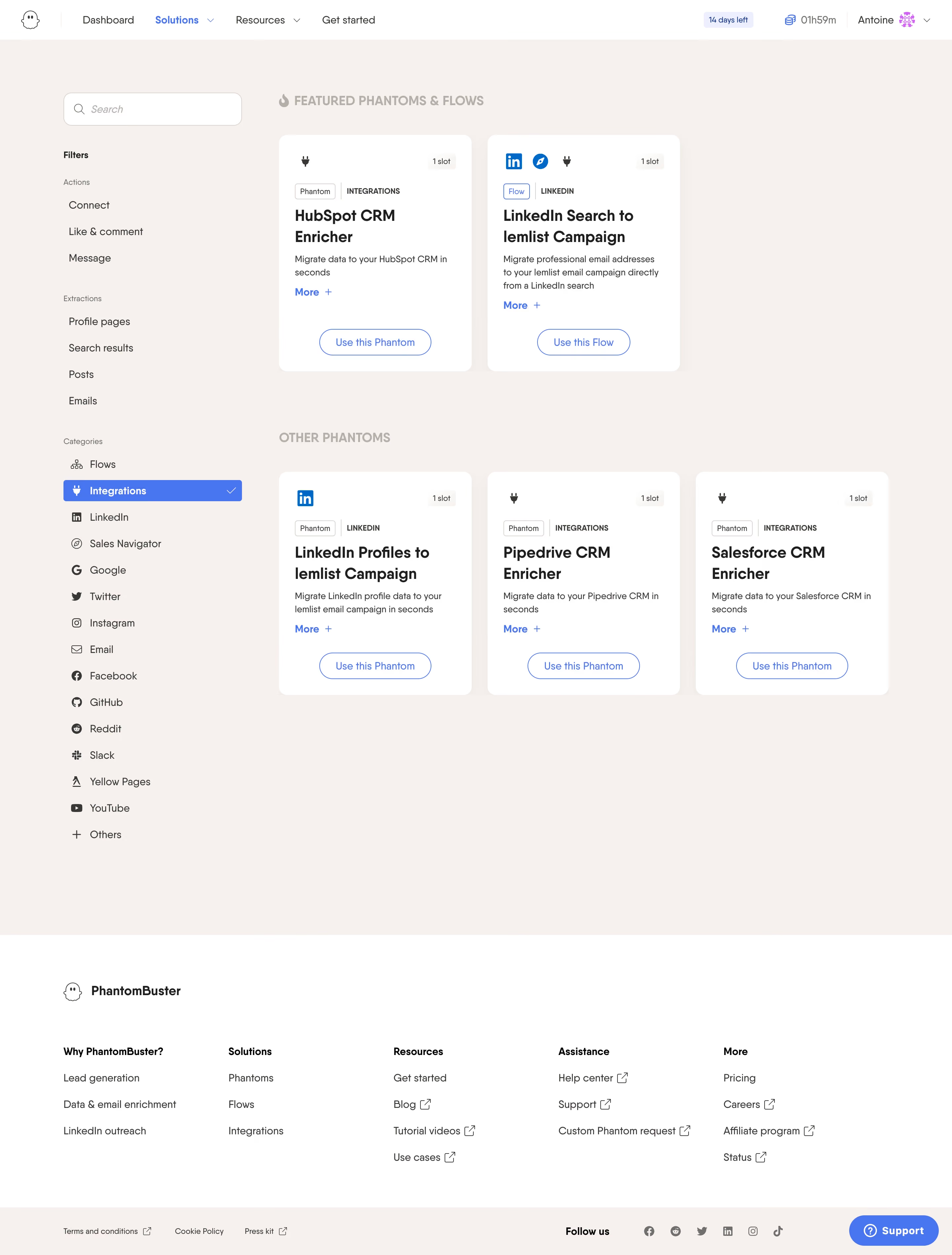
- **Character:** Warm, approachable integration catalog with a practical filter sidebar, white cards and bright blue selection states.
### Page composition
- **Canvas:** 2880 × 3796 screenshot pixels; CSS estimates assume approximately 2× capture scale.
- **Structure:** White account/navigation bar; cream catalog area with a left search/filter rail; two featured cards and three other cards; white multi-column footer and slim legal/social strip.
### Information hierarchy
- **Priority:** Featured integrations appear first, followed by the standard collection. The selected Integrations filter is filled blue.
- **Cards:** Service icon and slot badge precede type/category tags, bold title, short description, More link and outlined use action.
### Typography
- **Family:** Friendly geometric sans-serif appearance; exact family is unverified.
- **Scale:** Estimated CSS card titles 23–24px bold, descriptions 14–15px, navigation/filters 15–16px and badges 11–12px.
### Colors & surfaces
- **Sampled palette:** Warm background #F6F1EE; white cards #FFFFFF; blue #4874EF; dark copy #393836 and #1E1E1E; subtle warm fills #F3EEEB.
- **Treatment:** Section headings and filter-group labels use muted gray; product icons retain familiar service colors.
### Components
- **Catalog cards:** Approximately 290px CSS wide, with 12–14px radii and 24px padding. Rounded outlined actions align near the base.
- **Filters:** Search box, grouped action/extraction links and a long icon/category list. The active row includes a white checkmark.
- **Utilities:** Trial/time/account controls in header and blue Support pill at lower right.
### Visual rhythm
- **Spacing:** Approximately 24px card gutters, 64–80px between featured and other sections and generous empty space before footer.
- **Consistency:** Repeated card metadata and aligned action positions make varied integration titles comparable.
### Responsive
- **Guidance:** Mobile is not shown. Move filters into a disclosure, use a single-column card list and retain search above results.
### Adaptation guidance
- **Transfer:** Preserve the featured-versus-standard hierarchy and clear integration metadata. Adapt slots, categories and service marks to real target capabilities.
Use this context to reproduce the reference's visual language: layout, typography, colors, spacing, borders, radii, and distinctive elements. The screenshot takes priority if descriptions conflict.
## Direction
{{preferences.fidelityInstructions}}
## Output
{{output.instructions}}
Deliver a polished, cohesive design with precise alignment, hierarchy, and spacing. Produce the requested visual artifact, not just a description. If unsupported, explain the limitation.