Design with AI
Generate a new design based on this screen using your own content.
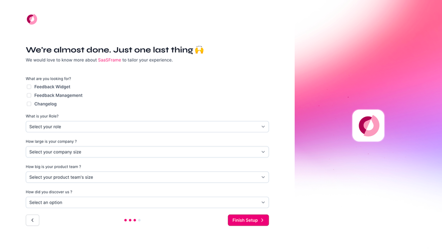
# Design from Reference: Olvy Account Setup
Create an original, high-fidelity visual design inspired by the reference. Prioritize composition, typography, colors, spacing, and component styling over technical implementation.
## Reference
- **Product:** Olvy
- **Category:** Account Setup
- **Screenshot:** https://cdn.prod.website-files.com/5e9dc792e1210c5325f7ebbc/6acbbc686325e7e23e4c953a_6acbbbc7fd63599d1685f025_cms-b8a8133ff860319406976142.webp
Analyze the screenshot first. If inaccessible, request it rather than guessing.
## Content
{{content.instructions}}
{{content.data}}
Preserve essential messaging and factual accuracy. Adapt structure and copy length for visual balance; never invent product claims.
## Visual Design
### Overall aesthetic
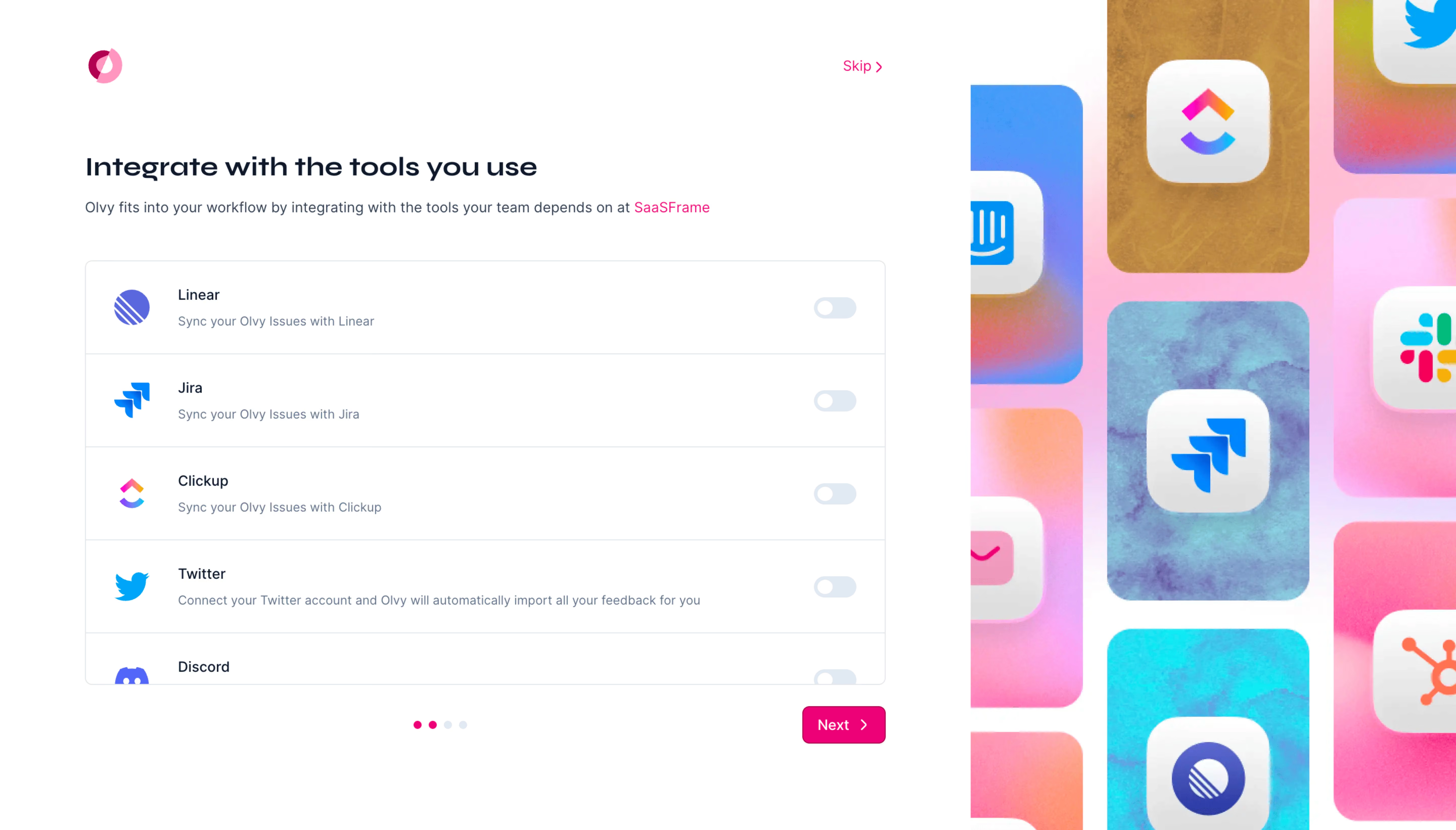
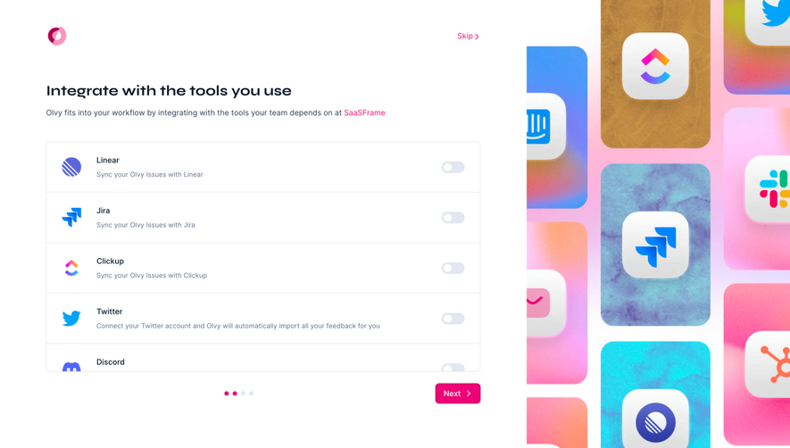
- **Character:** Colorful integration-onboarding step with a quiet white form and a vivid decorative app-logo wall.
### Page composition
- **Capture:** 5760 × 3284 screenshot pixels; estimated 4× CSS scale.
- **Structure:** Left two-thirds contain logo, Skip, heading/helper, scrollable integration list, progress dots and Next; right third shows tall textured multicolor app tiles.
### Information hierarchy
- **Priority:** Integration names and short descriptions align with off-state switches; Next and Skip offer clear progression choices.
### Typography
- **Families:** Wide rounded display heading and sans-serif interface; exact families unverified.
- **Estimated CSS sizes:** Heading 26px, body 14px, integration names 14px and helper 12px.
### Colors & surfaces
- **Measured palette:** White #FFFFFF, near-white #F9FAFA/#F6F7F7/#FFFEFF and neutral #DEDEDE/#E0E0E0.
- **Accents:** Hot pink navigation/progress and saturated pink, blue, cyan and gold artwork.
### Components
- **Elements:** Provider logos, separated integration rows, toggle switches, four progress dots, pink Next and small Skip.
- **Estimated geometry:** List approximately 790px wide, 92px rows, 8px border radius and 38px action height.
### Visual rhythm
- **Spacing:** Repeated rows make the functional side orderly while the large decorative strip supplies energy.
### Responsive
- **Suggested adaptation:** Remove or reduce artwork, keep list fluid and retain Skip/Next visibility. Mobile behavior is unverified.
### Adaptation guidance
- **Transfer:** Preserve optional connection choices and clear provider identity. Enable switches only for genuine integration states.
Use this context to reproduce the reference's visual language: layout, typography, colors, spacing, borders, radii, and distinctive elements. The screenshot takes priority if descriptions conflict.
## Direction
{{preferences.fidelityInstructions}}
## Output
{{output.instructions}}
Deliver a polished, cohesive design with precise alignment, hierarchy, and spacing. Produce the requested visual artifact, not just a description. If unsupported, explain the limitation.