
Thank you! Your submission has been received!
Oops! Something went wrong while submitting the form.
Get SaaSFrame Pro
Monthly
$18
Quarterly
$48
Yearly
$180
Upgrade to access this feature
Browse all screens & flows
Filter and search screens & flows
Access Figma files
Access mobile versions
Bookmark screens & flows
Join now
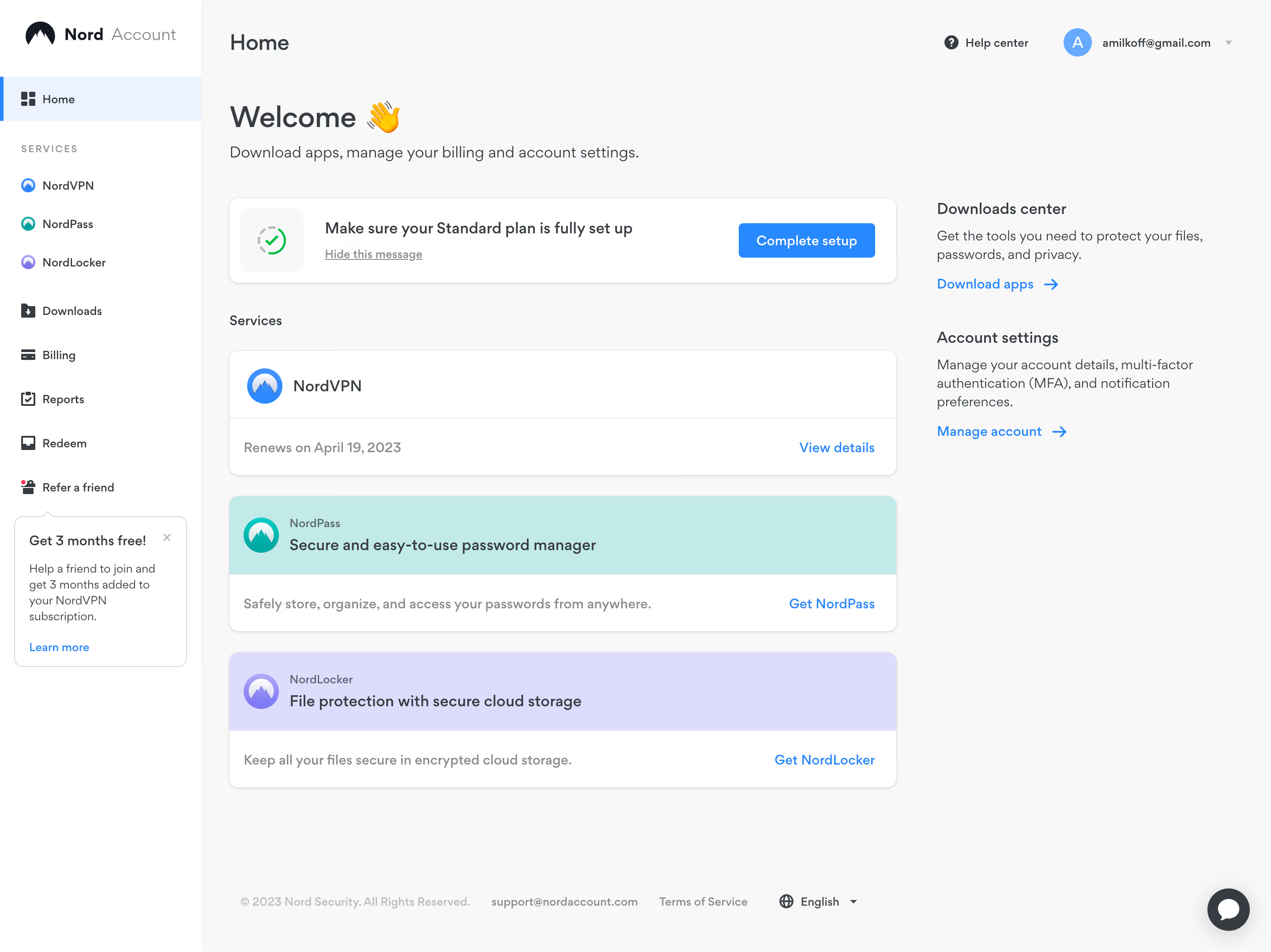
Nord VPN General Dashboard

Nord VPN
Online VPN service for speed and security
Designed by
No items found.

Bookmark
Bookmark

Design with AI
Thank you! Your submission has been received!
Oops! Something went wrong while submitting the form.
# Design from Reference: Nord VPN General Dashboard
Create an original, high-fidelity visual design inspired by the reference. Prioritize composition, typography, colors, spacing, and component styling over technical implementation.
## Reference
- **Product:** Nord VPN
- **Category:** Dashboard
- **Screenshot:** https://cdn.prod.website-files.com/5e9dc792e1210c5325f7ebbc/6acb6aeebf2e69a0c03b6c78_6acb6a1d5391d62536b62c55_cms-77455358d65c77e97f18a354.webp
Analyze the screenshot first. If inaccessible, request it rather than guessing.
## Content
{{content.instructions}}
{{content.data}}
Preserve essential messaging and factual accuracy. Adapt structure and copy length for visual balance; never invent product claims.
## Visual Design
### Overall aesthetic
- **Style:** A light account dashboard combines a white sidebar with a pale-gray workspace, restrained blue actions and pastel service panels.
- **Character:** Friendly and practical, with a welcoming heading, simple product icons and clear account-management links.
### Page composition
- **Capture:** The source is 2880 × 2158 pixels. Estimated CSS dimensions below assume an unverified 2× capture.
- **Sidebar:** A roughly 228-pixel white rail contains the account brand, selected Home row, service links and account destinations. A referral card sits beneath.
- **Top region:** Home appears at the left of the workspace header, while help and the account menu align right.
- **Main grid:** A large welcome heading and subtitle introduce a two-column content area: a roughly 755-pixel service column and a narrower support-link column.
- **Service column:** A setup reminder precedes a Services label, one subscription card and two pastel cross-sell cards.
- **Right column:** Downloads and account-settings explanations each end with a blue arrow link.
- **Bottom:** A compact copyright/support/legal/language row sits low in the workspace; a circular chat launcher anchors bottom right.
### Information hierarchy
- **Welcome:** A large heading with waving-hand emoji leads the page.
- **Setup priority:** A white reminder card pairs status icon and instruction with a filled Complete setup button.
- **Services:** Product identity leads each card, followed by renewal information or a brief offer and right-aligned action.
- **Support routes:** Short bold headings introduce secondary account tasks in the right column.
- **Sidebar state:** Home uses a pale-blue background and blue left-edge indicator.
### Typography
- **Family:** Rounded-looking sans serif throughout; exact identity is unverified.
- **Welcome:** Approximately 34 pixels, semibold; supporting line around 18 pixels.
- **Section roles:** Main page label around 26 pixels, service titles around 18 pixels and group labels around 16 pixels.
- **Body and controls:** Approximately 14–16 pixels with comfortable 20–22-pixel leading.
- **Utilities:** Sidebar category label uses small uppercase letters with wide tracking; footer copy is around 12 pixels.
### Colors & surfaces
- **Measured canvas:** Pale gray #F8F8F8 contrasts with white #FFFFFF cards and sidebar.
- **Service bands:** Lavender #DDDCFD and pale teal #C1EAE8 distinguish the two promotional service panels.
- **Ink:** Dark gray #373C43 supplies the primary text tone.
- **Blue accent:** #2888FF is sampled in the action system; pale blue #ECF3FF appears in selected navigation.
- **Depth:** Cards have thin gray boundaries, modest rounded corners and subtle lower-edge shadows.
### Components
- **Setup card:** Approximately 755 × 98 pixels with 12-pixel radius, status tile left, two text lines and a roughly 154 × 39-pixel blue button right.
- **Subscription card:** A white rounded panel has a product-icon header, horizontal divider and renewal/action footer.
- **Offer cards:** Teal and lavender top bands contain icons and product copy; white lower rows hold a short description and blue action.
- **Referral card:** A small outlined rounded card includes heading, close glyph, short explanation and blue link.
- **Account controls:** Circular initial avatar, account label and small chevron form the top-right menu.
- **Chat launcher:** A dark circular button with a white speech glyph and soft shadow sits above the bottom-right edge.
### Visual rhythm
- **Service spacing:** Roughly 24 pixels separate major cards; consistent widths and left alignment create a strong vertical stack.
- **Column balance:** The narrow right column remains text-led while the left uses larger bordered surfaces.
- **Footer placement:** A broad whitespace gap separates service content from the bottom utility row.
### Responsive
- **Evidence:** Only a desktop account view is observed; mobile navigation and card interactions are unverified.
- **Recommended reflow:** Stack the right-column account links after services and collapse the sidebar on narrow screens.
- **Recommended cards:** Allow setup text and button to stack, and wrap footer links without shrinking their text.
- **Accessibility:** Provide clear focus states and labels for avatar, chat and icon controls.
### Adaptation guidance
- **Preserve:** Keep the neutral shell, pastel service differentiation, blue actions and setup reminder prominence.
- **Implementation:** Build separate navigation, setup, subscription, offer and utility-link components with flexible widths.
- **Content fidelity:** Use actual account data rather than copying visible personal details, renewal dates or offers.
- **Behavior:** Setup, billing, downloads and chat behavior are not established by the image; define these independently.
Use this context to reproduce the reference's visual language: layout, typography, colors, spacing, borders, radii, and distinctive elements. The screenshot takes priority if descriptions conflict.
## Direction
{{preferences.fidelityInstructions}}
## Output
{{output.instructions}}
Deliver a polished, cohesive design with precise alignment, hierarchy, and spacing. Produce the requested visual artifact, not just a description. If unsupported, explain the limitation.


Category
Patterns
No items found.
Tech Stack

Added on
April 6, 2023
Similar screens
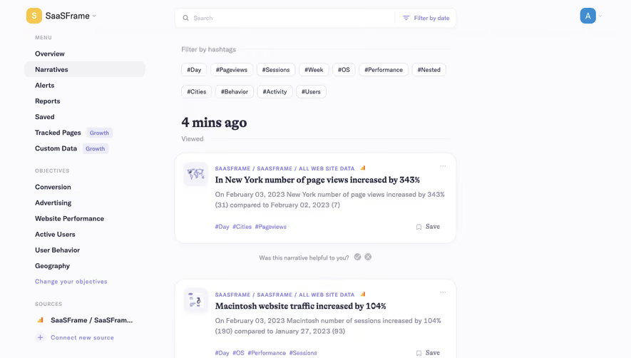


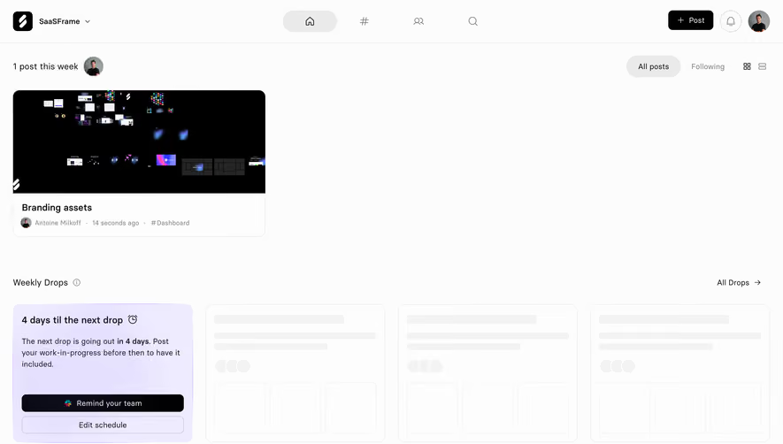

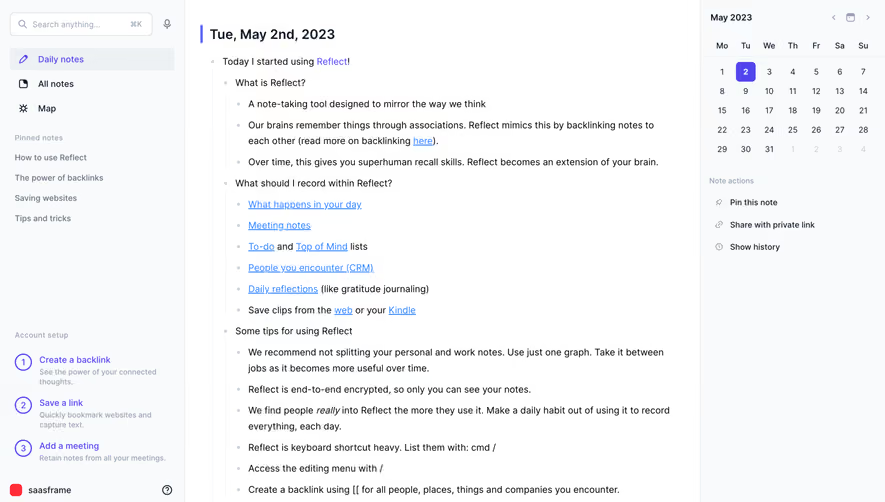

Upgrade to SaaSFrame Pro now to see similar examples.
Monthly
$18 /month
Billed $18 monthly
Browse all screens & flows
Filter and search screens & flows
Search text in screenshots
Access Figma files
Access mobile versions
Join now
Quarterly
$16 /month
Billed $48 quarterly
Browse all screens & flows
Filter and search screens & flows
Search text in screenshots
Access Figma files
Access mobile versions
Join now
Yearly
$15 /month
Billed $180 yearly
Browse all screens & flows
Filter and search screens & flows
Search text in screenshots
Access Figma files
Access mobile versions
Join now