
Thank you! Your submission has been received!
Oops! Something went wrong while submitting the form.
Get SaaSFrame Pro
Monthly
$18
Quarterly
$48
Yearly
$180
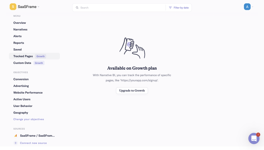
Upgrade to access this feature
Browse all screens & flows
Filter and search screens & flows
Access Figma files
Access mobile versions
Bookmark screens & flows
Join now
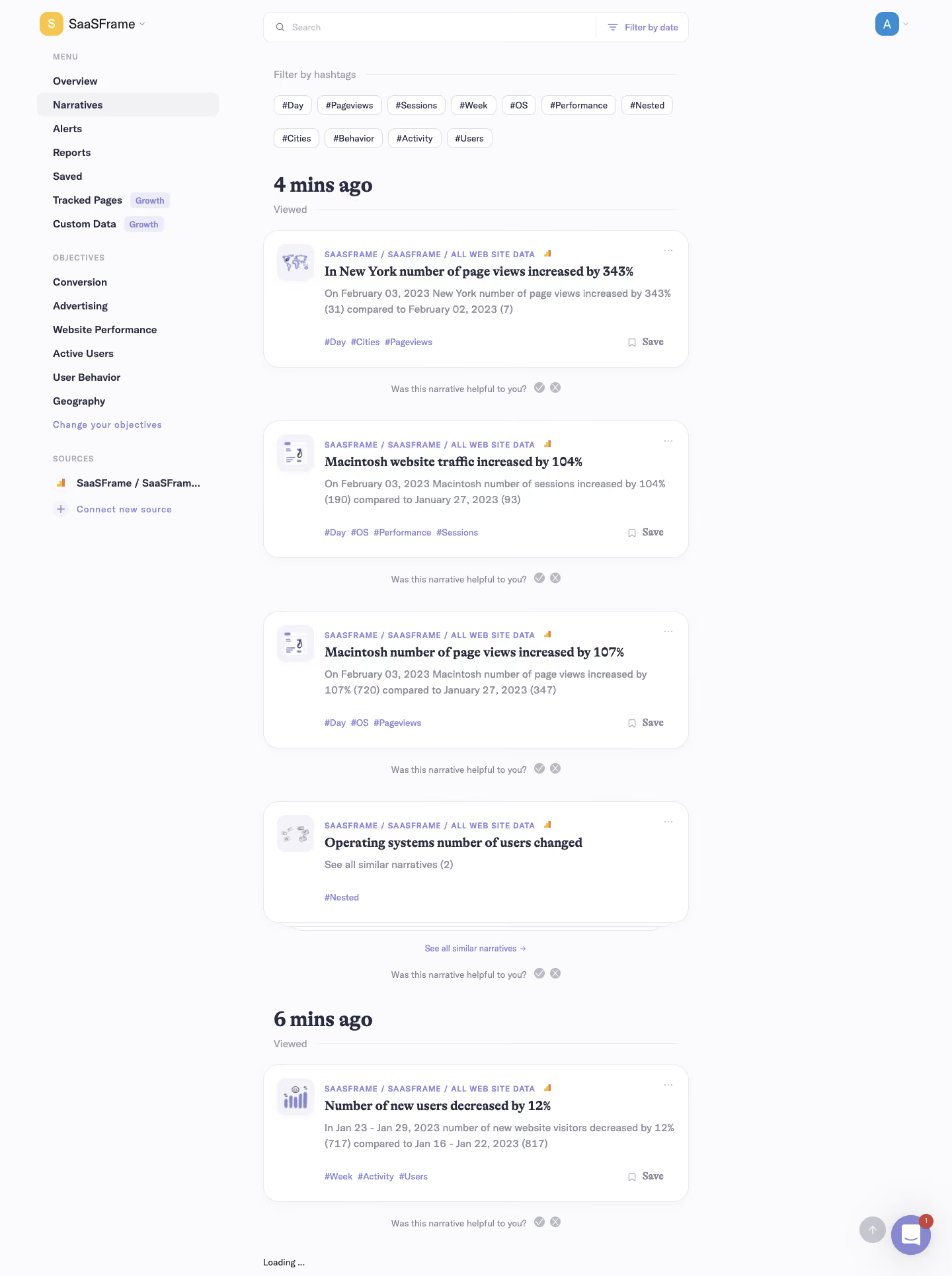
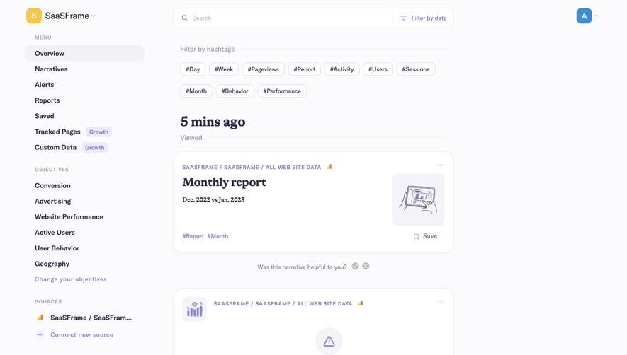
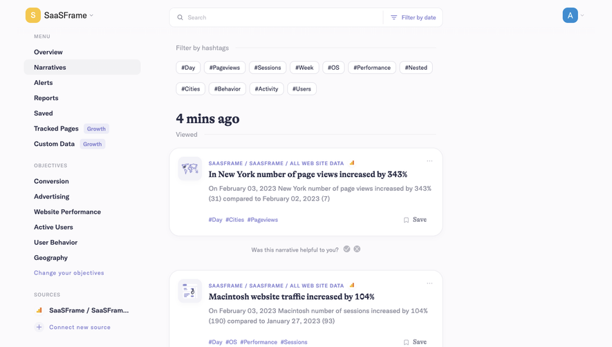
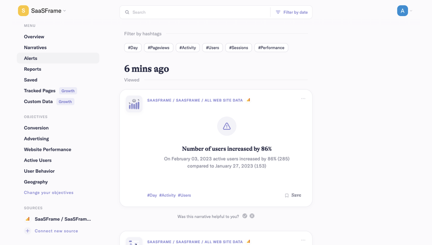
Narrative BI Dashboard

Narrative BI
Actionable Analytics for Growth teams
Designed by


Bookmark
Bookmark

Design with AI
Thank you! Your submission has been received!
Oops! Something went wrong while submitting the form.
# Design from Reference: Narrative BI Dashboard
Create an original, high-fidelity visual design inspired by the reference. Prioritize composition, typography, colors, spacing, and component styling over technical implementation.
## Reference
- **Product:** Narrative BI
- **Category:** Dashboard
- **Screenshot:** https://cdn.prod.website-files.com/5e9dc792e1210c5325f7ebbc/6acbbec839e7f22db402897b_6acbbe0d681d3a08a1ecf1f8_cms-128deb67124b0ca3358f4664.webp
Analyze the screenshot first. If inaccessible, request it rather than guessing.
## Content
{{content.instructions}}
{{content.data}}
Preserve essential messaging and factual accuracy. Adapt structure and copy length for visual balance; never invent product claims.
## Visual Design
### Overall aesthetic
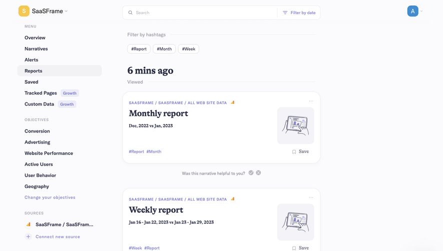
- **Character:** A soft analytical feed using off-white and lavender surfaces, rounded white cards and a distinctive mix of serif insight headlines with sans-serif interface text.
- **Evidence scale:** Original 1440 × 1930 pixels, inspected across its full height. Sizes are approximate image pixels; CSS scale and font identities remain unverified.
### Page composition
- **Sidebar:** A roughly 300 px left region contains workspace identity, menu links, objectives and source controls, grouped under small uppercase labels.
- **Feed:** A roughly 644 px column begins around x398, leaving a substantial empty region on the right.
- **Top controls:** A shared search/date-filter bar precedes eleven hashtag chips in two rows.
- **Timeline:** A four-minute group contains three standard insight cards and one stacked narrative cluster; a six-minute group contains another insight card.
- **Bottom:** Loading text sits near the feed's lower edge; back-to-top and purple support controls float at bottom right, with a red notification badge.
### Information hierarchy
- **Insight headlines:** Dark bold serif headlines explain each change; sans-serif body text supplies comparisons and numerical detail.
- **Context labels:** Small uppercase lavender source breadcrumbs sit above the headlines, alongside a tiny analytics mark.
- **Grouping:** Large serif relative-time headings and muted Viewed dividers organize the feed.
- **Secondary actions:** Hashtags sit at card bottom left, Save at bottom right, ellipsis at upper right and a helpfulness prompt with positive/negative circular controls below each entry.
### Typography
- **Time headings:** Unverified bold serif, approximately 32 px with 38 px line height and tight tracking.
- **Card headlines:** Bold serif around 20 px, 26 px line height; the nested cluster uses the same treatment.
- **Body:** Unverified sans-serif, around 16 px regular/medium, 24 px line height and muted tone.
- **Navigation:** Around 15 px semibold; section labels about 12 px uppercase with expanded tracking.
- **Metadata:** Breadcrumbs around 12 px bold with tracked uppercase; tags and feedback prompts around 13–14 px.
### Colors & surfaces
- **Canvas:** Measured #FBFAFC dominates the page.
- **Cards:** White #FFFFFF with pale gray-lavender edges; sampled #E9E8ED appears in structural details.
- **Primary text:** Deep navy #2A2C44 anchors navigation, serif headings and important labels.
- **Secondary surfaces:** Pale lavender #F3F2F8 appears in icon tiles and soft interface regions.
- **Accents:** Muted lavender links, tags, Growth badges and support bubble contrast with small yellow workspace and analytics accents.
### Components
- **Search/filter:** Approximately 644 × 44 px white rounded bar with thin outline; a vertical divider separates the date utility on the right.
- **Filter chips:** Small white outlined pills, about 30 px high, with modest 8–10 px radii and 8 px horizontal gaps.
- **Insight card:** Approximately 644 × 208 px, around 24 px radius, fine border and a very subtle shadow; roughly 20 px internal padding.
- **Card icon:** Approximately 56 px pale rounded square at upper left containing a small illustrative symbol; text begins in a consistently inset content column.
- **Nested cluster:** A shorter rounded card shows layered sheets behind it and a separate centered link to similar narratives.
- **Sidebar controls:** Narratives uses a broad pale active pill; objectives follow evenly spaced rows, while source names truncate with ellipses.
- **Feedback and utilities:** Small low-contrast circular response icons follow each helpfulness question; lower-right support bubble carries a red count badge.
### Visual rhythm
- **Feed cadence:** Standard cards repeat at roughly 288 px intervals when their feedback rows are included.
- **Internal spacing:** Breadcrumb, headline and comparison copy form a compact upper stack; a larger gap separates copy from tags and Save.
- **Section rhythm:** Sidebar groups use approximately 32 px separation, while navigation items follow a regular 36 px pitch.
- **Contrast:** Narrow feed width and broad outer whitespace make the repeated cards readable despite detailed metadata.
### Responsive
- **Observed limit:** Desktop feed only; mobile navigation and loading behavior are not verified.
- **Recommendation:** Collapse the sidebar and allow the feed to fill a single column with 16–24 px gutters.
- **Card handling:** Wrap hashtags and long headings, keep Save visible, and stack search/date controls if necessary.
- **Floating controls:** Maintain clear space between support utilities and feed content on narrow screens.
### Adaptation guidance
- **Retain:** Use serif insight statements to distinguish analytical storytelling from surrounding interface controls.
- **Implement:** Build reusable cards with source metadata, insight, comparison, tags, save and feedback in a stable order.
- **Verify:** Confirm actual fonts, data semantics and responsive behavior separately; the observed loading label and stacked cards do not establish interactive behavior.
Use this context to reproduce the reference's visual language: layout, typography, colors, spacing, borders, radii, and distinctive elements. The screenshot takes priority if descriptions conflict.
## Direction
{{preferences.fidelityInstructions}}
## Output
{{output.instructions}}
Deliver a polished, cohesive design with precise alignment, hierarchy, and spacing. Produce the requested visual artifact, not just a description. If unsupported, explain the limitation.


Category
Patterns


Added on
February 5, 2023

Similar screens
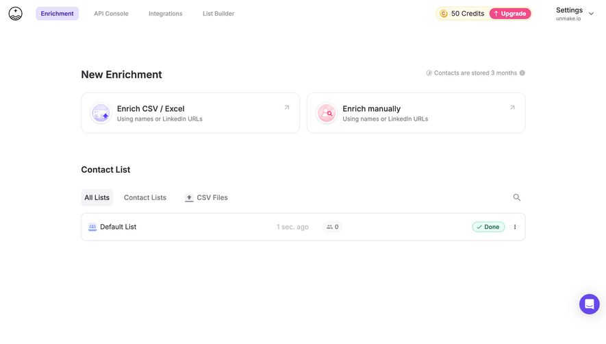


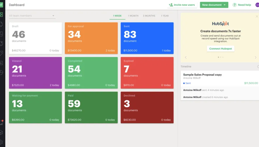


Upgrade to SaaSFrame Pro now to see similar examples.
Monthly
$18 /month
Billed $18 monthly
Browse all screens & flows
Filter and search screens & flows
Search text in screenshots
Access Figma files
Access mobile versions
Join now
Quarterly
$16 /month
Billed $48 quarterly
Browse all screens & flows
Filter and search screens & flows
Search text in screenshots
Access Figma files
Access mobile versions
Join now
Yearly
$15 /month
Billed $180 yearly
Browse all screens & flows
Filter and search screens & flows
Search text in screenshots
Access Figma files
Access mobile versions
Join now