Overall Style and Aesthetic
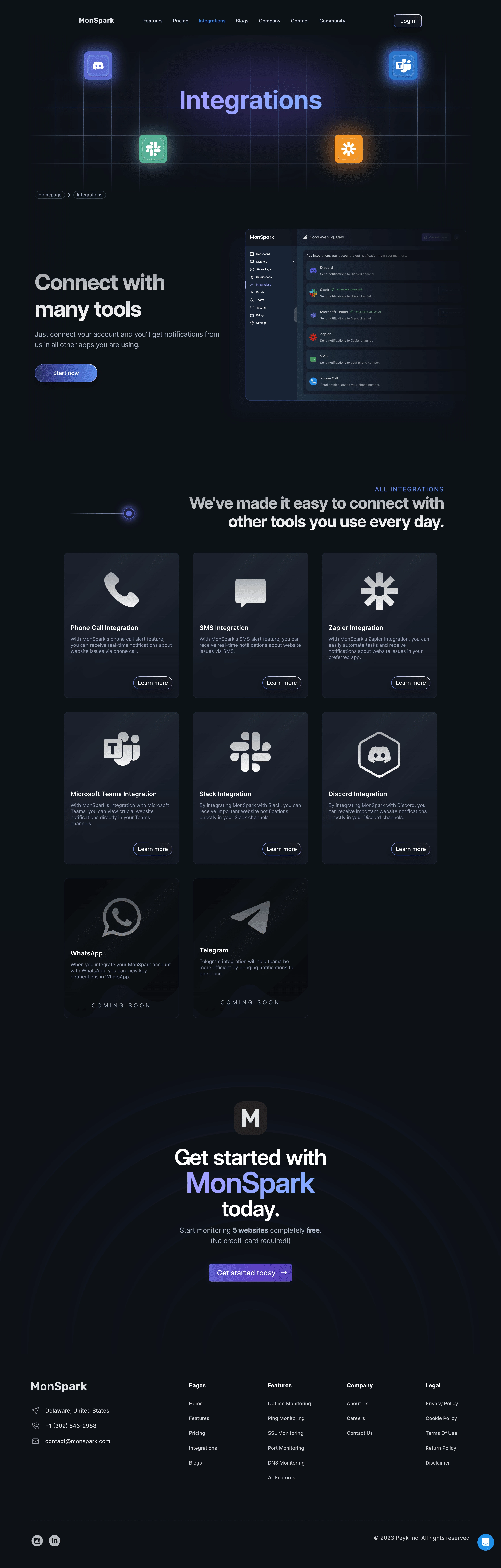
Monspark’s Integrations page embodies a crisp, modern aesthetic defined by generous white space and a balanced blend of soft color accents. The design feels uncluttered yet vibrant, delivering a professional confidence without sacrificing approachability. Rounded cards, smooth hover states, and clear grid organization foster a sense of order and visual ease. Layout and Structure
The page flows logically, beginning with a succinct hero section introducing the breadth of possible integrations. Below, a robust grid showcases integration partners, each in its own airy card. There’s a strategic use of whitespace, allowing each element to breathe. While the focus is on features, the footer includes essential navigation and social links, driving comprehensive site exploration. Visual Elements
Distinctive branded icons represent each integration, using consistent stroke widths and muted backgrounds for visual harmony. Subtle illustrations and soft drop shadows create gentle depth without overwhelming. There are no flashy animations, maintaining a steady, reliable energy, while bold primary CTAs encourage engagement. Color Palette and Typography
Monspark leverages a refined palette: calming blues and crisp whites dominate, accented by cool grays and the occasional burst of purple. Typography is clean and accessible, with a strong sans-serif heading hierarchy paired with lighter body text. Headings stand out in weight and size, guiding users naturally down the page. User Experience Patterns
Navigation is instantly intuitive—sticky header, clear menu, and consistent CTAs (“Integrate Now”) streamline the journey. Integrated search enables rapid filtering of integrations, while microinteractions like hover highlights liven the discovery experience without distracting. Unique or Notable Design Choices
Monspark’s choice to display integrations as individual, interactive cards creates an app-like feeling, making complex functionality approachable. The absence of overused stock photography emphasizes authentic brand clarity, resulting in a trustworthy, product-focused tone—perfect for SaaS inspiration.